Sherwin-Williams Pearly White (SW 7009) is a delicate and versatile off-white paint color that radiates subtle sophistication. Its understated charm makes it an excellent choice for homeowners and designers alike, seeking a neutral palette with a hint of warmth. Whether you’re creating a serene retreat or a polished living space, Pearly White offers the perfect backdrop for a wide range of aesthetic styles.
Pearly White stands out for its soft, creamy undertones, which lend the color a welcoming and cozy vibe. While it remains firmly in the neutral category, its faint beige undertones add warmth without overpowering its light appearance. It lacks stark coolness, making it a balanced off-white that avoids feeling clinical or sterile. This subtle warmth allows Pearly White to harmonize beautifully with both warm and cool color schemes, making it a versatile choice for various spaces.
Pairing Pearly White with complementary colors is effortless, thanks to its neutral versatility. Here are some coordinating colors that enhance its beauty:
Pearly White’s adaptability makes it suitable for a variety of applications and interior styles. Here are some ideas to incorporate this timeless shade into your home:
For open-concept homes or spaces where cohesion is key, Pearly White is an excellent choice for walls throughout the house. It provides a consistent, neutral backdrop that allows furniture, artwork, and decor to shine.
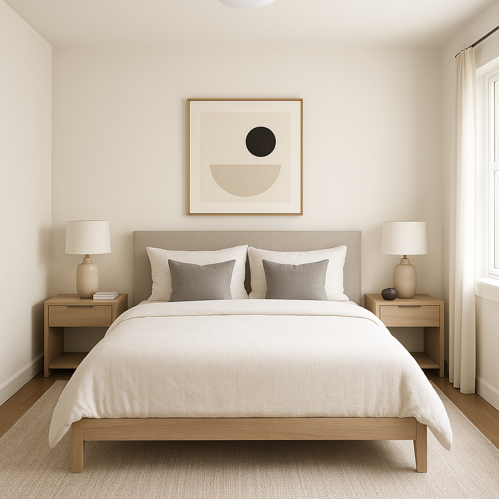
The soft warmth of Pearly White creates a serene atmosphere, making it ideal for living rooms and bedrooms. Pair it with textured fabrics, natural wood tones, and warm metallics like brass or gold for a cozy yet refined environment.
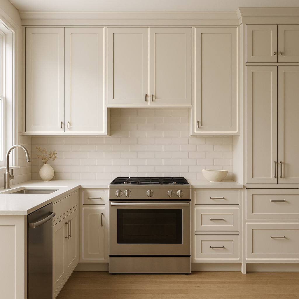
Use Pearly White on kitchen or bathroom walls to create a bright and airy space. Pair it with white or light gray cabinetry and quartz countertops for a clean, modern aesthetic. For added contrast, incorporate darker accents like oil-rubbed bronze or black fixtures.
Pearly White can be used for trim, moldings, or ceilings to soften transitions between wall colors while maintaining a cohesive look. Its subtle undertones complement both warmer and cooler palettes, making it an ideal choice for these secondary surfaces.
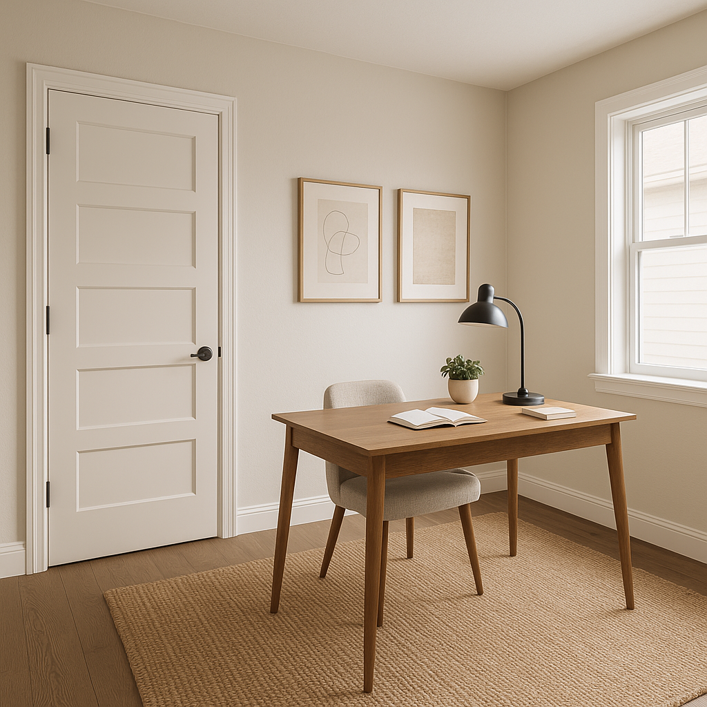
In home offices or workspaces, Pearly White fosters a calm and focused environment. Pair it with deep greens, blues, or charcoals for a sophisticated and productive space.
Sherwin-Williams Pearly White is a designer favorite because it works beautifully in various design aesthetics, from traditional to modern. Its warmth makes it especially well-suited to farmhouse, coastal, or transitional interiors, while its neutral foundation ensures compatibility with minimalist or contemporary designs.
By choosing Sherwin-Williams Pearly White, you’re opting for a color that combines timeless elegance with versatility. Its soft, creamy undertones, paired with complementary colors, allow you to create spaces that feel both inviting and refined. Whether you're refreshing a single room or redesigning an entire home, Pearly White is a reliable and sophisticated choice that will stand the test of time.
Note: These images were all generated with AI, there may be inaccurate color results. Please only use a general reference to get a rough idea of what a color may look like, we will continue to generate new images to improve accuracy.
View Colors Only by Brand (No Imagery):
Sherwin-Williams
|
Benjamin-Moore
|
Behr
|
Valspar
Live on the Eastern Slope of Colorado and looking for a local painting professional, check out all our painting services and reach out for a free estimate.
Copyright © 2026 : Wild Fox Painting Inc. : 12435 Mead Way, Littleton, CO 80125


