Sherwin-Williams Creamy (SW 7012) is a timeless, soft off-white that exudes warmth and comfort. It’s a versatile neutral that can transform any space into a cozy haven while maintaining a clean, refined aesthetic. Creamy is part of Sherwin-Williams' Classic Color Collection, making it a trusted favorite for homeowners and designers alike.
The beauty of Creamy lies in its subtle yellow undertones. These undertones give the paint color its warm and welcoming feel without leaning too far into a saturated yellow. Creamy never feels stark or cold, which makes it an excellent choice for rooms where you want to evoke a sense of relaxation and coziness. Unlike cooler whites, Creamy has an organic softness that pairs well with traditional, farmhouse, and transitional design styles.
Sherwin-Williams Creamy harmonizes beautifully with a range of complementary colors. Whether you’re creating a monochromatic palette or a dynamic color contrast, Creamy delivers a seamless foundation.
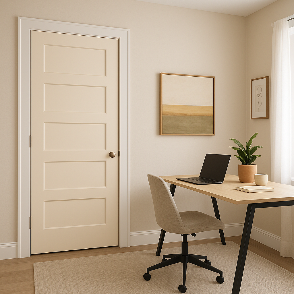
Sherwin-Williams Creamy is incredibly versatile, making it a go-to choice for nearly any room or application. Its warm undertones ensure that it works well in both natural and artificial lighting, making it suitable for spaces that need an inviting, timeless touch.
Creamy is perfect for creating a cozy yet sophisticated living space. Pair it with natural wood tones, textured linens, and warm metallic accents like brass or gold for a balanced, inviting aesthetic.
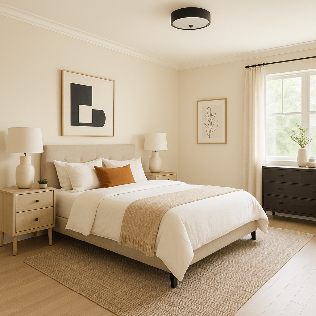
For a serene retreat, Creamy is an ideal backdrop. Layer it with soft blues or muted greens to enhance its calming qualities. Opt for plush fabrics, such as velvet or cotton, to complement its warmth.
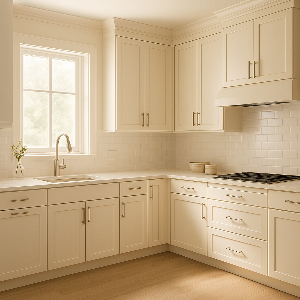
Creamy works beautifully in kitchens, especially for cabinets and walls. Pair it with darker countertops like black granite or quartz for contrast, or use it alongside butcher-block counters for a farmhouse-inspired look.
In bathrooms, Creamy creates a clean and spa-like atmosphere. Combine it with cool gray tiles or soft blue accents for a fresh, airy feel.
Sherwin-Williams Creamy isn’t just for interiors—it’s a stunning choice for home exteriors. Its warm undertones add charm and curb appeal, making it perfect for traditional and modern farmhouse-style homes. Pair it with dark shutters or trim colors, such as Sherwin-Williams Tricorn Black (SW 6258), for a bold statement.
Lighting plays a key role in how Sherwin-Williams Creamy appears in your space. In rooms with ample natural light, the yellow undertones may become slightly more pronounced, giving the room a sunnier disposition. Under artificial lighting, Creamy maintains its soft and inviting tone, making it suitable for spaces that lack abundant natural light.
Sherwin-Williams Creamy is an excellent choice for anyone seeking a warm, versatile neutral that feels timeless and approachable. It bridges the gap between traditional and modern styles, allowing you to use it in virtually any design scheme. Whether you’re repainting a single room or an entire home, Creamy provides a classic backdrop that effortlessly enhances your décor.
Note: These images were all generated with AI, there may be inaccurate color results. Please only use a general reference to get a rough idea of what a color may look like, we will continue to generate new images to improve accuracy.
View Colors Only by Brand (No Imagery):
Sherwin-Williams
|
Benjamin-Moore
|
Behr
|
Valspar
Live on the Eastern Slope of Colorado and looking for a local painting professional, check out all our painting services and reach out for a free estimate.
Copyright © 2026 : Wild Fox Painting Inc. : 12435 Mead Way, Littleton, CO 80125


