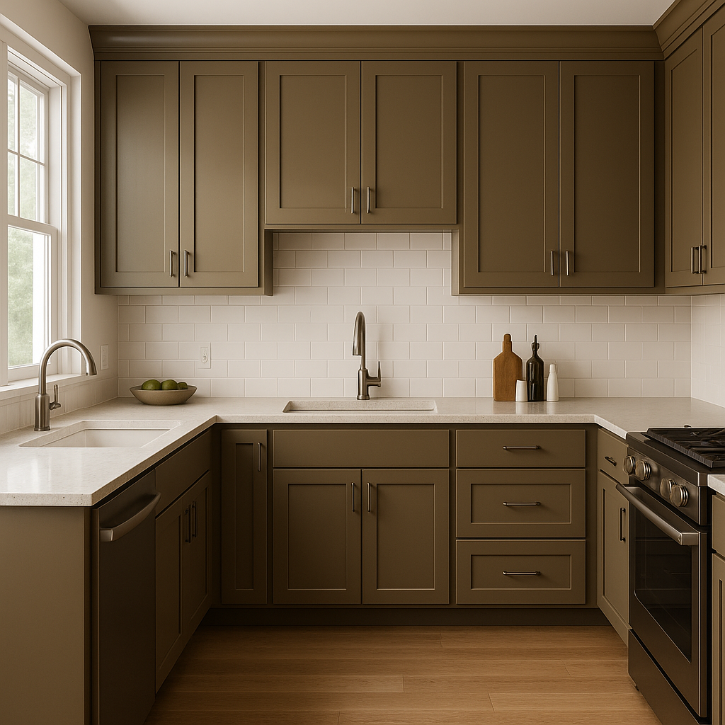
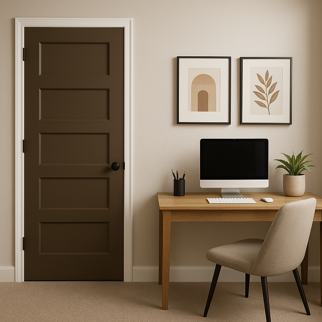
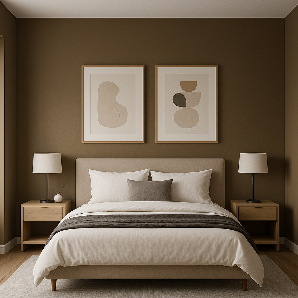
Sherwin-Williams Status Bronze SW 7034 is a timeless and versatile color that exudes sophistication and warmth. This rich, earthy hue is part of the Sherwin-Williams Neutral Color Family and offers a blend of brown and gray tones that create a balanced, grounded aesthetic. Whether you're designing a cozy living room, a modern kitchen, or a serene bedroom, Status Bronze delivers a sense of understated elegance and versatility.
The beauty of Status Bronze lies in its subtle undertones, which lean towards a warm taupe with hints of bronze and a whisper of green. These undertones make it a flexible choice that adapts to various lighting conditions. In natural daylight, you’ll notice its warm brown-gray base, while in artificial lighting, the bronze undertones come forward, adding depth and character. The understated green undertones lend it a sophisticated, organic feel, making it an excellent choice for rooms where tranquility and balance are desired.
Status Bronze pairs effortlessly with a range of colors, making it a designer’s dream for creating harmonious interiors. Here are some ideal coordinating colors:
Thanks to its versatility and warm undertones, Status Bronze is a popular choice for various applications:
Sherwin-Williams Status Bronze strikes the perfect balance between warm and neutral, making it a go-to color for both traditional and modern interiors. Its adaptability to a variety of styles and color palettes ensures it can seamlessly fit into any design project. Whether you’re aiming to create a sleek, contemporary space or a cozy, rustic retreat, Status Bronze brings a sense of sophistication and serenity to your home.
Note: These images were all generated with AI, there may be inaccurate color results. Please only use a general reference to get a rough idea of what a color may look like, we will continue to generate new images to improve accuracy.
View Colors Only by Brand (No Imagery):
Sherwin-Williams
|
Benjamin-Moore
|
Behr
|
Valspar
Live on the Eastern Slope of Colorado and looking for a local painting professional, check out all our painting services and reach out for a free estimate.
Copyright © 2026 : Wild Fox Painting Inc. : 12435 Mead Way, Littleton, CO 80125


