Sherwin-Williams Porpoise SW 7047 is a rich, versatile neutral that lends itself to creating spaces of understated elegance and warmth. Its deep, complex tone makes it a standout choice for those who want a refined color that feels grounded yet modern. Whether you're designing a cozy home retreat or a professional workspace, Porpoise offers a perfect balance of sophistication and comfort.
Porpoise is a warm, medium-to-dark greige (a mix of gray and beige) with subtle brown undertones. Depending on the lighting, it can lean more toward a taupe-like warmth or a muted charcoal-gray coolness. This chameleon-like quality gives it depth and dimension, making it an excellent choice for layering textures and accents. In rooms with natural light, the soft brown undertones become more prominent, creating a warm and inviting atmosphere. Under artificial or cooler lighting, Porpoise reveals its gray base, offering a more subdued, modern vibe.
Porpoise pairs beautifully with a wide range of colors, allowing you to customize your palette to suit your personal style. Here are some suggestions for coordinating colors:
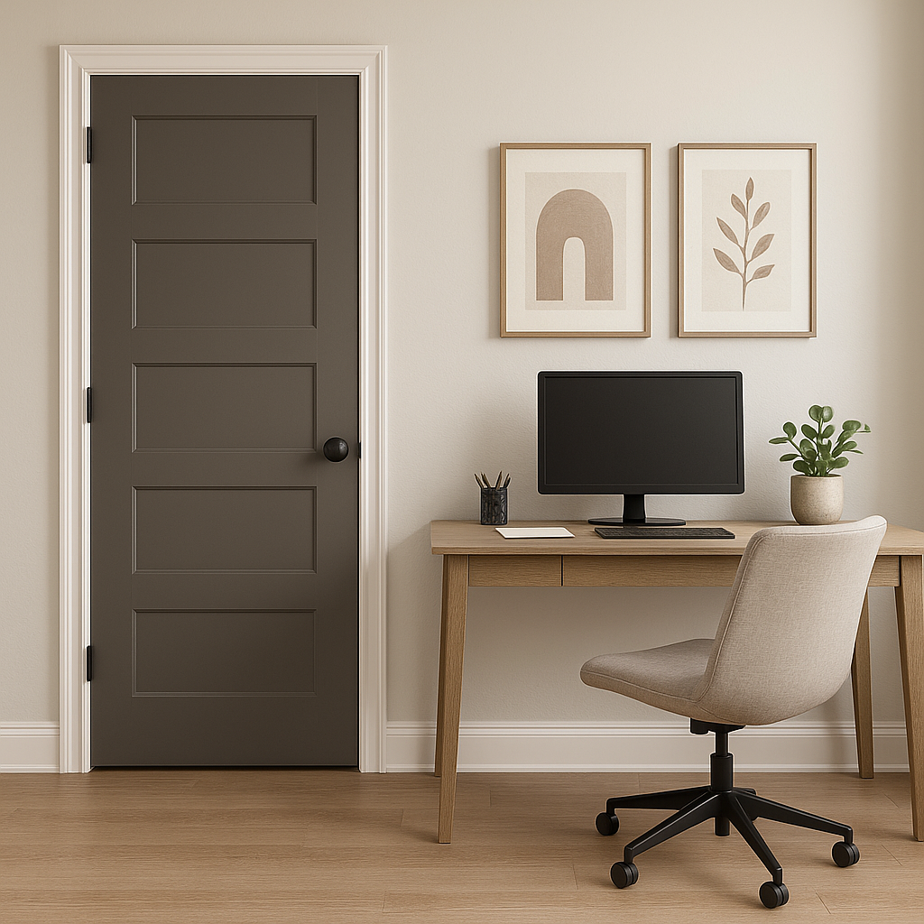
Porpoise’s versatility makes it a stellar choice for a variety of applications. Here are some ideas for how to use this luxurious neutral:
Porpoise works beautifully as a main wall color in living rooms, creating a cozy yet sophisticated backdrop for furniture, artwork, and décor. Pair it with light-colored furniture and soft textiles for a balanced, inviting look.
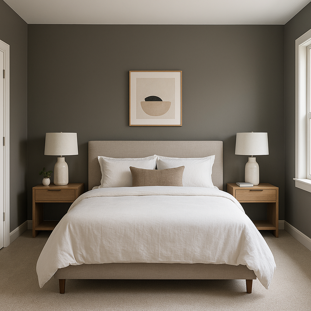
For a tranquil retreat, Porpoise can be used on all walls or as an accent color behind the bed. Its warm undertones help create a calming atmosphere that promotes relaxation.
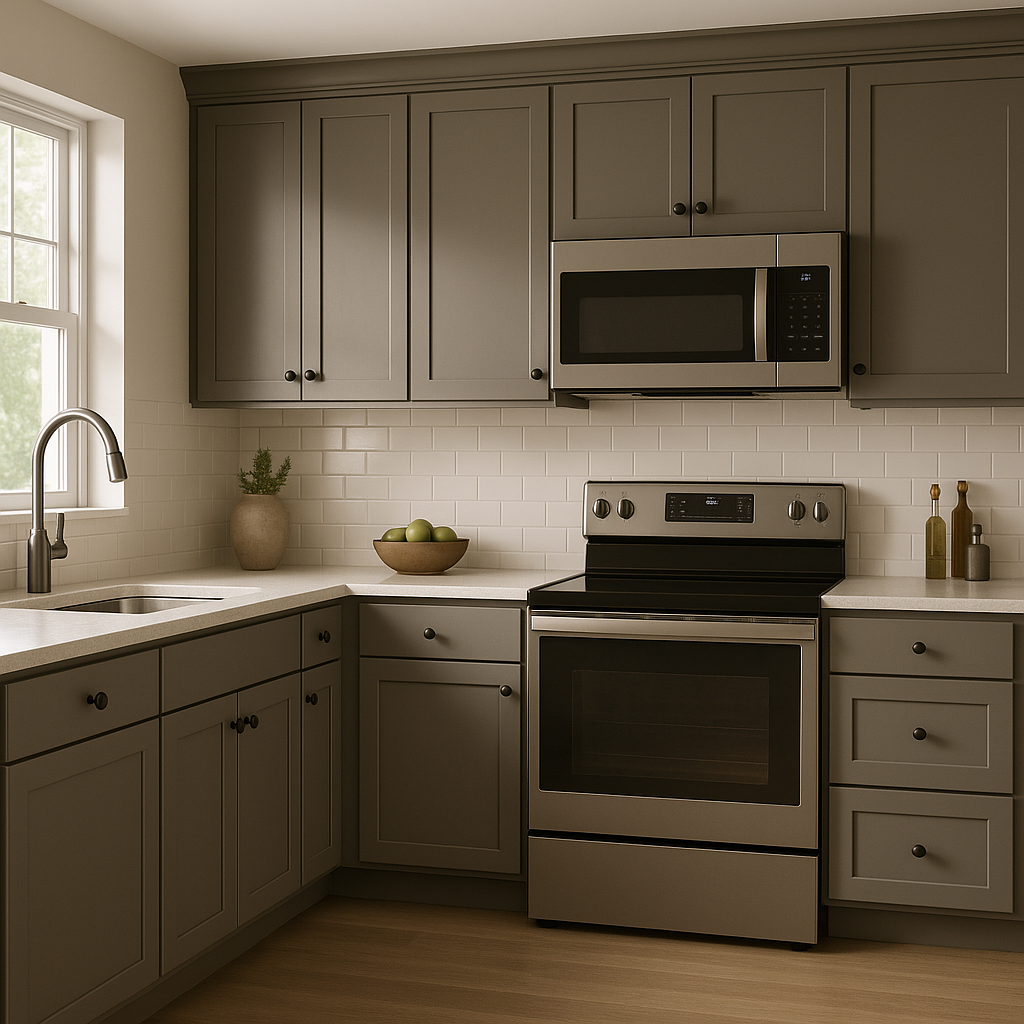
Porpoise adds depth to kitchens and dining spaces, especially when paired with white or cream cabinetry. It also works well for kitchen islands, giving them a bold, statement-making appearance.
In bathrooms, Porpoise exudes spa-like sophistication. Pair it with white tiles, chrome fixtures, and soft lighting to create a luxurious space that feels both modern and timeless.
Porpoise makes a stunning exterior paint color for homes. Its warm undertones complement both natural and man-made materials like stone, brick, and wood.
Note: These images were all generated with AI, there may be inaccurate color results. Please only use a general reference to get a rough idea of what a color may look like, we will continue to generate new images to improve accuracy.
View Colors Only by Brand (No Imagery):
Sherwin-Williams
|
Benjamin-Moore
|
Behr
|
Valspar
Live on the Eastern Slope of Colorado and looking for a local painting professional, check out all our painting services and reach out for a free estimate.
Copyright © 2026 : Wild Fox Painting Inc. : 12435 Mead Way, Littleton, CO 80125


