Sherwin-Williams Nuance (SW 7049) is a soft and sophisticated neutral paint color that brings a sense of serenity and timeless elegance to any space. This calming hue is a blend of subtle cool and warm tones, making it a versatile choice for both modern and traditional interiors. With its understated charm, Nuance effortlessly serves as a backdrop that highlights other design elements, creating a harmonious and inviting atmosphere.
Nuance is a complex and balanced neutral with delicate undertones that add depth to its appearance. Primarily, the color leans toward a soft greige (a blend of gray and beige), but it also carries a faint hint of green undertones. These green undertones are subtle enough to maintain its neutral essence while introducing a touch of freshness. Depending on the lighting in your space, Nuance may appear slightly cooler or warmer, shifting between a pale gray and a warm beige. This chameleon-like quality makes it an adaptable choice for various settings and styles.
To create a cohesive and visually appealing palette, Nuance pairs beautifully with a wide variety of coordinating colors. Here are some complementary options to consider:
Nuance’s versatility makes it a fantastic choice for almost any room in your home. Its ability to adapt to different lighting conditions and pair with a wide range of colors ensures it will look beautiful no matter where you use it.
Nuance creates a calming and welcoming environment in shared spaces. Pair it with plush furnishings in soft textures and warm-toned accents to enhance its cozy appeal. Consider using it as a wall color with white trim for a timeless and polished look.
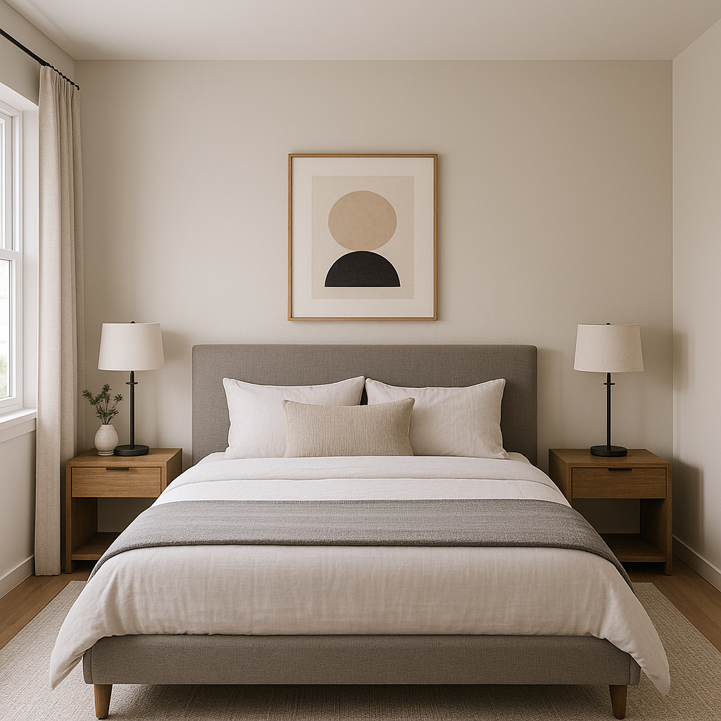
In bedrooms, Nuance promotes relaxation and restfulness. It works well with natural wood tones, soft textiles, and neutral bedding for a serene retreat. Add pops of muted green or dusty blue for a touch of color that complements the undertones.
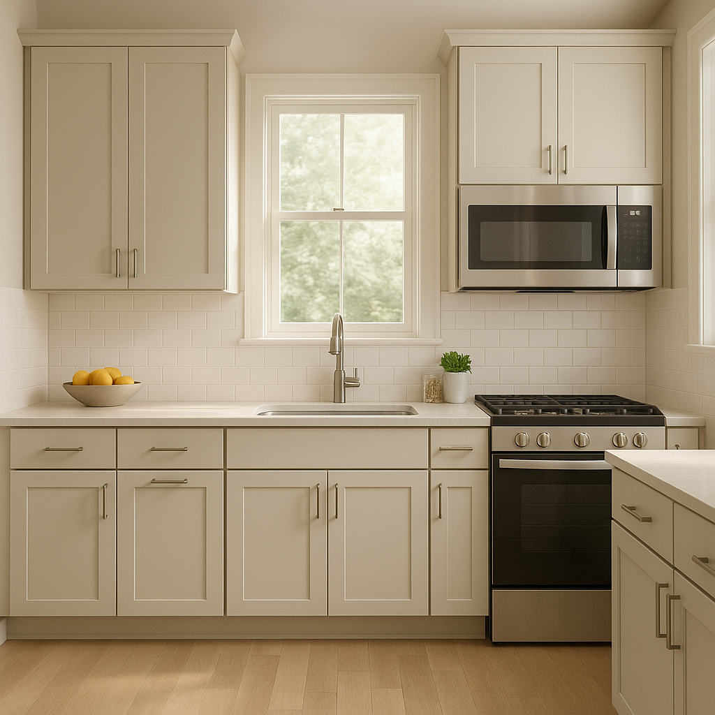
Nuance is a perfect choice for kitchens and dining areas where you want a neutral yet fresh feel. Pair it with white cabinets and brushed nickel hardware for a clean, airy look. You can also incorporate darker accents, like navy or charcoal, for a more dramatic effect.
Bathrooms painted in Nuance exude spa-like tranquility. Combine it with crisp white tiles, warm wood vanities, and natural stone textures for a soothing and cohesive design.
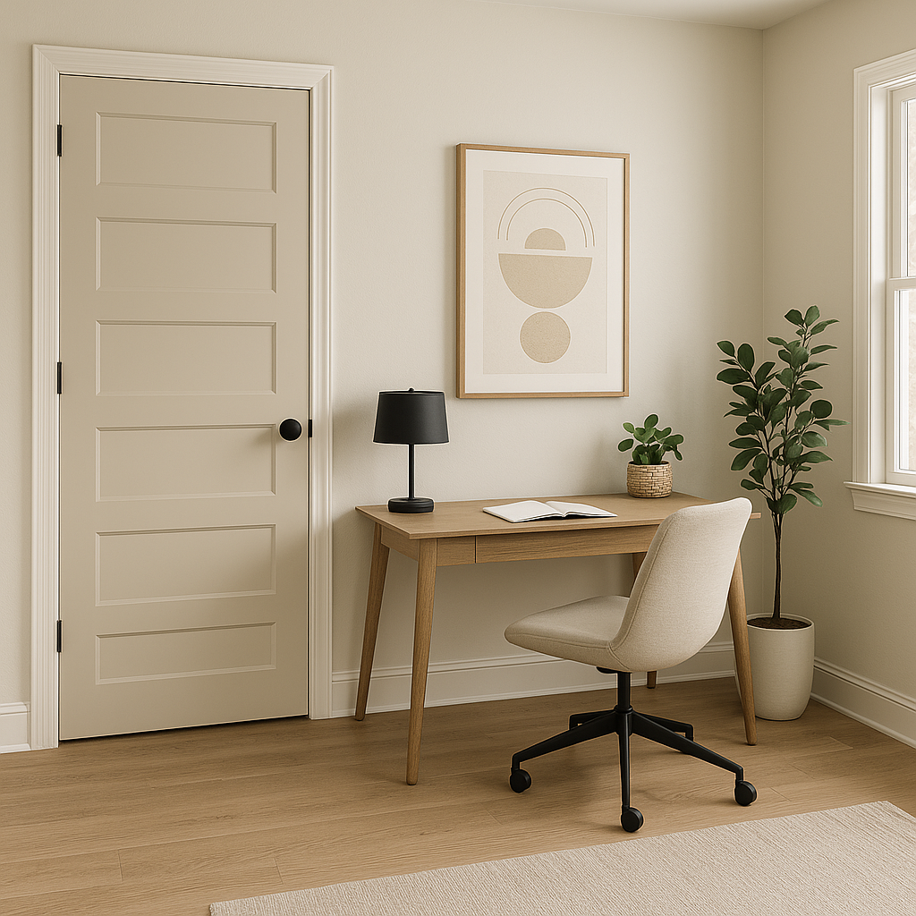
As a neutral, Nuance is an excellent choice for transitional spaces like hallways and entryways. It creates a seamless flow throughout your home and sets the stage for bolder accent colors in adjoining rooms.
Lighting plays a significant role in how Nuance appears in your space. In rooms with ample natural light, the color will lean slightly cooler, showcasing more of its gray undertones. In spaces with warmer artificial lighting, Nuance takes on a cozier, beige-like quality. To ensure the perfect look, consider testing the color in different lighting conditions before committing.
Sherwin-Williams Nuance is the epitome of understated elegance. Its delicate balance of gray, beige, and green undertones makes it a versatile neutral that adapts beautifully to a wide range of design styles. Whether you're looking to create a tranquil bedroom, a welcoming living room, or a polished entryway, Nuance offers the perfect foundation for your interior design vision. Its ability to pair effortlessly with whites, earthy neutrals, muted greens, and deep accents ensures you have endless possibilities to customize your space.
Note: These images were all generated with AI, there may be inaccurate color results. Please only use a general reference to get a rough idea of what a color may look like, we will continue to generate new images to improve accuracy.
View Colors Only by Brand (No Imagery):
Sherwin-Williams
|
Benjamin-Moore
|
Behr
|
Valspar
Live on the Eastern Slope of Colorado and looking for a local painting professional, check out all our painting services and reach out for a free estimate.
Copyright © 2026 : Wild Fox Painting Inc. : 12435 Mead Way, Littleton, CO 80125


