Sherwin-Williams Passive SW 7064 is a versatile, modern gray that has become a staple in both residential and commercial interior design. Its understated elegance and ability to harmonize with various design styles make it a go-to choice for creating a balanced, serene atmosphere. Here's everything you need to know about this sophisticated neutral, including its undertones, coordinating colors, and ideal uses.
Passive is a cool gray with subtle undertones of blue and a hint of green. These undertones give it a soft, crisp appearance without feeling too stark or cold. The blue undertones are more prominent in spaces with ample natural light, while the green undertones subtly emerge in artificial lighting or in rooms with warmer accents. This duality allows Passive to adapt seamlessly to its surroundings, making it a chameleon-like color that shifts beautifully depending on the lighting and decor.
One of the standout features of Passive SW 7064 is its ability to pair effortlessly with a wide range of coordinating colors. Whether you're aiming for a monochromatic look or want to introduce pops of color, Passive is the perfect base.
Thanks to its neutral versatility, Passive can be used in virtually any room or design setting. Here are some of the best applications for this chic gray:
Passive's cool undertones work beautifully in living rooms, providing a calm and grounded backdrop for furniture and decor. Pair it with plush textiles and metallic accents to create a modern yet cozy environment. Its adaptability ensures it complements both minimalist and eclectic living spaces.
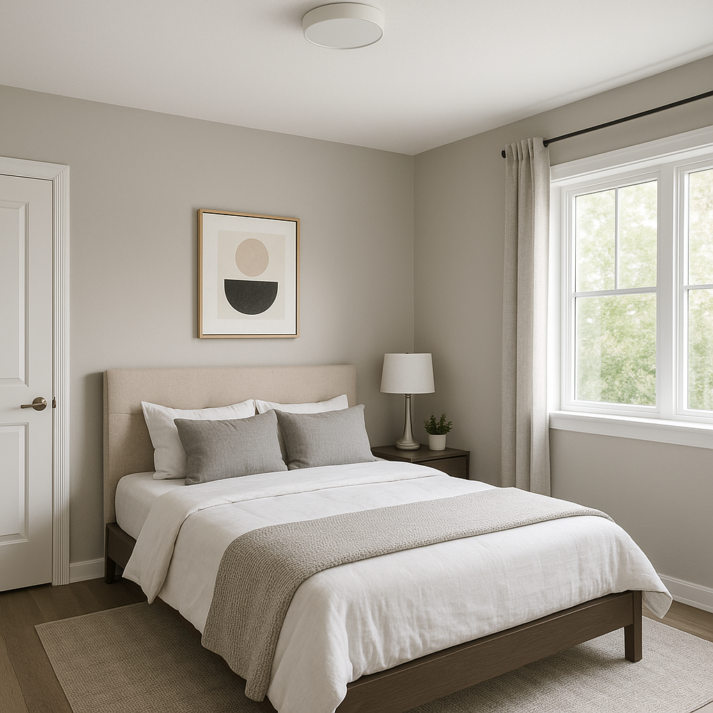
For bedrooms, Passive promotes a soothing, restful vibe. Combine it with soft whites and muted pastels for a dreamy, serene retreat. Adding layers of texture through bedding, rugs, and curtains enhances its tranquil appeal.
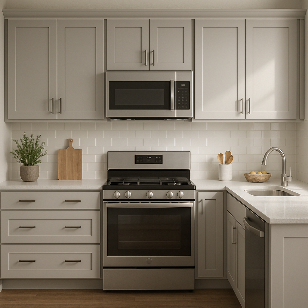
In kitchens, Passive pairs wonderfully with white or gray cabinetry, stainless steel appliances, and marble or quartz countertops. Its cool tones create a clean, sophisticated look that feels fresh and timeless.
Passive is an excellent choice for bathrooms, where its crisp coolness enhances the spa-like atmosphere. Pair it with white subway tiles, chrome fixtures, and soft blue or green accents for a refreshing, coastal-inspired design.
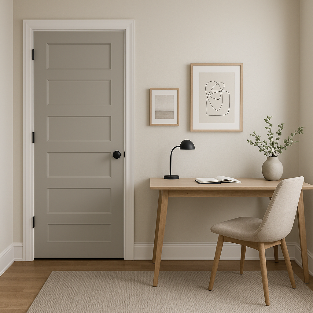
For home offices or workspaces, Passive fosters focus and productivity. Its neutral tone provides a distraction-free canvas that pairs well with modern furniture and art pieces, creating a professional and stylish environment.
Passive isn't limited to interiors—it’s also a stunning choice for exteriors. Use it as a primary siding color and pair it with bright white trim for a classic look. Alternatively, combine it with darker hues like Iron Ore (SW 7069) for a bold, contemporary aesthetic.
Note: These images were all generated with AI, there may be inaccurate color results. Please only use a general reference to get a rough idea of what a color may look like, we will continue to generate new images to improve accuracy.
View Colors Only by Brand (No Imagery):
Sherwin-Williams
|
Benjamin-Moore
|
Behr
|
Valspar
Live on the Eastern Slope of Colorado and looking for a local painting professional, check out all our painting services and reach out for a free estimate.
Copyright © 2026 : Wild Fox Painting Inc. : 12435 Mead Way, Littleton, CO 80125


