Sherwin-Williams Ponder SW 7079 is a versatile, soft gray with a delicate balance of warmth and coolness, making it an ideal choice for a wide range of interior and exterior spaces. With its understated elegance and ability to adapt to various lighting conditions, Ponder is a go-to neutral for creating a calming and refined atmosphere. Whether you’re designing a modern minimalist retreat or a cozy, traditional home, this shade offers incredible flexibility and timeless appeal.
One of the most distinctive features of Ponder SW 7079 is its subtle undertones. While it is primarily a gray, Ponder carries faint blue and green undertones that give it a unique depth. These undertones are soft and muted, preventing the color from feeling too cold or stark. Instead, they provide a gentle, airy quality that makes this shade feel light and inviting.
It’s important to note that the undertones in Ponder can shift depending on the surrounding colors and lighting conditions. In natural light, the blue undertones may become more pronounced, lending a cool and tranquil vibe. Under artificial lighting, the green undertones might surface slightly, adding warmth and balance.
Ponder SW 7079 pairs beautifully with a wide range of colors, making it a versatile choice for any design palette. Whether you’re creating a monochromatic scheme or adding complementary hues, the following coordinating colors can enhance the overall aesthetic:
These colors allow you to create a cohesive and sophisticated palette that works for both modern and traditional styles.
Ponder SW 7079 is a highly versatile neutral that works beautifully across a variety of spaces and applications. Here are some ideas for incorporating this shade into your home:
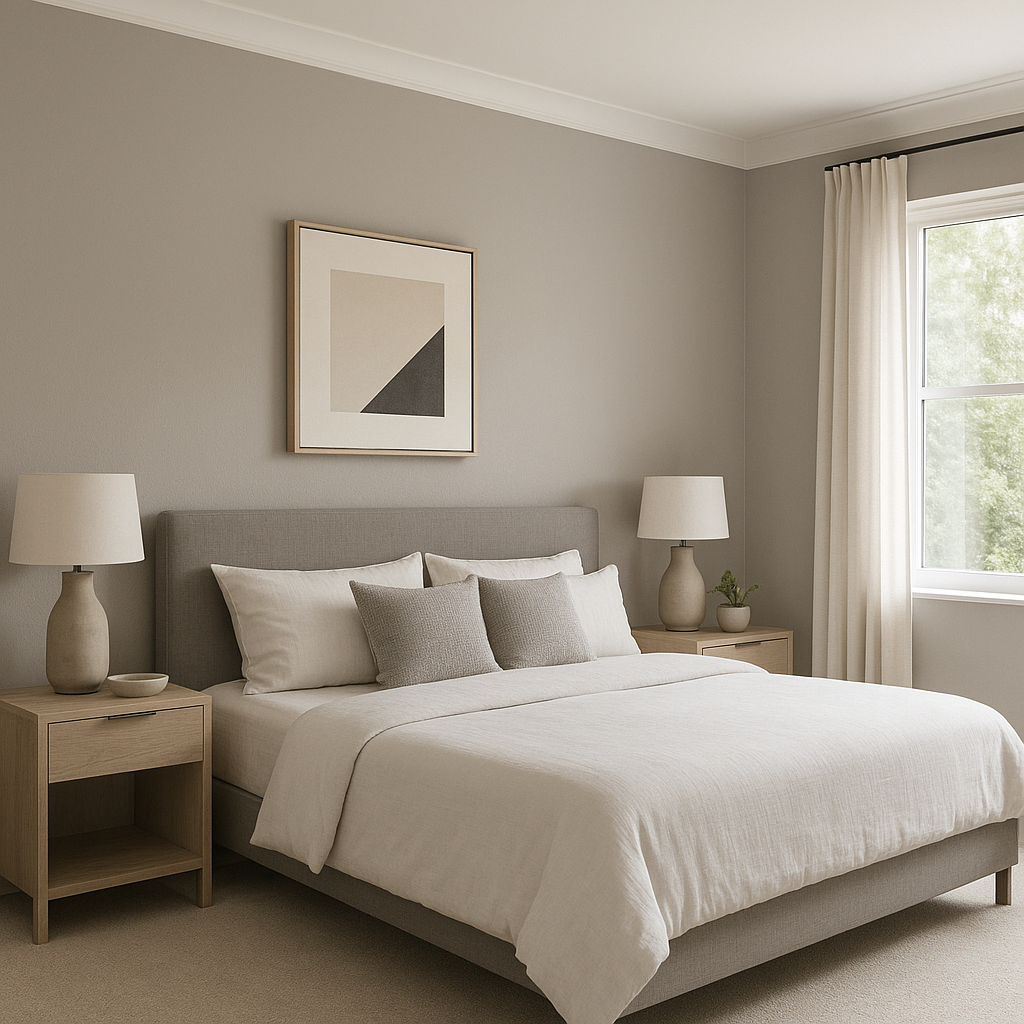
Ponder’s calm and soothing nature makes it an excellent choice for living rooms and bedrooms. Pair it with soft textiles, natural wood tones, and light-colored furnishings for a serene, restful haven. The subtle blue and green undertones add a touch of freshness, making it ideal for spaces where relaxation is key.
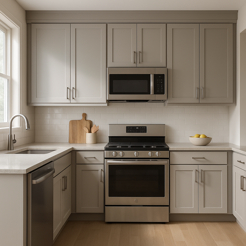
In kitchens and bathrooms, Ponder can create a clean and modern look without feeling too sterile. Use it on walls or cabinetry, and pair it with white subway tiles, marble countertops, and brushed nickel fixtures for a timeless, elegant finish. Its understated coolness works particularly well in spaces with ample natural light.
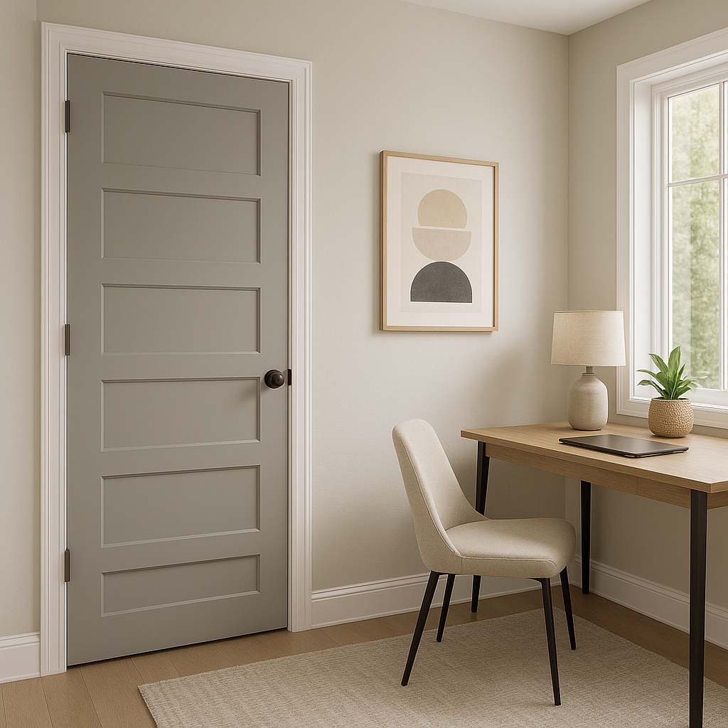
For home offices or study areas, Ponder provides a neutral backdrop that helps maintain focus and productivity. Its balanced undertones lend a professional yet inviting feel, making it an excellent choice for work environments.
On exteriors, Ponder SW 7079 delivers a sophisticated curb appeal. Use it as the primary color for siding and pair it with crisp white trim and darker accents like charcoal shutters or a navy front door. Its ability to adapt to changing light throughout the day adds dynamic character to your home’s exterior.
Note: These images were all generated with AI, there may be inaccurate color results. Please only use a general reference to get a rough idea of what a color may look like, we will continue to generate new images to improve accuracy.
View Colors Only by Brand (No Imagery):
Sherwin-Williams
|
Benjamin-Moore
|
Behr
|
Valspar
Live on the Eastern Slope of Colorado and looking for a local painting professional, check out all our painting services and reach out for a free estimate.
Copyright © 2026 : Wild Fox Painting Inc. : 12435 Mead Way, Littleton, CO 80125


