Sherwin-Williams Dry Dock (SW 7502) is a beautifully balanced mid-tone neutral that exudes warmth, sophistication, and versatility. With its earthy brown undertones and subtle taupe influences, Dry Dock is an exceptional choice for creating spaces that feel grounded yet inviting. Whether you're looking to design a cozy living room, a refined bedroom, or a welcoming entryway, this shade adapts effortlessly to a variety of design styles, ranging from traditional to modern.
Dry Dock is a rich and nuanced color with undertones that lean toward warm brown and taupe. These undertones provide depth and dimension while maintaining a soft, approachable vibe. Unlike cooler neutrals, Dry Dock avoids the starkness of gray or greige, offering a slightly warmer alternative for spaces that demand a touch of coziness. Its subtly earthy undertones make it ideal for pairing with other warm tones, while its balanced nature ensures it doesn’t overpower lighter or cooler accents.
One of the reasons Dry Dock is such a popular choice is its compatibility with a wide range of color palettes. Whether you're building a monochromatic scheme or introducing a pop of color, Dry Dock serves as an elegant backdrop. Here are some coordinating colors that pair beautifully with this shade:
Dry Dock’s versatility makes it a go-to choice for a variety of applications. Here are some ideas to inspire its use in your home or commercial space:
Dry Dock creates a cozy yet elegant atmosphere in living spaces. Pair it with plush textures like velvet or linen upholstery, and accentuate the warmth with wooden furniture or brass hardware. Add coordinating throw pillows or rugs in complementary tones like navy or green for a polished finish.
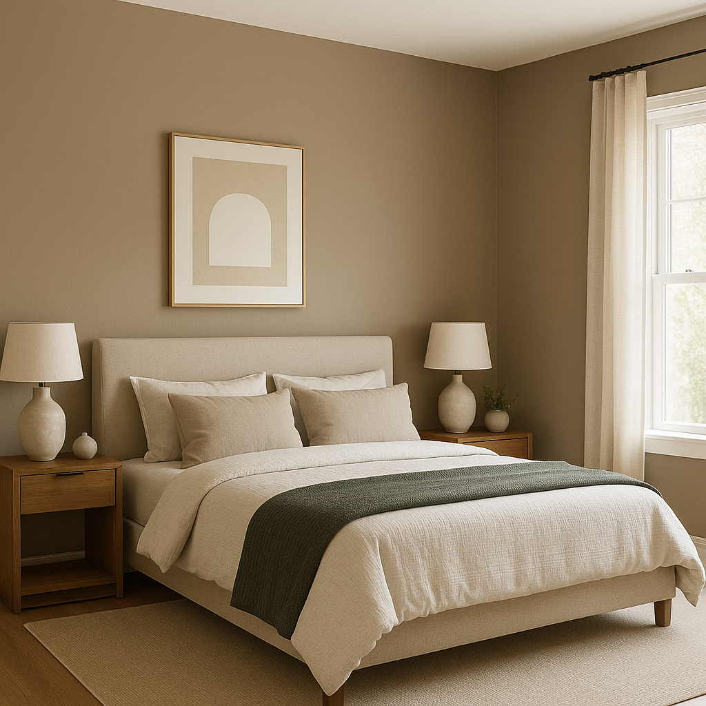
In bedrooms, Dry Dock fosters a serene and restful ambiance. Use it as the main wall color with crisp white bedding and natural wood tones to create a tranquil retreat. Metallic accents in gold or bronze can further elevate the room’s sophistication.
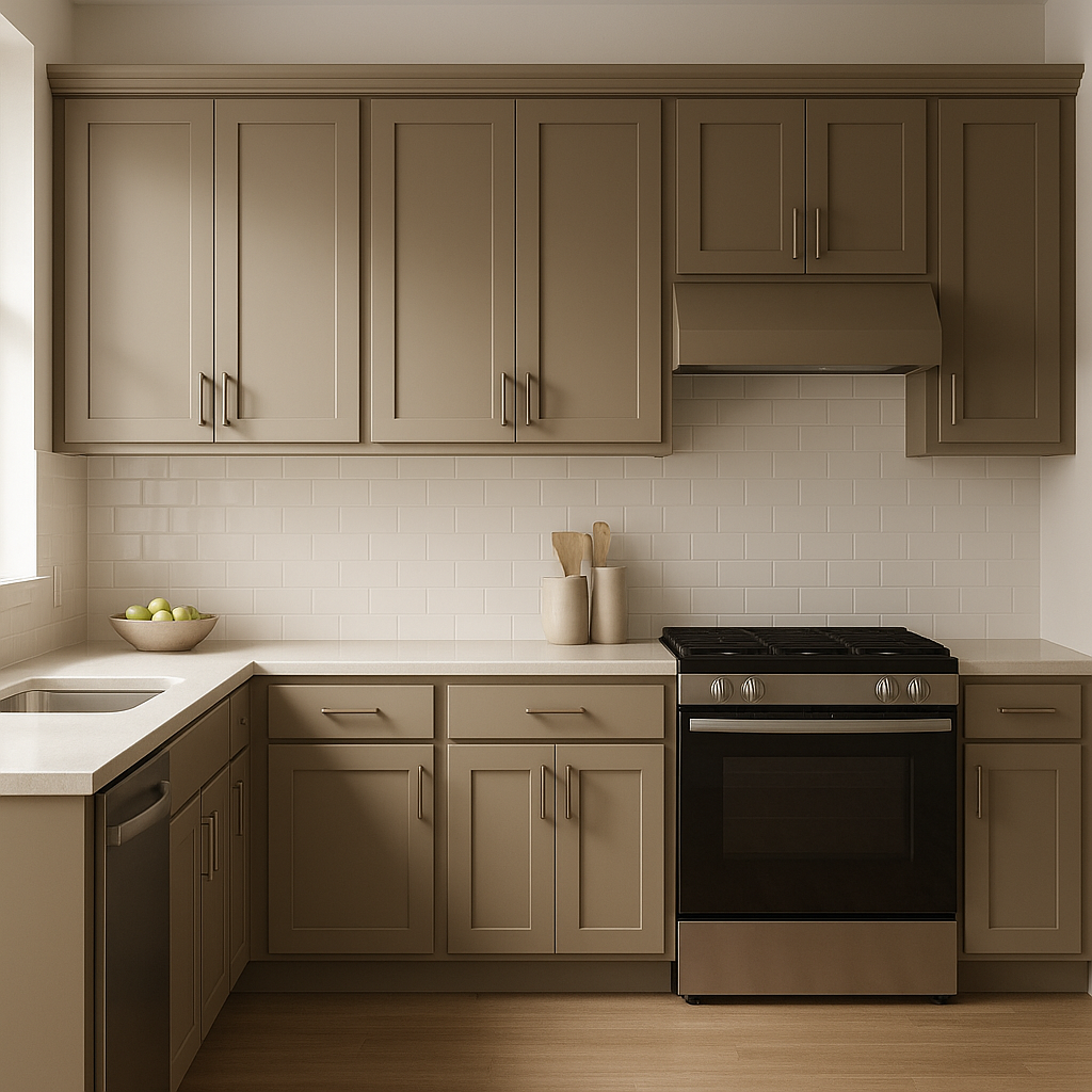
For kitchens and dining rooms, Dry Dock works beautifully when paired with white or cream cabinetry and warm wood finishes. Incorporate pops of color through backsplash tiles or decorative items to add personality.
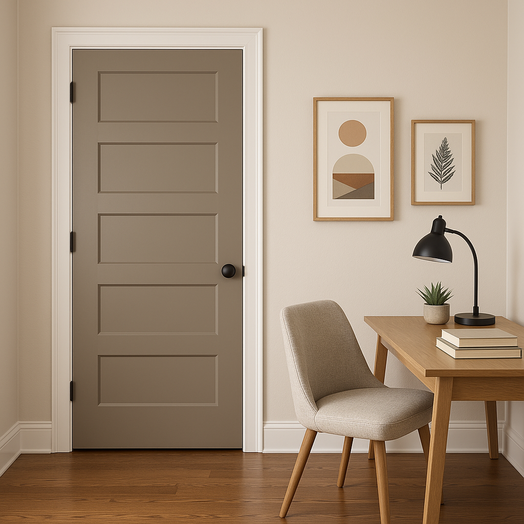
Dry Dock’s balanced tone lends itself well to workspaces, creating an environment that feels focused yet comfortable. Pair it with deep blues or greens for a creative and inspiring aesthetic.
This color isn’t limited to interiors—it’s also a stunning option for exteriors. Use Dry Dock for siding, paired with white trim and black accents for timeless curb appeal. Its earthy undertones ensure it blends beautifully with natural surroundings.
Like any paint color, Dry Dock’s appearance can shift depending on the lighting in your space. In rooms with ample natural light, it will appear lighter and more neutral, while in dimmer spaces, its warm undertones become more prominent. Before committing, test it in different areas of your home to see how it interacts with your lighting conditions.
Sherwin-Williams Dry Dock (SW 7502) is an enduring neutral that brings warmth and refinement to any space. With its versatile undertones and ability to coordinate with a wide array of colors, it’s a perfect choice for both interior and exterior applications. Whether used as the star of your palette or a complementary backdrop, Dry Dock creates spaces that feel timeless, elegant, and effortlessly inviting.
Note: These images were all generated with AI, there may be inaccurate color results. Please only use a general reference to get a rough idea of what a color may look like, we will continue to generate new images to improve accuracy.
View Colors Only by Brand (No Imagery):
Sherwin-Williams
|
Benjamin-Moore
|
Behr
|
Valspar
Live on the Eastern Slope of Colorado and looking for a local painting professional, check out all our painting services and reach out for a free estimate.
Copyright © 2026 : Wild Fox Painting Inc. : 12435 Mead Way, Littleton, CO 80125


