Sherwin-Williams Sanderling (SW 7513) is a timeless paint color that perfectly bridges the gap between warm and cool tones, making it a versatile choice for a wide range of interior design styles. This sophisticated beige carries a subtle earthiness that evokes a sense of comfort and understated elegance. Whether you're crafting a cozy living space or a polished office setting, Sanderling offers the flexibility you need to create the perfect atmosphere.
Sanderling is a warm neutral with soft taupe and beige undertones. It leans slightly toward the warmer side, with hints of gray that keep it grounded and refined. These understated undertones prevent it from feeling overly yellow or overly cool, making it a balanced neutral that complements various palettes. The touch of gray provides a subdued sophistication, while its beige warmth ensures a welcoming and comfortable vibe.
Sherwin-Williams Sanderling pairs beautifully with complementary colors that enhance its warm undertones and create harmonious spaces. Here are some of the best coordinating colors:
These coordinating colors allow you to create a cohesive palette, whether you're aiming for a serene and calming space or a bold, modern design.
Sanderling’s balanced neutrality makes it ideal for a variety of applications in both residential and commercial settings. Its versatility allows it to shine in multiple spaces:
The warm taupe undertones of Sanderling create an inviting atmosphere in living rooms. Pair it with soft white trim and natural wood furniture for a relaxed yet refined look. Add pops of color with throw pillows or area rugs to keep the room dynamic.
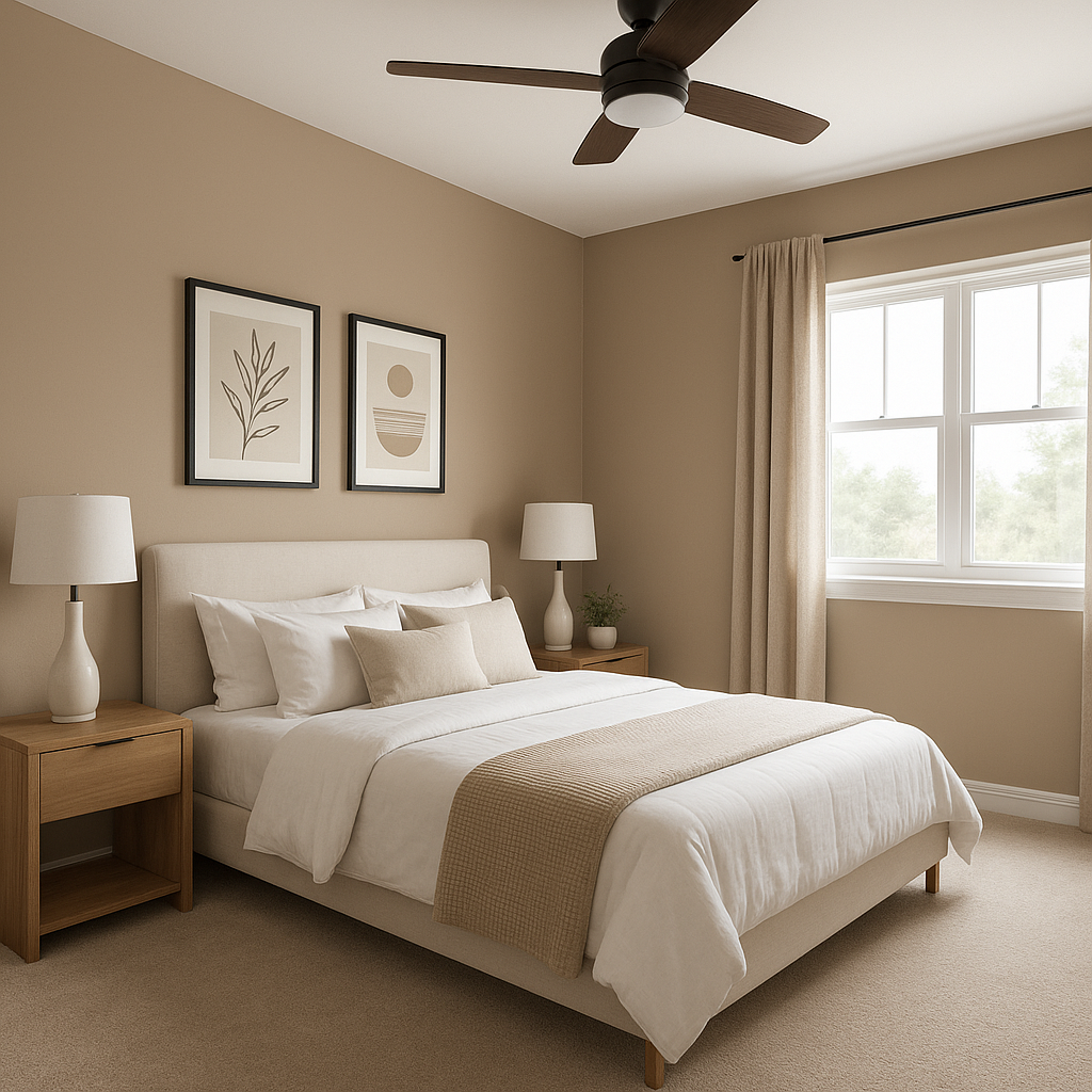
Sanderling is perfect for creating a tranquil and restful bedroom environment. Use it as the main wall color and complement it with plush bedding in soft whites, muted greens, or deep grays for a layered and luxurious feel.
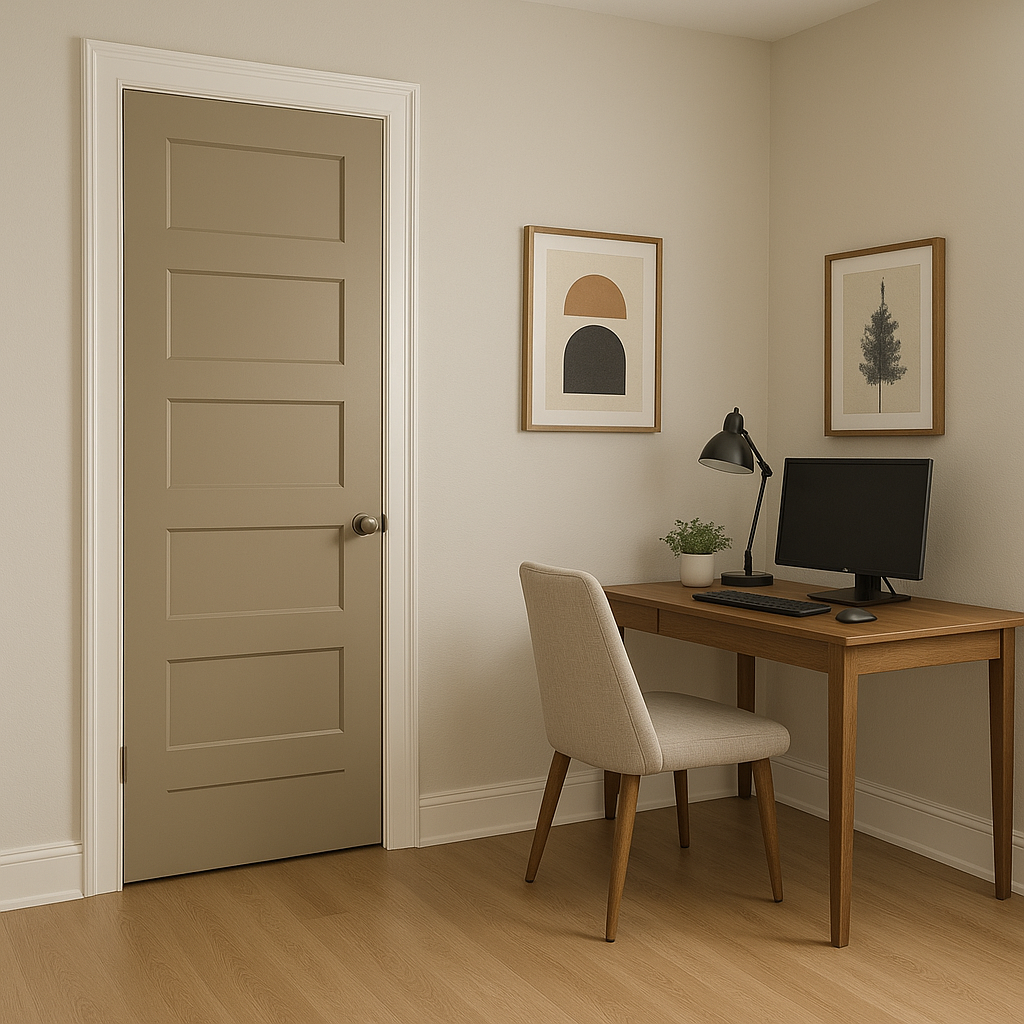
As a sophisticated neutral, Sanderling works well in home offices where focus and creativity are key. Pair it with dark wood furniture and metallic accents to establish a professional yet inspiring workspace.
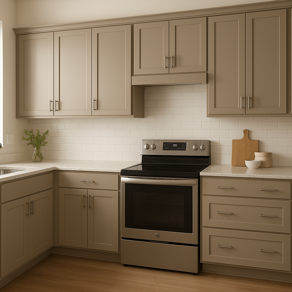
This warm beige can be used for kitchen cabinetry or walls to achieve a timeless look. Contrast it with crisp white countertops and backsplash tiles, or go bold with dark hardware and accents for a modern twist.
Sanderling brings subtle elegance to bathrooms, especially when paired with light fixtures and decorative elements in brushed gold or bronze. Its soothing tones make it a great choice for spa-like retreats.
In transitional areas like hallways or entryways, Sanderling serves as a welcoming backdrop that ties together spaces with varying color schemes. Its neutral nature ensures it won’t overpower or clash with adjoining rooms.
Sherwin-Williams Sanderling (SW 7513) is more than just a paint color—it’s a versatile design tool that brings warmth, sophistication, and balance to any space. Its subtle undertones and adaptability make it the perfect choice for homeowners and designers alike seeking a neutral that feels fresh yet classic. Whether used as the primary color in a room or as part of a layered palette, Sanderling has the ability to elevate interiors with its timeless charm.
Note: These images were all generated with AI, there may be inaccurate color results. Please only use a general reference to get a rough idea of what a color may look like, we will continue to generate new images to improve accuracy.
View Colors Only by Brand (No Imagery):
Sherwin-Williams
|
Benjamin-Moore
|
Behr
|
Valspar
Live on the Eastern Slope of Colorado and looking for a local painting professional, check out all our painting services and reach out for a free estimate.
Copyright © 2026 : Wild Fox Painting Inc. : 12435 Mead Way, Littleton, CO 80125


