Sherwin-Williams Pier (SW 7545) is a rich, inviting paint color that evokes a sense of timeless sophistication. This deep brown hue carries warm undertones that make it feel grounded and elegant, creating a space that’s cozy yet refined. Perfectly suited for both residential and commercial interiors, Pier strikes an excellent balance between boldness and versatility, making it an exceptional choice for those who want to create a statement without overwhelming a room.
Pier (SW 7545) is a warm brown with subtle undertones of red and espresso. These undertones give the color depth and richness, preventing it from feeling flat or dull. The reddish undertones subtly emerge depending on lighting conditions, adding dimension to your space. In brighter light, Pier can take on a slightly lighter and warmer appearance, while in dimly lit spaces, it deepens to create a dramatic, moody ambiance.
Sherwin-Williams Pier pairs beautifully with an array of complementary and contrasting hues. For a harmonious palette, consider pairing it with soft, neutral tones that allow Pier to shine:
For more contrast and an energizing effect, pair Pier with lighter, cooler shades:
Metallic finishes such as brushed brass or matte black also work wonderfully alongside Pier, adding a touch of modern elegance to your design.
Pier’s rich, warm tone makes it incredibly versatile, suited for a range of interior applications.
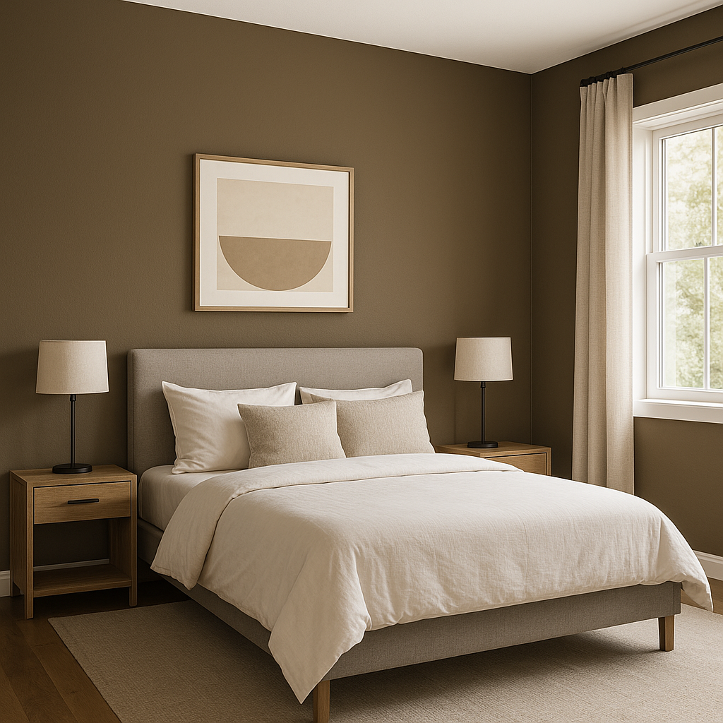
Pier can be used as an accent wall color to add depth and drama to living rooms, bedrooms, or dining areas. Its bold tone draws the eye, making it a fantastic backdrop for artwork or statement furniture pieces.
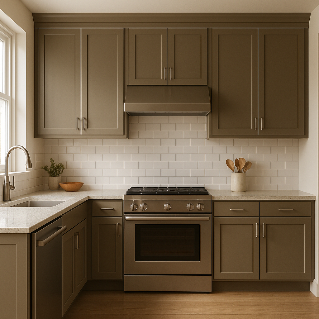
For kitchens or bathrooms, Pier is a stylish choice for cabinetry and built-ins. It creates a luxurious, high-end feel, especially when paired with marble countertops or brushed metallic hardware.
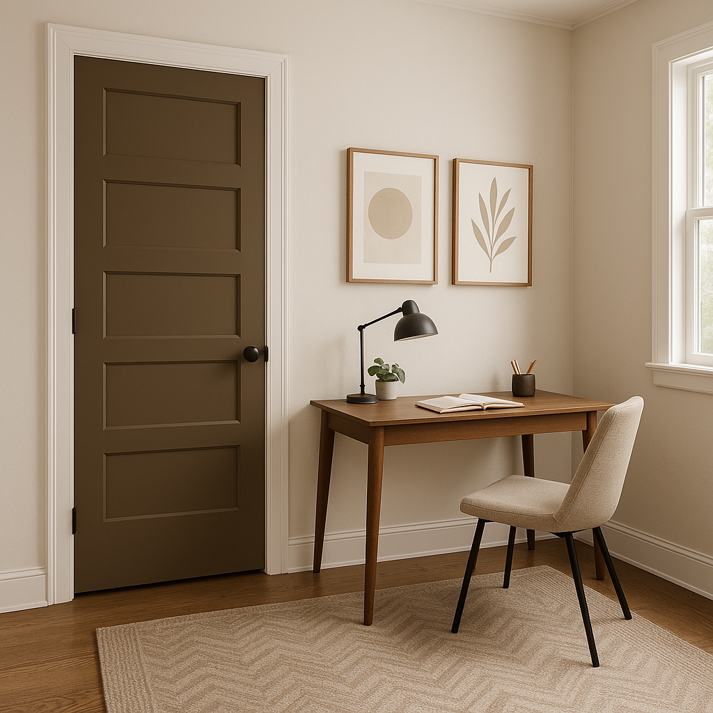
Pier is ideal for creating a cozy, focused atmosphere in home offices or libraries. Its deep tone fosters a sense of intimacy and concentration, making it perfect for spaces dedicated to work or relaxation.
If you want to infuse your living room with warmth and sophistication, Pier works beautifully on all walls or as part of a layered color scheme. Pair it with neutral furnishings and textures like linen, leather, or wool for a cohesive, inviting space.
In commercial settings such as boutique stores, restaurants, or offices, Pier lends a sense of professionalism and luxury. It creates a sophisticated ambiance that helps establish a memorable impression.
Keep in mind that Pier’s appearance changes depending on the lighting. In spaces with ample natural light, the reddish undertones may become more pronounced, enhancing its warmth. In areas with limited light, Pier deepens and creates a dramatic atmosphere. To ensure the color works well in your space, test it with swatches under various lighting conditions.
Sherwin-Williams Pier (SW 7545) is a stunning choice for anyone seeking a rich, versatile color that elevates interiors with warmth, depth, and style. Whether used as a bold accent or throughout an entire room, Pier creates an atmosphere of timeless sophistication that’s sure to impress.
Note: These images were all generated with AI, there may be inaccurate color results. Please only use a general reference to get a rough idea of what a color may look like, we will continue to generate new images to improve accuracy.
View Colors Only by Brand (No Imagery):
Sherwin-Williams
|
Benjamin-Moore
|
Behr
|
Valspar
Live on the Eastern Slope of Colorado and looking for a local painting professional, check out all our painting services and reach out for a free estimate.
Copyright © 2026 : Wild Fox Painting Inc. : 12435 Mead Way, Littleton, CO 80125


