Sherwin-Williams Prairie Grass (SW 7546) is a versatile and inviting neutral that effortlessly bridges the gap between earthy sophistication and cozy warmth. This timeless shade exudes a natural charm, making it a perfect choice for spaces that need a grounded, soothing atmosphere. Whether you're looking to create an elegant living room, a tranquil bedroom, or a welcoming entryway, Prairie Grass delivers understated beauty with a hint of rustic appeal.
Prairie Grass features warm, golden undertones that give it a comfortable and approachable vibe. These subtle yellow and beige undertones lend a soft glow to the paint color, making it feel cozy without overpowering your space. Its warmth pairs beautifully with other neutrals and natural materials, such as wood and stone, adding depth and dimension to your design. The undertones ensure that Prairie Grass is adaptable to various lighting conditions, feeling brighter and sunnier in spaces with ample natural light, while maintaining its earthy richness in darker areas.
Prairie Grass works well with a variety of coordinating colors, making it ideal for creating harmonious palettes and layered designs. Here are some suggestions for pairing colors:
Complementary Neutrals: Pair Prairie Grass with creamy whites such as Sherwin-Williams Alabaster (SW 7008) or Shoji White (SW 7042) for a clean and refined look. These lighter hues balance the warmth of Prairie Grass and create contrast without feeling stark.
Earthy Accents: Enhance Prairie Grass's natural vibe by introducing darker earthy tones like Sherwin-Williams Urbane Bronze (SW 7048) or Iron Ore (SW 7069). These deep shades add drama and sophistication while maintaining an organic aesthetic.
Soft Greens: For a serene and organic palette, pair Prairie Grass with muted greens like Sherwin-Williams Retreat (SW 6207) or Evergreen Fog (SW 9130). These nature-inspired hues complement the warm undertones and create a calming environment.
Warm Reds and Terracottas: If you're looking to add a pop of bold color, consider pairing Prairie Grass with rich reds or terracottas, such as Sherwin-Williams Cavern Clay (SW 7701). These warm hues accentuate the golden undertones of Prairie Grass and create a cozy, inviting atmosphere.
Prairie Grass is an adaptable color that can be used in virtually any room, thanks to its warm and neutral qualities. Here are some suggestions for incorporating it into your home:
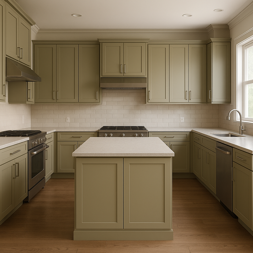
Living Rooms: Prairie Grass serves as an excellent backdrop for living spaces, creating a cozy and welcoming environment. Pair it with natural textures like linen, jute rugs, and weathered wood furniture for a rustic yet refined look.
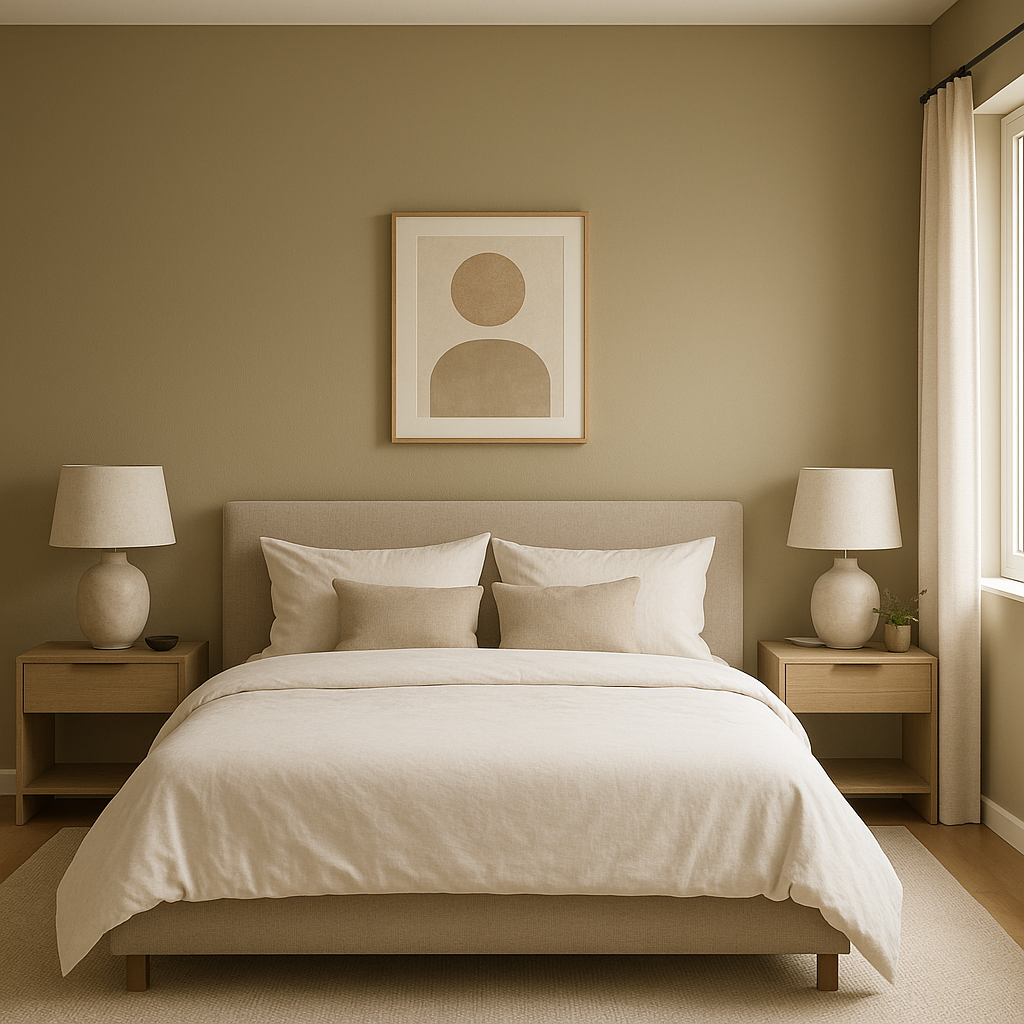
Bedrooms: Its soothing undertones make Prairie Grass a great choice for bedrooms, where comfort and relaxation are key. Layer soft bedding in whites, creams, and muted greens to complement the color and promote a restful atmosphere.
Dining Rooms: Warm, earthy tones like Prairie Grass can make dining spaces feel more intimate and inviting. Consider pairing it with dark wood furniture and metallic accents for a sophisticated yet approachable vibe.
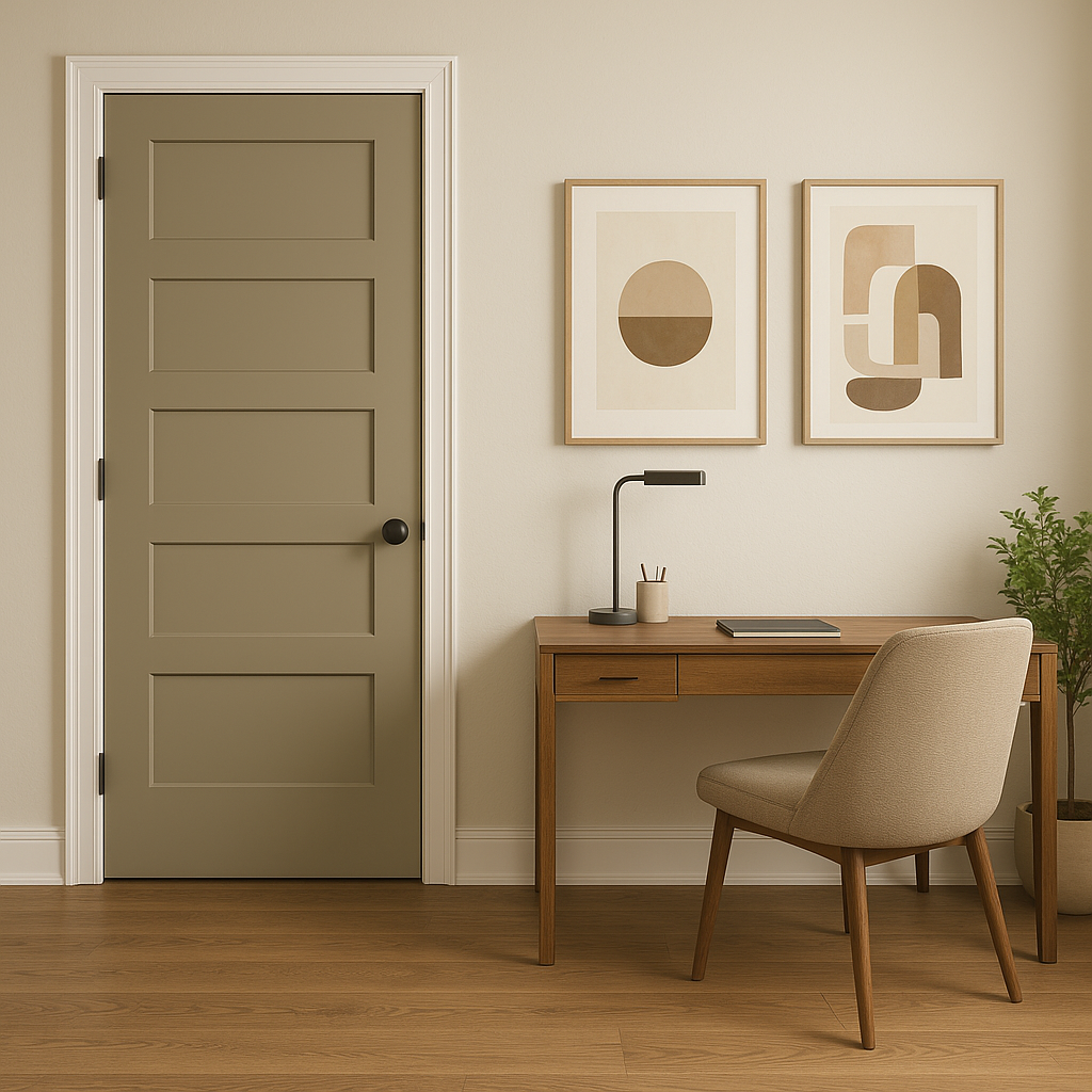
Home Offices: If you're looking to create a productive yet calming workspace, Prairie Grass provides a neutral backdrop that isn’t overly distracting. Incorporate natural materials and pops of greenery to enhance focus and creativity.
Hallways and Entryways: Prairie Grass is an excellent choice for transitional spaces like hallways and entryways, as it sets a welcoming tone while coordinating seamlessly with adjacent rooms.
Prairie Grass's undertones can shift depending on the lighting in your space. In rooms with ample natural light, its golden hues will appear brighter and sunnier, creating a cheerful ambiance. In areas with limited light, the color takes on a deeper, richer appearance, enhancing its earthy qualities. To ensure it complements your intended style, test Prairie Grass in different lighting conditions before committing to it.
Sherwin-Williams Prairie Grass (SW 7546) is more than just a neutral—it’s a warm, grounding color that brings a sense of comfort and elegance to any interior. With its golden undertones, versatile coordinating colors, and ability to adapt to various design styles, Prairie Grass is a smart choice for homeowners and designers seeking a timeless yet inviting hue.
Note: These images were all generated with AI, there may be inaccurate color results. Please only use a general reference to get a rough idea of what a color may look like, we will continue to generate new images to improve accuracy.
View Colors Only by Brand (No Imagery):
Sherwin-Williams
|
Benjamin-Moore
|
Behr
|
Valspar
Live on the Eastern Slope of Colorado and looking for a local painting professional, check out all our painting services and reach out for a free estimate.
Copyright © 2026 : Wild Fox Painting Inc. : 12435 Mead Way, Littleton, CO 80125


