Sherwin-Williams Portico (SW 7548) is a versatile and refined paint color that serves as a perfect backdrop for creating serene, inviting spaces. This soft neutral has a warm, taupe-gray base that exudes elegance while maintaining a sense of understated simplicity. Portico is designed to complement a wide range of design styles, from modern minimalism to classic traditional interiors, making it a go-to choice for homeowners and interior designers alike.
Portico has subtle beige undertones that lend warmth to its gray foundation. These undertones make it an ideal choice for spaces where you want to strike a balance between cool and warm hues. The delicate taupe quality gives Portico a sense of coziness without veering too far into brown, while its muted gray notes keep it sophisticated and versatile.
Depending on the lighting, Portico may lean slightly warmer in natural daylight or cooler under artificial light, making it a chameleon-like shade that adapts beautifully to its environment. This flexibility allows it to harmonize with a variety of color palettes and finishes, making it a reliable choice for both residential and commercial spaces.
To bring out the best in Portico, consider pairing it with complementary hues that enhance its neutral charm:
These coordinating colors offer endless possibilities for designing a balanced and cohesive space, whether you’re aiming for a monochromatic look or introducing pops of color.
Portico’s adaptable nature makes it suitable for a variety of interior applications:
Create a cozy, welcoming atmosphere in living rooms by using Portico on the walls. Its neutral warmth works well with both light and dark furniture, allowing you to experiment with textures such as soft chenille throws, wooden accents, or sleek metallic fixtures.
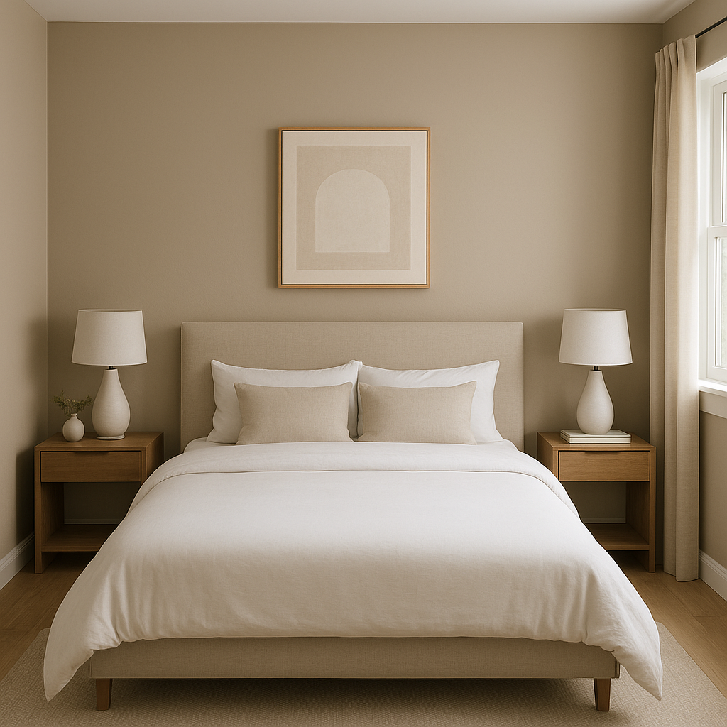
Portico is an exceptional choice for bedrooms due to its calming effect. Pair it with soft linens in shades of ivory, blush, or sage to create a restful retreat. Add depth with coordinating darker tones like Urbane Bronze for furniture or accent pieces.
In bathrooms, Portico’s understated elegance shines. It pairs beautifully with marble countertops, brushed nickel hardware, and white subway tile. Use it on the walls to create a spa-like ambiance that feels luxurious yet serene.
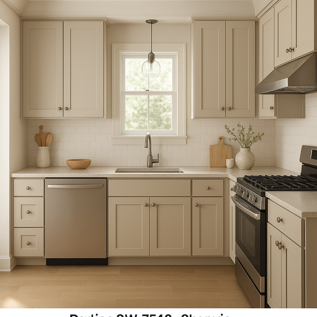
Portico is a fantastic option for kitchen cabinetry or walls, especially when complemented by Pure White trim and accents. Its taupe-gray tone lends a timeless look that works well with both modern and farmhouse-inspired kitchen designs.
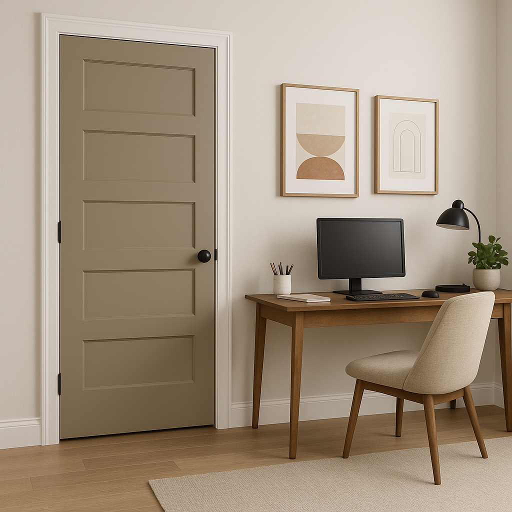
For a productive yet calming workspace, Portico’s muted tone creates an ideal backdrop that won’t distract. Pair it with warm wood furniture and soft lighting to foster focus and creativity.
Portico can also be used as an accent color in spaces dominated by lighter neutrals like Pure White or Accessible Beige. Its subtle depth adds visual interest without overwhelming the room.
Sherwin-Williams Portico (SW 7548) is a perfect blend of gray and beige that strikes a delicate balance between warmth and sophistication. Its adaptable undertones and compatibility with a broad spectrum of coordinating colors make it a versatile choice for any room in your home. Whether you’re creating a minimalist sanctuary or a richly layered space, Portico offers the flexibility and timeless appeal you need to bring your vision to life.
Transform your interiors with Sherwin-Williams Portico and create spaces that feel effortlessly elegant, welcoming, and serene.
Note: These images were all generated with AI, there may be inaccurate color results. Please only use a general reference to get a rough idea of what a color may look like, we will continue to generate new images to improve accuracy.
View Colors Only by Brand (No Imagery):
Sherwin-Williams
|
Benjamin-Moore
|
Behr
|
Valspar
Live on the Eastern Slope of Colorado and looking for a local painting professional, check out all our painting services and reach out for a free estimate.
Copyright © 2026 : Wild Fox Painting Inc. : 12435 Mead Way, Littleton, CO 80125


