Sherwin-Williams Patience (SW 7555) is an elegant and timeless shade that exudes warmth and tranquility. This subtly creamy neutral is perfect for creating a welcoming atmosphere in a variety of spaces, from cozy living rooms to serene bedrooms. Its soft, understated presence makes it a versatile choice for modern, transitional, or even rustic interiors, pairing beautifully with a range of design styles. Whether you're looking to refresh a small nook or transform an entire home, Patience offers the perfect balance of sophistication and simplicity.
Patience is a light beige with delicate pink undertones that add a touch of softness to the hue. These warm undertones prevent it from feeling too stark or flat, making it an inviting choice for spaces that need a gentle glow. The pink undertones are subtle enough to keep the color versatile, but they provide just the right amount of warmth to harmonize with other earthy and light tones. This makes Patience an excellent option for rooms that benefit from a cozy, lived-in vibe without sacrificing elegance.
One of the standout qualities of Patience is how effortlessly it coordinates with other colors. You can pair it with a range of complementary shades to create a cohesive palette tailored to your personal style. Here are a few ideas:
These coordinating hues allow you to build a palette that feels cohesive while maintaining contrast and visual interest.
Patience is an incredibly adaptable paint color, making it suitable for a wide variety of design applications. Here are a few ways to use this serene neutral in your home or commercial space:
Patience is ideal for open-concept spaces and living rooms where you want to create a cozy yet polished environment. Its warm undertones pair beautifully with wooden furniture and natural textures like jute rugs or linen curtains. It also works well with metallic accents in gold or bronze for a touch of sophistication.
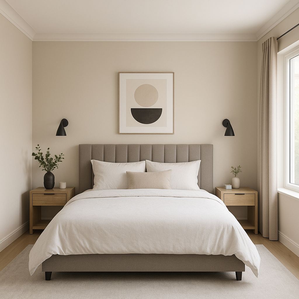
If you're designing a bedroom that feels like a personal retreat, Patience can help you achieve a serene and calming atmosphere. Pair it with soft bedding in whites, creams, or pastel shades, and consider adding pops of color with throw pillows or artwork in muted blues or greens.
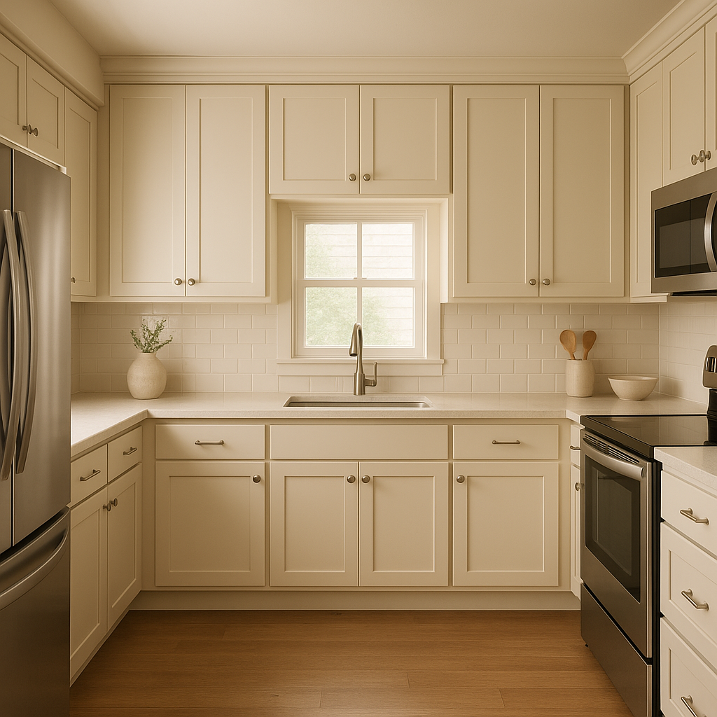
Patience shines in kitchen and dining spaces, especially when paired with white cabinetry or countertops. The warm beige undertones keep the space feeling bright and inviting, while earthy accessories like wooden bowls and woven placemats enhance its natural appeal.
For a spa-like bathroom, Patience creates a soothing backdrop that complements marble or white tile finishes. Add greenery and natural wood accents to complete the look.
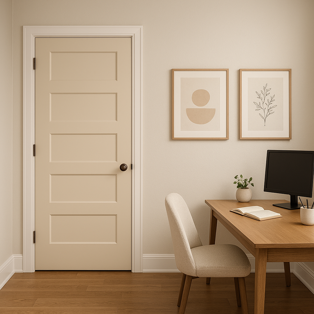
Patience is a fantastic choice for home offices and workspaces where focus and calm are essential. Its neutral tone provides a clean canvas that encourages productivity while maintaining a warm and welcoming vibe.
Patience looks different depending on the lighting in your space. In rooms with ample natural light, it leans brighter and creamier, highlighting its subtle pink undertones. In spaces with lower lighting, it takes on a cozier, slightly warmer appearance. To ensure it works well in your home, test Patience with swatches in various lighting conditions before committing.
Sherwin-Williams Patience (SW 7555) offers the perfect blend of warmth and versatility. Its soft undertones make it an excellent backdrop for a wide range of design styles, while its ability to coordinate with other colors ensures it fits seamlessly into any palette. Whether you're refreshing a single room or designing an entire home, this serene neutral is a timeless choice that will never go out of style.
Note: These images were all generated with AI, there may be inaccurate color results. Please only use a general reference to get a rough idea of what a color may look like, we will continue to generate new images to improve accuracy.
View Colors Only by Brand (No Imagery):
Sherwin-Williams
|
Benjamin-Moore
|
Behr
|
Valspar
Live on the Eastern Slope of Colorado and looking for a local painting professional, check out all our painting services and reach out for a free estimate.
Copyright © 2026 : Wild Fox Painting Inc. : 12435 Mead Way, Littleton, CO 80125


