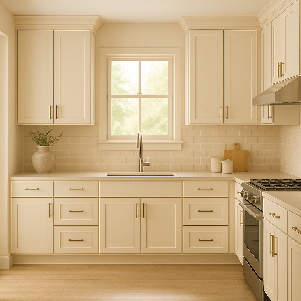
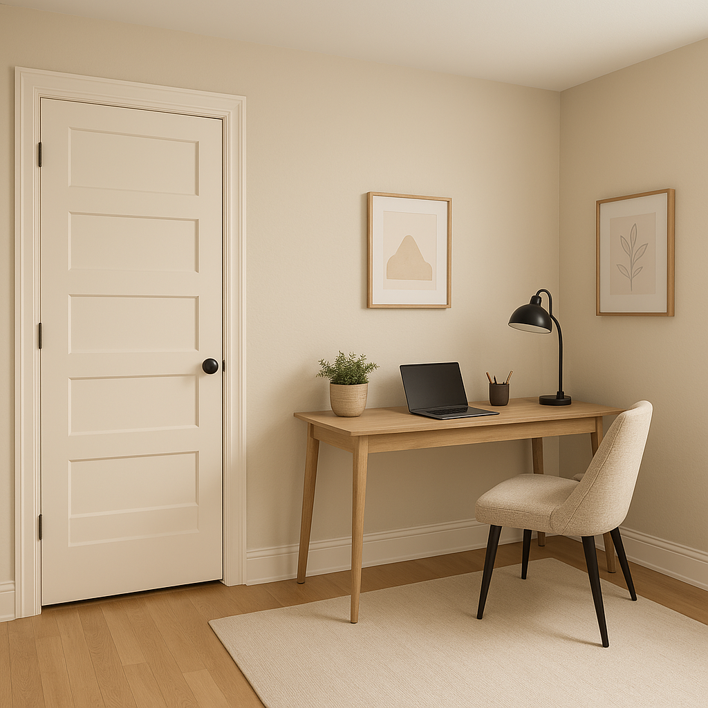
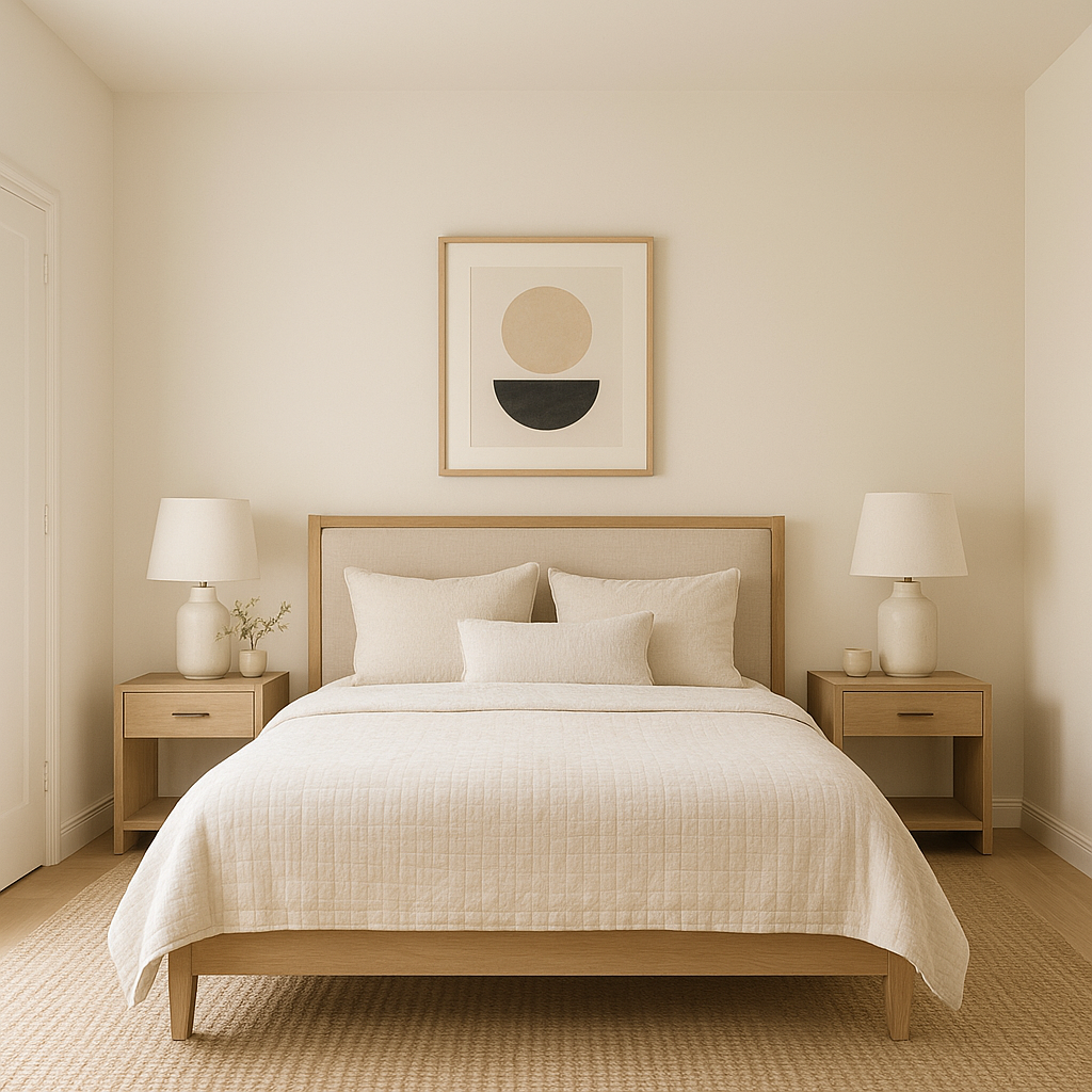
Sherwin-Williams Décor White (SW 7559) is a soft, creamy white that exudes elegance and sophistication. Perfect for creating serene spaces, this timeless neutral strikes the delicate balance between warm and cool tones, making it an incredibly versatile choice for a variety of design aesthetics. Whether you're crafting a bright, airy retreat or a polished, modern interior, Décor White delivers a refined finish that complements any room.
Décor White is a warm white, subtly infused with creamy undertones. These delicate undertones prevent it from feeling stark or sterile while maintaining a crisp and clean appearance. The hint of cream gives it a welcoming vibe, making it especially suitable for spaces where comfort and sophistication are paramount. Depending on lighting conditions, Décor White can appear slightly warmer under incandescent lighting or more neutral in natural daylight, adapting beautifully to its surroundings.
Décor White is incredibly versatile and pairs harmoniously with a wide range of shades. Whether you're looking to create contrast or complement other hues, this white is an excellent anchor for your palette. Below are some coordinating colors to consider:
Décor White is a versatile choice that works exceptionally well in a variety of spaces and design applications. Here are some ideas for incorporating this shade into your home:
Sherwin-Williams Décor White (SW 7559) is the ultimate choice for homeowners and designers seeking an elegant, versatile, and welcoming neutral. Its creamy undertones add warmth and character, making it suitable for traditional, modern, farmhouse, and coastal-inspired interiors. Pair it with coordinating colors to create a harmonious palette that reflects your unique style and transforms your space into a masterpiece.
Décor White invites brightness and sophistication into your home while offering endless design possibilities. Whether used as a primary color or an accent, this shade proves to be an enduring favorite for those who appreciate timeless beauty and versatility.
Note: These images were all generated with AI, there may be inaccurate color results. Please only use a general reference to get a rough idea of what a color may look like, we will continue to generate new images to improve accuracy.
View Colors Only by Brand (No Imagery):
Sherwin-Williams
|
Benjamin-Moore
|
Behr
|
Valspar
Live on the Eastern Slope of Colorado and looking for a local painting professional, check out all our painting services and reach out for a free estimate.
Copyright © 2026 : Wild Fox Painting Inc. : 12435 Mead Way, Littleton, CO 80125


