Sherwin-Williams Restful White (SW 7563) is a sophisticated off-white that exudes warmth and tranquility, making it an excellent choice for homeowners seeking a versatile and inviting backdrop for their interiors. Its soft, creamy appearance balances brightness with subtle depth, creating a serene atmosphere that feels both modern and timeless. Whether used as a main wall color or as part of a layered palette, Restful White is a classic hue that works beautifully in a variety of settings.
Restful White has delicate beige undertones that lend it a sense of coziness while steering clear of stark or overly cool whites. These warm undertones make it particularly appealing for spaces that need a touch of softness without veering too yellow or overly creamy. Its balanced warmth helps it harmonize effortlessly with natural materials like wood, stone, or textiles, making it a favorite choice for interiors that embrace organic textures and earthy vibes.
Sherwin-Williams Restful White is highly adaptable and pairs beautifully with a wide range of coordinating colors. Here are some excellent choices:
Complementary Neutrals: Pair Restful White with similar warm-toned neutrals like Accessible Beige (SW 7036) or Nomadic Desert (SW 6107) to create a seamless and harmonious look in your space.
Soft Blues and Greens: For a refreshing contrast, consider muted shades like Sea Salt (SW 6204) or Rainwashed (SW 6211). These gentle blues and greens enhance the tranquility of Restful White, making them perfect for bedrooms or bathrooms.
Deep Accents: Add drama and sophistication with rich, contrasting tones such as Iron Ore (SW 7069) or Naval (SW 6244). These darker colors can be used on cabinetry, accent walls, or even furniture to elevate the overall design.
Warm Earth Tones: Restful White works wonderfully alongside terracotta-inspired shades like Cavern Clay (SW 7701) or soft browns such as Spicewood (SW 7715) for a cozy, grounded atmosphere.
Restful White is a versatile color that can be used in a variety of ways throughout your home:
Whole-Home Neutral: As a foundational wall color, Restful White is ideal for open-concept living spaces. It provides a clean yet warm backdrop that allows furniture, artwork, and decor to shine.
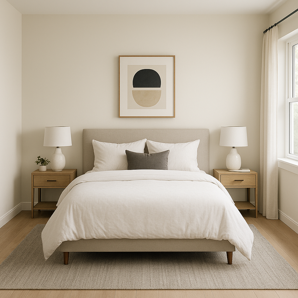
Bedrooms and Living Rooms: The soothing warmth of Restful White makes it a perfect choice for spaces designed for relaxation. Pair it with soft textures like linen, wool, or plush throws to enhance the coziness.
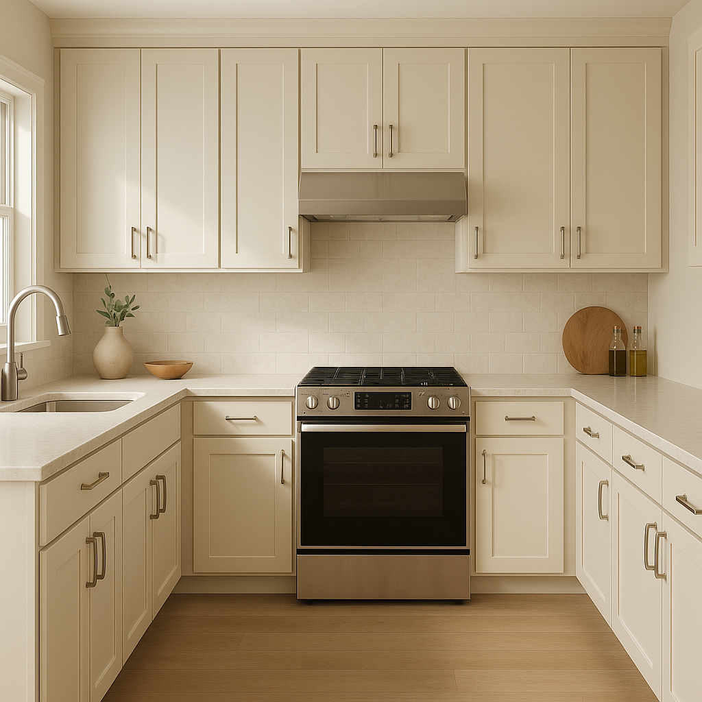
Kitchens and Dining Areas: This hue complements both modern and traditional kitchen designs. Use it on walls, cabinetry, or trim to create a welcoming and timeless aesthetic.
Bathrooms: Restful White's understated elegance lends itself well to spa-like bathrooms. Combine it with natural stone countertops, brushed nickel fixtures, and soft pastel accents for a rejuvenating retreat.
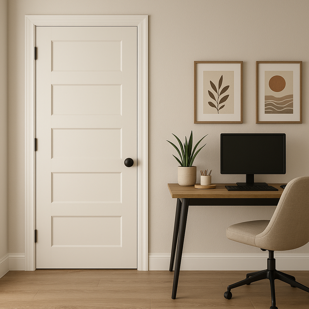
Trim and Ceiling Color: If you're looking for a subtler alternative to stark white trim, Restful White can be used to add a hint of warmth while maintaining a crisp, clean look.
Sherwin-Williams Restful White (SW 7563) is more than just a paint color; it's a tool for creating spaces that feel inviting, balanced, and timeless. Its warm undertones ensure it never feels too sterile, while its adaptability allows it to complement a wide range of design styles, from farmhouse chic to contemporary minimalism. Whether you're refreshing a single room or designing an entire home, Restful White offers the perfect balance of sophistication and simplicity.
Note: These images were all generated with AI, there may be inaccurate color results. Please only use a general reference to get a rough idea of what a color may look like, we will continue to generate new images to improve accuracy.
View Colors Only by Brand (No Imagery):
Sherwin-Williams
|
Benjamin-Moore
|
Behr
|
Valspar
Live on the Eastern Slope of Colorado and looking for a local painting professional, check out all our painting services and reach out for a free estimate.
Copyright © 2026 : Wild Fox Painting Inc. : 12435 Mead Way, Littleton, CO 80125


