Sherwin-Williams Blackberry (SW 7577) is a rich, deep purple that exudes luxury, sophistication, and drama. This striking color is perfect for those who want to make a bold statement while maintaining an air of refinement. With its dark, moody tone, Blackberry transforms any space into a cozy yet elegant retreat, making it an excellent choice for accent walls, statement furniture pieces, or even entire rooms.
Blackberry has distinct undertones that make it a versatile and complex hue. The color leans heavily into the purple family but carries subtle hints of black and brown, which give it a grounded, earthy edge. These undertones prevent it from feeling overly vibrant and instead create a rich, velvety finish that works beautifully in sophisticated interiors. Depending on the lighting, Blackberry can appear warmer or cooler, adding depth and intrigue to your space. In dim lighting, it may lean towards a more shadowy, almost black-purple, while in brighter conditions, the richness of the plum hue takes center stage.
Sherwin-Williams Blackberry pairs beautifully with a wide range of coordinating colors, allowing you to craft a balanced and harmonious palette. Here are some standout options:
Neutral Pairings:
Pair Blackberry with soft, neutral shades to balance its intensity and create a calming effect. Colors like SW 7029 Agreeable Gray, SW 7015 Repose Gray, or SW 7008 Alabaster provide a gentle contrast, allowing Blackberry to stand out as the star of the design.
Bold Accent Colors:
For a modern and adventurous palette, combine Blackberry with other rich hues like SW 6204 Sea Salt or SW 7570 Egret White. These colors add depth and character to the design, creating a layered and dynamic look.
Metallics and Textures:
Blackberry pairs exquisitely with metallic finishes like gold, brass, or copper. Incorporate these accents through light fixtures, furniture hardware, or decor pieces to amplify the luxurious feel of the space.
Blackberry is a dramatic and versatile hue that works well in a variety of interior design applications. Here are some of the best ways to use this color:
Create a stunning focal point in a living room, bedroom, or dining area by using Blackberry on an accent wall. Pair it with light neutral shades on surrounding walls to ensure the space feels balanced and inviting.
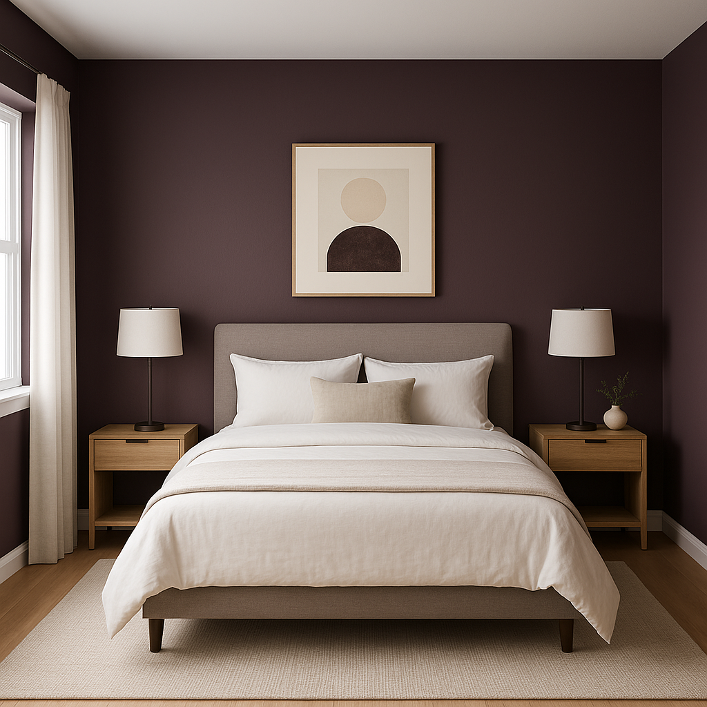
If you're looking to design a cozy and intimate bedroom, Blackberry is an excellent choice. Use it as the main wall color and complement it with soft bedding in cream, gray, or blush tones. Add textured throws or decorative pillows to enhance the luxurious atmosphere.
Blackberry is ideal for spaces that benefit from a touch of drama. Consider using it in dining rooms or home offices to create an elegant and focused environment. Incorporate wood tones and metallic accents to elevate the look further.
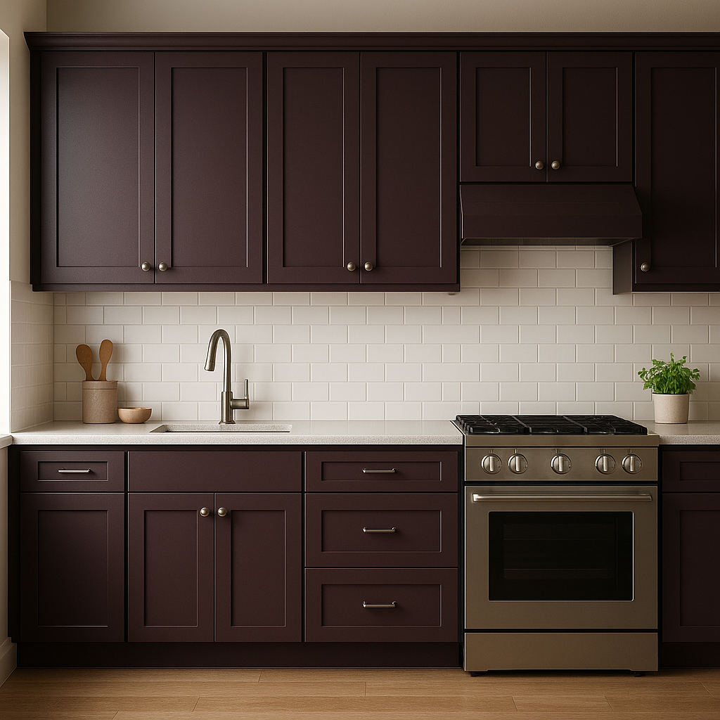
This rich purple also works beautifully on furniture or cabinetry. Paint a feature piece like a dresser, kitchen island, or built-in bookshelves in Blackberry to add depth without overwhelming the space.
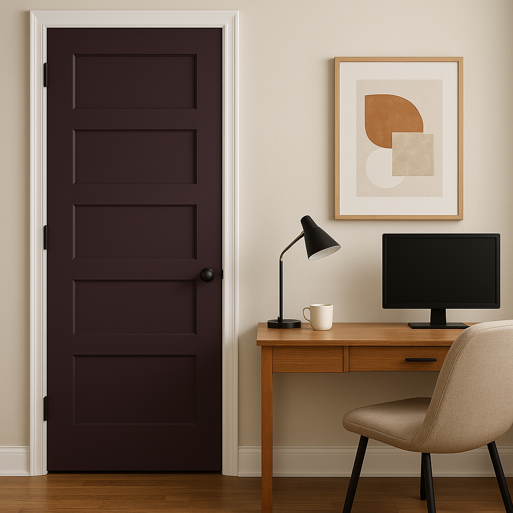
For a high-design look, use Blackberry on ceilings or trim. This unconventional application can add a sense of intimacy and richness to the room, especially when paired with lighter wall colors.
Because Blackberry is a dark and saturated color, lighting plays a crucial role in how it appears in your space. It thrives in rooms with ample natural light, where its plum undertones can shine, but it also creates a cozy ambiance in low-light settings. To ensure the color doesn’t feel too heavy, balance it with adequate lighting from fixtures such as chandeliers, sconces, or recessed lighting.
Sherwin-Williams Blackberry (SW 7577) is a bold yet versatile paint color that provides endless possibilities in interior design. With its rich plum undertones and luxurious feel, it can transform any space into a dramatic and stylish retreat. Whether you’re looking to create a moody bedroom, a sophisticated dining area, or a striking accent wall, Blackberry is sure to deliver elegance and intrigue.
Note: These images were all generated with AI, there may be inaccurate color results. Please only use a general reference to get a rough idea of what a color may look like, we will continue to generate new images to improve accuracy.
View Colors Only by Brand (No Imagery):
Sherwin-Williams
|
Benjamin-Moore
|
Behr
|
Valspar
Live on the Eastern Slope of Colorado and looking for a local painting professional, check out all our painting services and reach out for a free estimate.
Copyright © 2026 : Wild Fox Painting Inc. : 12435 Mead Way, Littleton, CO 80125


