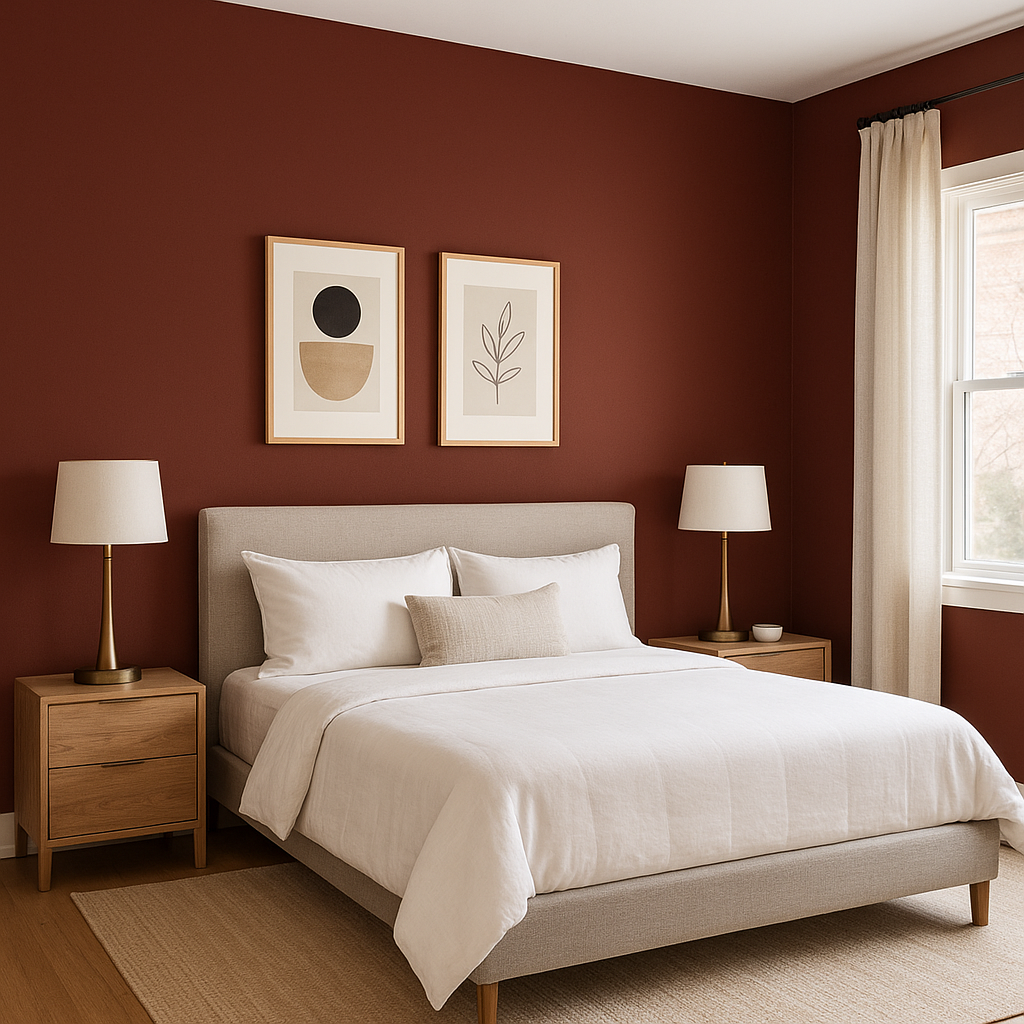
Sherwin-Williams Salute (SW 7582) is a rich, warm red that exudes elegance, confidence, and sophistication. This striking hue is perfect for creating bold and memorable spaces, whether used as an accent or as the primary color in a room. The depth of Salute sets it apart from brighter reds, offering a refined intensity that feels mature and grounded. Its versatility allows it to complement both traditional and contemporary styles, making it a favorite among interior designers seeking to add drama and personality to their projects.
Salute has subtle brown and terracotta undertones, which contribute to its earthy warmth. These undertones keep the color from feeling overly vibrant or harsh, lending a subdued and welcoming quality to the red. The presence of these undertones makes Salute an excellent choice for spaces where you want the drama of red but prefer a shade that feels more grounded and approachable. This balance of boldness and warmth allows Salute to pair beautifully with a variety of other colors and materials.
To make the most of Sherwin-Williams Salute, pair it with coordinating colors that complement its richness and enhance its undertones. Below are some options to consider:
Sherwin-Williams Alabaster (SW 7008)
A soft, creamy white like Alabaster creates a stunning contrast with Salute, allowing the red to stand out while maintaining a sense of brightness and balance in the space. This pairing evokes timeless sophistication and works beautifully in traditional or transitional interiors.
Sherwin-Williams Urbane Bronze (SW 7048)
This dark, moody bronze enhances the earthy undertones of Salute, creating a luxurious and dramatic palette. Together, these colors can define cozy yet upscale spaces such as dining rooms or living areas.
Sherwin-Williams Toasty (SW 6095)
A warm beige like Toasty complements Salute’s terracotta undertones, creating a harmonious color scheme that feels inviting and grounded. This pairing is ideal for spaces where comfort and warmth are priorities.
Sherwin-Williams Naval (SW 6244)
For a bold and modern look, pair Salute with Naval, a deep navy blue. The contrast between the two creates a striking visual impact that is perfect for statement walls or unique accents.
Sherwin-Williams Salute is an incredibly versatile red that can be used in various ways throughout your home or commercial space. Below are some ideas for incorporating this stunning shade:
Salute’s boldness makes it an ideal choice for accent walls. Whether in a living room, bedroom, or dining area, a Salute accent wall adds depth and character, instantly becoming the focal point of the room.
Red has long been associated with warmth and hospitality, making Salute a natural choice for dining spaces. Its earthy undertones create a welcoming atmosphere that encourages conversation and connection.
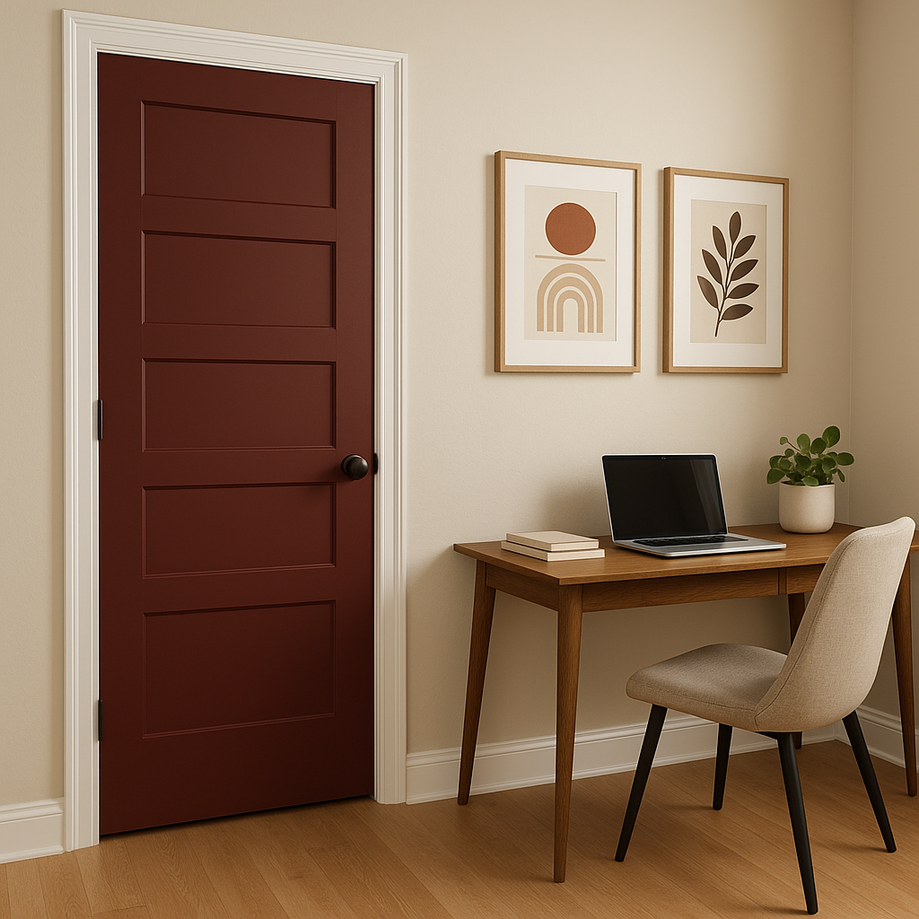
Make a statement with Sherwin-Williams Salute on your front door. Its rich, warm tone is perfect for creating curb appeal and leaving a lasting impression on guests.
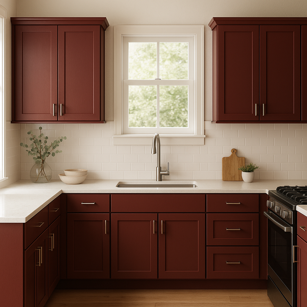
For those who want to experiment with color in smaller doses, Salute can be used on furniture or cabinetry. Painting a dresser, built-in shelves, or kitchen islands in Salute adds a pop of color without overwhelming the space.
Salute’s versatility allows it to shine in both traditional and modern settings. In traditional spaces, pair it with warm neutrals, dark woods, and ornate details. In modern interiors, combine Salute with sleek metallics, crisp whites, or deep blues for a bold and contemporary aesthetic.
As with any paint color, lighting plays a significant role in how Sherwin-Williams Salute appears in a space. In rooms with plenty of natural light, Salute will feel vibrant and dynamic, while in dimly lit areas, its warm undertones will create a cozy and intimate ambiance. Be sure to test the color in your specific lighting conditions to see how it interacts with your space.
Sherwin-Williams Salute (SW 7582) is a truly timeless color that offers the perfect blend of drama, warmth, and sophistication. Whether you’re looking to create a bold statement or add a touch of elegance to your home, this versatile red is sure to leave a lasting impression.
Note: These images were all generated with AI, there may be inaccurate color results. Please only use a general reference to get a rough idea of what a color may look like, we will continue to generate new images to improve accuracy.
View Colors Only by Brand (No Imagery):
Sherwin-Williams
|
Benjamin-Moore
|
Behr
|
Valspar
Live on the Eastern Slope of Colorado and looking for a local painting professional, check out all our painting services and reach out for a free estimate.
Copyright © 2026 : Wild Fox Painting Inc. : 12435 Mead Way, Littleton, CO 80125


