Sherwin-Williams Brick Paver (SW 7599) is a rich, earthy red that captures the warmth and timeless charm of classic brick surfaces. With its subtle brown undertones, this color is an excellent choice for interiors and exteriors alike, evoking a sense of rustic elegance and grounded sophistication. Whether used as an accent or a primary color, Brick Paver delivers depth and personality to any space.
Brick Paver leans toward a warm red with distinct brown undertones that soften its intensity. These undertones ensure the color remains approachable and versatile, avoiding the overly bold or saturated feel that some reds can convey. The subtle warmth makes it an inviting choice for spaces where comfort and character are key. The brown influence also adds a touch of earthiness, making Brick Paver feel connected to nature and architectural traditions.
Brick Paver pairs beautifully with a variety of complementary tones, allowing you to create harmonious palettes that suit your design needs. Here are some standout options:
Neutrals:
Pair Brick Paver with soft, creamy whites like Sherwin-Williams Alabaster (SW 7008) or Pure White (SW 7005) to highlight its warmth and create a balanced, clean aesthetic. Greige tones like Accessible Beige (SW 7036) or Repose Gray (SW 7015) bring a modern touch while maintaining a neutral backdrop.
Earthy Greens:
Shades like Evergreen Fog (SW 9130) or Rosemary (SW 6187) complement Brick Paver’s natural undertones beautifully. These colors echo the outdoors, creating a grounded and cohesive look.
Warm Browns:
Deeper browns such as Turkish Coffee (SW 6076) or Medium Brown (SW 6145) enhance the brick-like quality of Brick Paver, producing a layered and textural effect.
Golden Accents:
For a contrasting pop, try warm golden tones such as Honey Bees (SW 9026) or Sundried Tomato (SW 7585). These can add vibrancy and draw attention to Brick Paver’s rich, red hue.
Brick Paver is incredibly versatile, making it a favorite among designers for multiple applications. Here are some ideas to inspire its use:
Accent Walls:
Transform a living room, dining area, or home office with a Brick Paver accent wall. Its warmth and depth immediately draw attention, creating a focal point that feels sophisticated yet inviting.
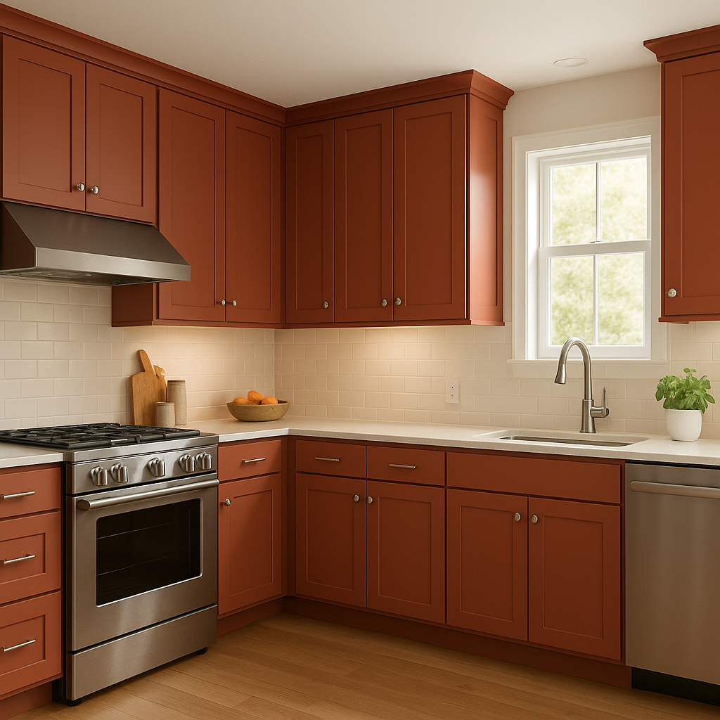
Rustic Kitchens:
Use Brick Paver for cabinetry or an island to introduce a farmhouse-inspired charm. Pair it with neutral countertops and backsplash tiles for a balanced, cohesive design.
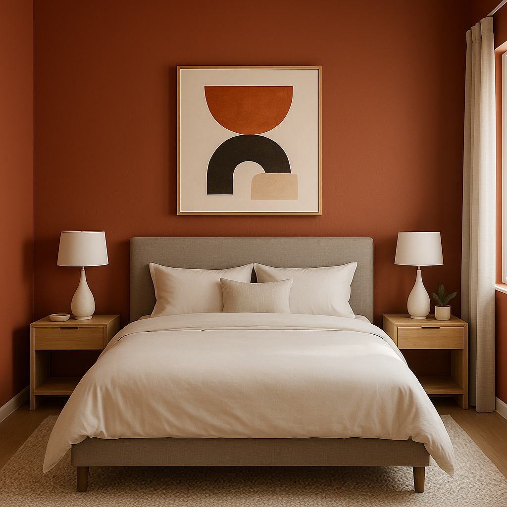
Bedrooms:
Add a cozy and romantic feel by incorporating Brick Paver in a bedroom. Complement it with soft, neutral bedding and warm lighting to create a serene retreat.
Fireplaces:
Bring warmth and authenticity to a fireplace surround by using Brick Paver. Its name alone evokes the timeless appeal of brickwork, making it a natural choice for this application.
Siding and Trim:
Brick Paver is a stunning option for exterior siding or trim, especially in traditional or Craftsman-style homes. Pair it with white or taupe accents for a classic, enduring look.
Outdoor Living Areas:
Use Brick Paver on outdoor walls, patio features, or even furniture to create a cohesive and inviting space. Its earthy tone blends seamlessly with natural surroundings.
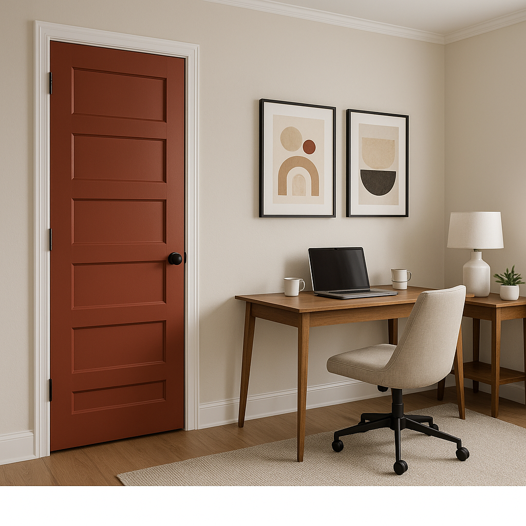
Front Door:
Make your entryway stand out with a Brick Paver front door. It’s a bold yet welcoming choice that adds curb appeal and personality.
Sherwin-Williams Brick Paver (SW 7599) is a color that balances boldness with warmth, making it a timeless addition to any design palette. Its versatility, earthy undertones, and ability to coordinate with a wide range of colors ensure it can adapt to both modern and traditional aesthetics. Whether you're looking to make a statement or create a cozy retreat, Brick Paver is a color that delivers depth, charm, and enduring style.
Note: These images were all generated with AI, there may be inaccurate color results. Please only use a general reference to get a rough idea of what a color may look like, we will continue to generate new images to improve accuracy.
View Colors Only by Brand (No Imagery):
Sherwin-Williams
|
Benjamin-Moore
|
Behr
|
Valspar
Live on the Eastern Slope of Colorado and looking for a local painting professional, check out all our painting services and reach out for a free estimate.
Copyright © 2026 : Wild Fox Painting Inc. : 12435 Mead Way, Littleton, CO 80125


