Sherwin-Williams Adrift (SW 7608) is a captivating medium-toned blue that evokes a sense of calm and tranquility. With its soothing, understated elegance, this color finds its place in a wide range of design styles, from coastal-inspired spaces to chic modern interiors. Its balanced tone makes it a versatile choice for both residential and commercial applications, allowing you to create spaces that feel inviting, grounded, and effortlessly stylish.
Adrift carries soft gray undertones that give it a muted and refined appearance. The subtle infusion of gray prevents it from feeling overly bright or saturated, making it an ideal choice for creating a serene atmosphere without overpowering the room. These undertones lend the color a sophisticated quality that complements a wide variety of palettes and furnishings.
Depending on the lighting, Adrift may lean cooler or warmer. In spaces with natural daylight, it can feel fresh and airy, while in rooms with warmer artificial light, it may take on a slightly cozier tone. This chameleon-like adaptability makes it a favorite among interior designers looking for a blue that feels timeless.
Sherwin-Williams Adrift pairs beautifully with a range of coordinating colors, whether you’re aiming for contrast or a harmonious blend. Here are some stunning combinations to consider:
Neutrals: To create a soft, balanced look, pair Adrift with warm neutrals like Sherwin-Williams Alabaster (SW 7008) or cooler neutrals like Repose Gray (SW 7015). These tones allow Adrift to stand out while maintaining a relaxed and grounded feel.
Accent Colors: For a pop of vibrancy, pair Adrift with rich, earthy hues like Sherwin-Williams Urbane Bronze (SW 7048) or a soft green such as Sea Salt (SW 6204). These complementary shades bring depth and visual interest to the design.
Monochromatic Palette: If you're looking to create a layered blue aesthetic, consider combining Adrift with lighter blues like Sleepy Blue (SW 6225) or deeper tones such as Naval (SW 6244). This approach can give your space a cohesive and serene vibe.
Trim and Ceilings: For crisp contrast, use Extra White (SW 7006) on trim and ceilings. This classic white will brighten the space and highlight Adrift’s calming beauty.
Adrift is a versatile color that works in a variety of settings and design styles. Whether you’re looking to create a relaxing retreat or add an element of sophistication, this hue can transform any space with its timeless appeal.
Adrift is a fantastic choice for living spaces where comfort meets style. Its peaceful tone fosters an inviting ambiance, making it perfect for walls in family rooms or living rooms. Pair it with neutral furnishings and natural wood accents for a cozy, balanced look.
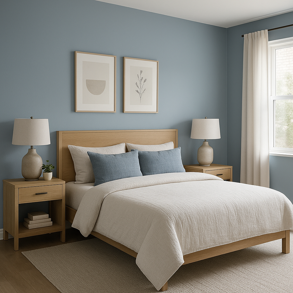
Adrift’s tranquil nature makes it an excellent option for bedrooms. Use it as the main wall color or as an accent behind the bed to create a serene sanctuary. Pair it with plush white bedding and soft gray textiles to enhance the calming effect.
Bring a spa-like feel to your bathroom with Adrift. Its muted blue tone pairs beautifully with white subway tile, marble countertops, and brushed nickel fixtures. Add greenery or soft towels in complementary hues for a polished, relaxing retreat.
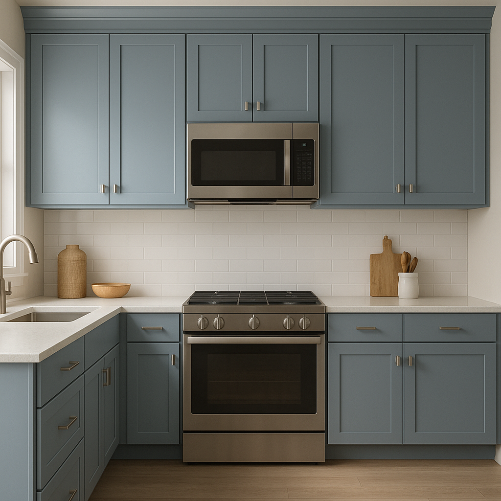
For kitchens, Adrift works wonderfully on cabinets or as an accent wall. Pair it with white quartz countertops, stainless steel appliances, and light wood flooring for a fresh, coastal-inspired look.
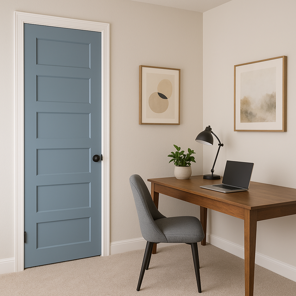
Adrift isn’t just limited to interiors—it shines on exteriors as well. Use it on the siding of your home for a coastal charm or as a front door color to make a welcoming statement. Pair it with crisp whites for trim and darker shades for shutters to add striking curb appeal.
Sherwin-Williams Adrift (SW 7608) is the perfect blend of calm and sophistication. Its soft gray undertones and versatile pairing options allow it to complement a variety of spaces, from cozy bedrooms to elegant kitchens. Whether you’re looking to create a serene atmosphere or add a touch of modern refinement, Adrift is a timeless choice that enhances any interior or exterior environment.
Elevate your design with Sherwin-Williams Adrift—a color that embodies tranquility, balance, and effortless style.
Note: These images were all generated with AI, there may be inaccurate color results. Please only use a general reference to get a rough idea of what a color may look like, we will continue to generate new images to improve accuracy.
View Colors Only by Brand (No Imagery):
Sherwin-Williams
|
Benjamin-Moore
|
Behr
|
Valspar
Live on the Eastern Slope of Colorado and looking for a local painting professional, check out all our painting services and reach out for a free estimate.
Copyright © 2026 : Wild Fox Painting Inc. : 12435 Mead Way, Littleton, CO 80125


