Sherwin-Williams Tranquil Aqua (SW 7611) is a captivating color that effortlessly blends the soothing qualities of blue with the refreshing vibrance of green. This gentle aqua hue brings a sense of serenity and balance to any space, making it a favorite among interior designers for creating a calm and inviting atmosphere. With its understated beauty and versatility, Tranquil Aqua is a perfect choice for residential and commercial spaces alike, offering endless possibilities for creative design.
Tranquil Aqua features subtle gray undertones that temper its vibrant aqua base, lending it a sophisticated and modern edge. These gray undertones prevent the color from appearing overly saturated or bright, ensuring it remains soft and tranquil rather than overwhelming. This muted quality makes Tranquil Aqua an excellent choice for spaces where a peaceful ambiance is desired. Depending on the lighting, it can lean slightly cooler or warmer, making it adaptable to various environments.
Sherwin-Williams Tranquil Aqua pairs beautifully with a range of complementary shades, allowing you to create cohesive and harmonious color palettes. Here are some coordinating colors to consider:
By incorporating these coordinating hues, you can tailor Tranquil Aqua to suit a variety of design styles, from coastal to contemporary and everything in between.
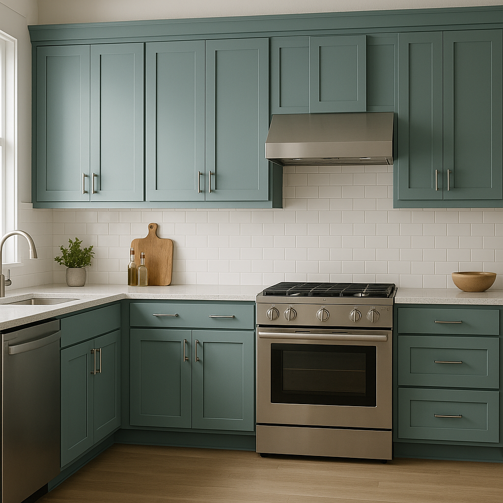
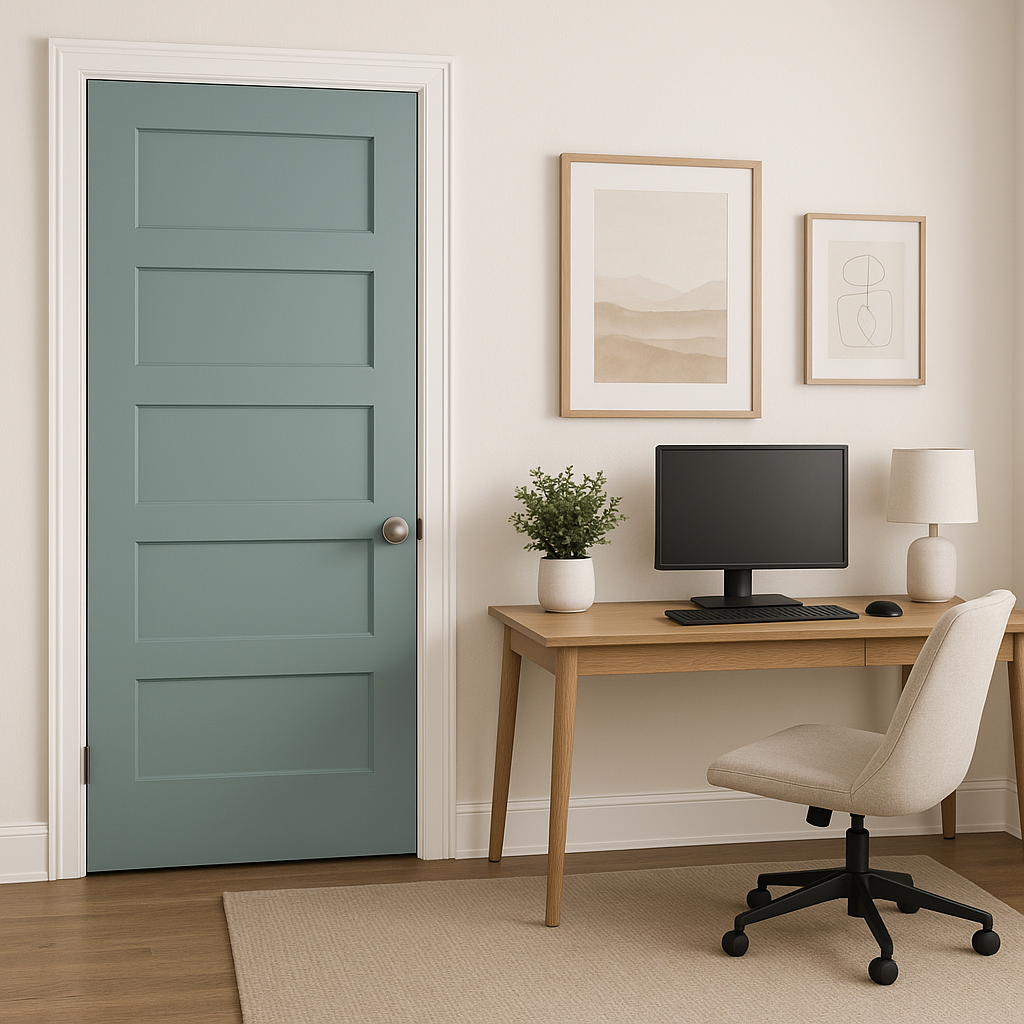
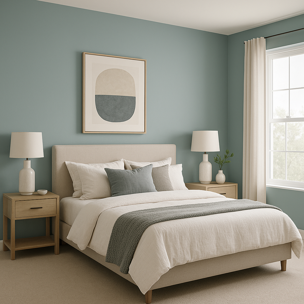
Tranquil Aqua’s gentle, refreshing nature makes it an exceptionally versatile paint color. Here are some ideas for incorporating this serene aqua into your design projects:
As with any paint color, lighting can significantly influence how Tranquil Aqua appears in a room. In spaces with abundant natural light, its aqua tones will shine, bringing out its refreshing and vibrant qualities. In dimly lit areas, its gray undertones become more pronounced, giving it a softer and more neutral appearance. Always test Tranquil Aqua in your space under various lighting conditions to ensure it achieves the desired effect.
Sherwin-Williams Tranquil Aqua (SW 7611) is more than just a paint color—it's a mood enhancer. Its ability to evoke calmness and balance makes it a versatile choice for spaces where you want to feel centered and at ease. With its elegant undertones, compatibility with a wide range of coordinating colors, and adaptability to different settings, Tranquil Aqua is a timeless hue that will elevate your interiors with effortless style. Whether you're designing a coastal retreat or a modern haven, this serene shade will bring a breath of fresh air to your space.
Note: These images were all generated with AI, there may be inaccurate color results. Please only use a general reference to get a rough idea of what a color may look like, we will continue to generate new images to improve accuracy.
View Colors Only by Brand (No Imagery):
Sherwin-Williams
|
Benjamin-Moore
|
Behr
|
Valspar
Live on the Eastern Slope of Colorado and looking for a local painting professional, check out all our painting services and reach out for a free estimate.
Copyright © 2026 : Wild Fox Painting Inc. : 12435 Mead Way, Littleton, CO 80125


