Sherwin-Williams St. Bart’s (SW 7614) is a captivating, medium-to-light blue-green paint color that evokes the tranquil essence of tropical shores and ocean breezes. Its soft yet vibrant tone offers a harmonious blend of coastal charm and modern sophistication, making it a versatile choice for a variety of interior and exterior spaces.
St. Bart’s is a balanced blue-green that leans slightly more toward green than blue, giving it a fresh and lively character without being overly bright or saturated. It features subtle gray undertones that soften the vibrancy, ensuring the color remains refined and grounded. These undertones make St. Bart’s adaptable to different lighting conditions, shifting slightly cooler or warmer depending on the surrounding décor and the amount of natural light in the space.
To create a cohesive design palette, pair St. Bart’s with complementary hues that enhance its coastal elegance and versatility. Here are some coordinating color options:
Neutrals:
Accent Colors:
Wood Tones: Natural wood finishes, such as light oak or medium walnut, pair effortlessly with St. Bart’s to enhance its organic and breezy aesthetic.
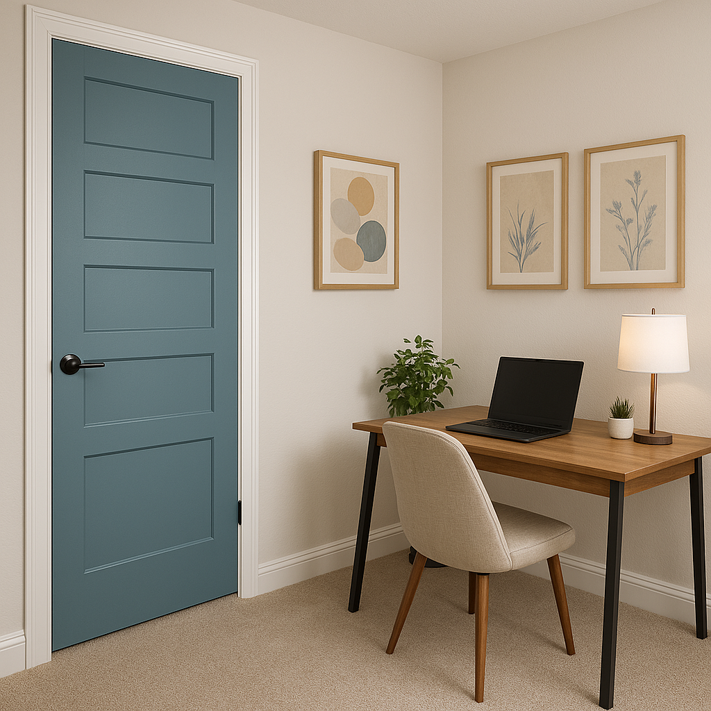
St. Bart’s is incredibly versatile and can be featured in various spaces to achieve a wide range of design styles. Here are some of its best applications:
Transform your living room into a relaxed coastal retreat by using St. Bart’s as the main wall color. Pair it with crisp white trim, natural jute rugs, and linen-upholstered furniture to complete the look.
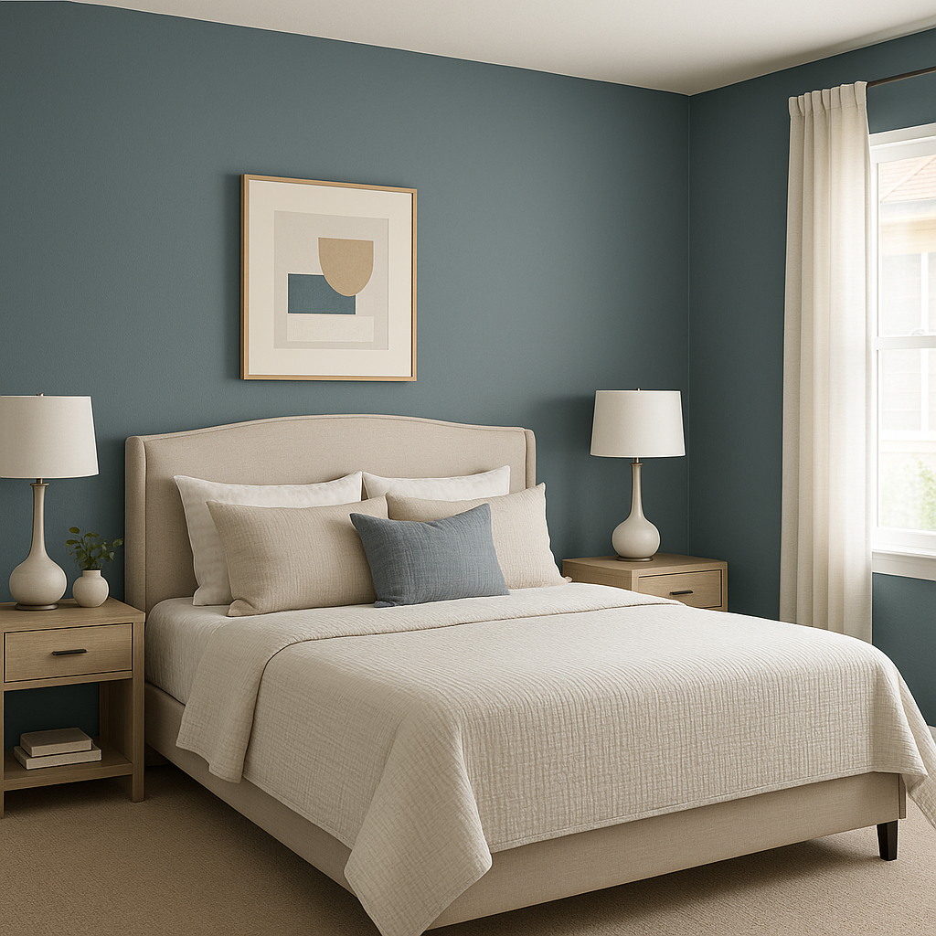
For a serene and restful bedroom atmosphere, St. Bart’s is an ideal choice. Combine it with soft white bedding, pale gray accents, and touches of greenery for a calming sanctuary.
Create a spa-like ambiance in your bathroom by using St. Bart’s on walls or cabinetry. Complement it with marble countertops, brushed nickel fixtures, and soft white towels to evoke a clean and refreshing feel.
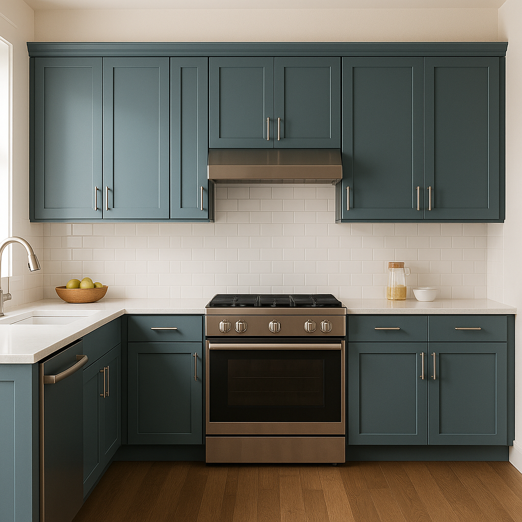
St. Bart’s works beautifully as a cabinet color or backsplash accent in kitchens, especially when paired with white countertops and warm brass hardware. Its subtle vibrancy adds personality without overwhelming the space.
St. Bart’s is equally stunning on home exteriors, offering a coastal-inspired façade. Use it as a main body color with white trim for a classic seaside look, or pair it with darker blues and greens for a more dramatic curb appeal.
Lighting plays a significant role in how St. Bart’s is perceived in your space. In bright, sunlit rooms, its blue tones shine through with a fresh and airy feel. In less illuminated areas, the gray-green undertones surface, adding depth and sophistication. Consider testing it with Sherwin-Williams sample pots in your specific space to see how it interacts with your lighting.
Sherwin-Williams St. Bart’s (SW 7614) strikes the perfect balance between soothing tranquility and understated vibrancy. Whether you’re designing a coastal-inspired retreat or simply looking to infuse your space with a refreshing touch of color, St. Bart’s is a timeless choice that adapts beautifully to a variety of styles and settings. Its versatility, calming nature, and ability to coordinate with a wide range of colors make it a must-have for any designer’s palette.
Note: These images were all generated with AI, there may be inaccurate color results. Please only use a general reference to get a rough idea of what a color may look like, we will continue to generate new images to improve accuracy.
View Colors Only by Brand (No Imagery):
Sherwin-Williams
|
Benjamin-Moore
|
Behr
|
Valspar
Live on the Eastern Slope of Colorado and looking for a local painting professional, check out all our painting services and reach out for a free estimate.
Copyright © 2026 : Wild Fox Painting Inc. : 12435 Mead Way, Littleton, CO 80125


