Sherwin-Williams Grapy (SW 7629) is an elegant and rich purple paint color that exudes sophistication and depth. With its moody yet refined personality, Grapy makes a statement in any interior design. This color is perfect for those seeking to add a touch of drama and luxury to their spaces while maintaining a grounded aesthetic. Its versatility allows it to shine both as a bold focal point or as a complementary accent.
Grapy is a deep purple with subtle undertones of gray and blue, lending it a muted sophistication rather than an overly saturated or vibrant look. These undertones help balance the richness of the purple, making it more approachable and adaptable in different lighting conditions. In brighter spaces, the blue undertones become more prominent, creating a cool and serene vibe. In dimmer lighting, the gray undertones emerge, giving the color a velvety and dramatic appearance.
Sherwin-Williams Grapy pairs beautifully with a range of colors, allowing you to create various design moods. Whether you’re aiming for contrast or cohesion, here are some recommended coordinating colors:
Neutral Pairings: To balance the boldness of Grapy, opt for soft neutrals such as Sherwin-Williams White Flour (SW 7102) or Pure White (SW 7005). These creamy whites brighten the space and allow Grapy to stand out as a feature color.
Gray Pairings: Complement the subtle gray undertones in Grapy with medium to dark grays like Dovetail (SW 7018) or Repose Gray (SW 7015). These combinations create a monochromatic look with depth and sophistication.
Earthy Accents: Warm earthy tones such as Urbane Bronze (SW 7048) or Tony Taupe (SW 7038) pair well with Grapy, adding a grounded and organic touch to the palette.
Soft Pastels: For a playful yet elegant vibe, combine Grapy with muted pastels like Sea Salt (SW 6204) or Silvermist (SW 7621). These lighter tones create a layered and balanced contrast.
Sherwin-Williams Grapy is a versatile color that can be used in a variety of settings, from residential to commercial spaces. Its rich and sophisticated hue lends itself to creating a luxurious atmosphere. Here are some inspiring ways to use Grapy:
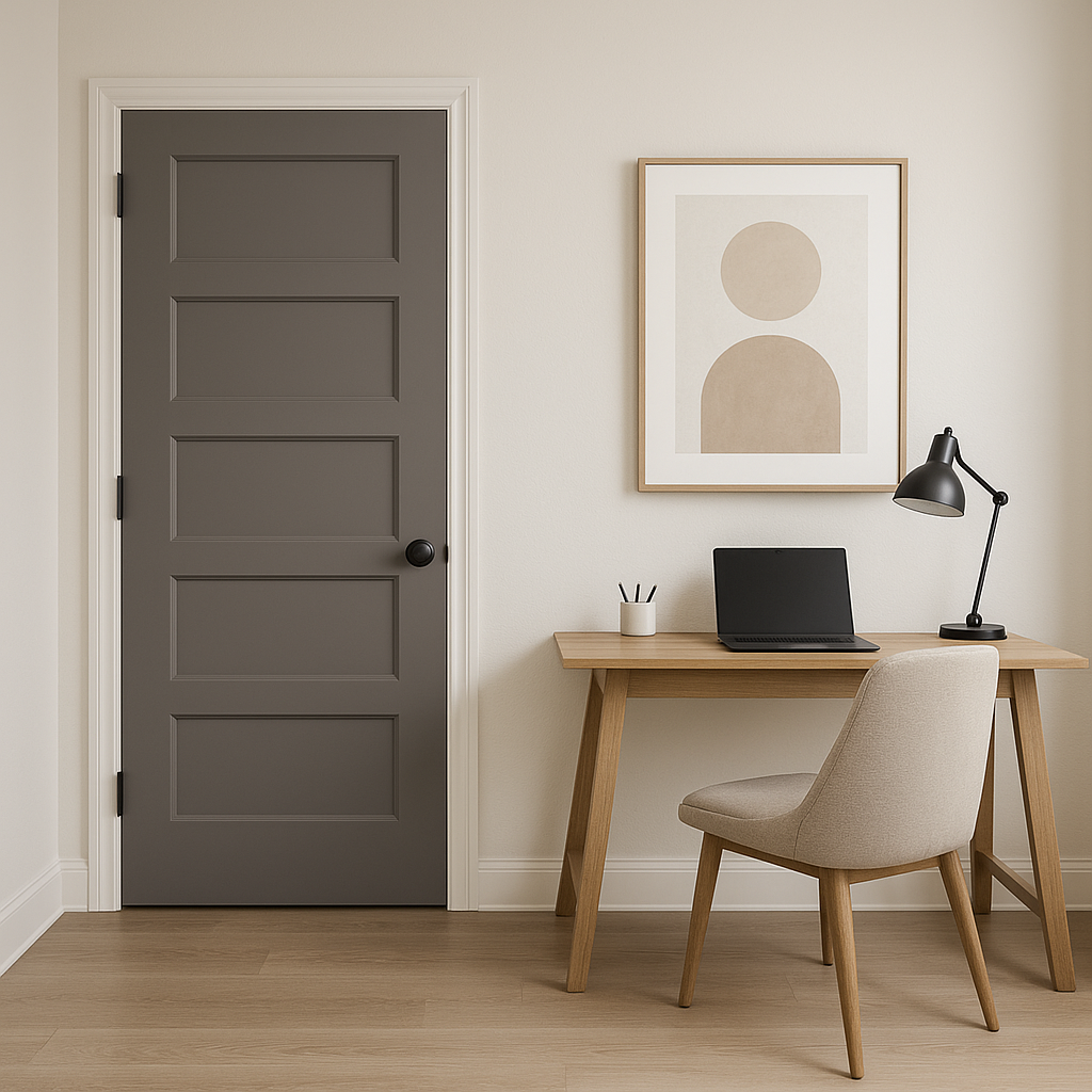
Accent Walls: Grapy is ideal for creating a feature wall that draws attention and sets the tone of a room. Pair it with lighter walls to make the accent pop without overwhelming the space.
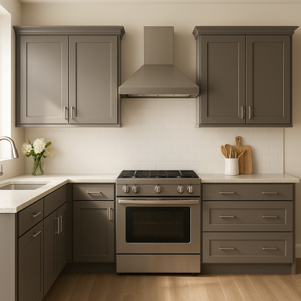
Living Rooms: Use Grapy to add a moody and elegant touch to your living room. Pair it with plush textiles like velvet or linen in complementary shades for a cozy yet refined look.
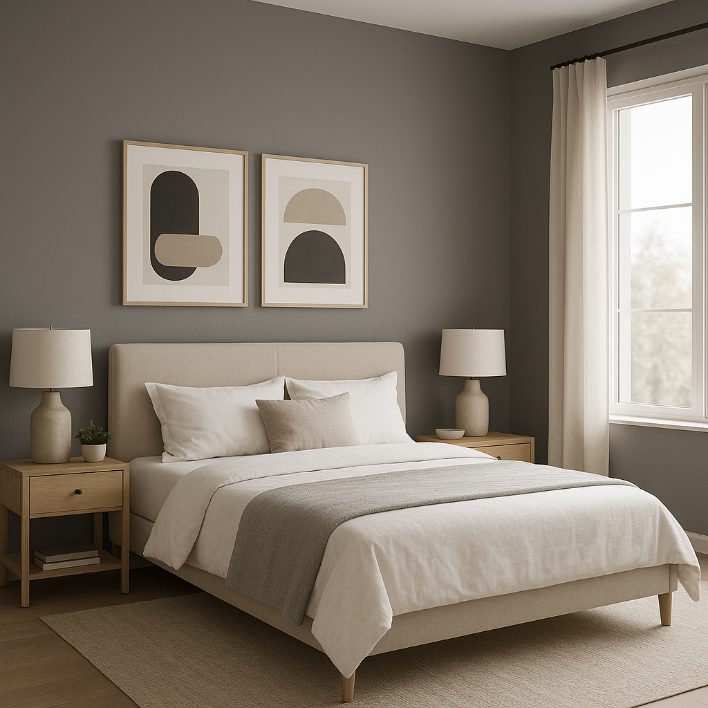
Bedrooms: Grapy is perfect for bedrooms, where its calming blue undertones promote relaxation while its richness adds a sense of intimacy. Consider using it on walls or even furniture pieces like a dresser or nightstand.
Dining Rooms: For a sophisticated dining experience, Grapy can transform your dining room into a chic and inviting space. Pair it with metallic accents like gold or brass for an elevated look.
Powder Rooms: This bold shade is an excellent choice for smaller spaces, such as powder rooms, where it can create a dramatic and jewel-like effect.
Commercial Spaces: Grapy is equally suited for commercial applications, such as boutique interiors or luxury spas, where its depth and elegance can enhance the overall ambiance.
Grapy’s appearance changes depending on the lighting in a space. In rooms with ample natural light, the blue undertones will shine through, creating a cooler and more contemporary feel. In spaces with artificial or dim lighting, the gray undertones will take center stage, resulting in a cozier and more dramatic effect. Be sure to test Grapy in your space to see how it interacts with your lighting conditions.
Sherwin-Williams Grapy (SW 7629) is more than just a bold purple—it’s a nuanced and sophisticated choice that can elevate any space. Whether used sparingly as an accent or boldly across an entire room, Grapy’s rich personality and versatility make it a standout option for modern interiors.
Note: These images were all generated with AI, there may be inaccurate color results. Please only use a general reference to get a rough idea of what a color may look like, we will continue to generate new images to improve accuracy.
View Colors Only by Brand (No Imagery):
Sherwin-Williams
|
Benjamin-Moore
|
Behr
|
Valspar
Live on the Eastern Slope of Colorado and looking for a local painting professional, check out all our painting services and reach out for a free estimate.
Copyright © 2026 : Wild Fox Painting Inc. : 12435 Mead Way, Littleton, CO 80125


