Sherwin-Williams Raisin (SW 7630) is an exquisite deep brown with a subtle purple undertone, making it an exceptional choice for interiors that seek a dramatic yet refined ambiance. This luxurious color offers a perfect balance between earthy warmth and bold sophistication, making it a versatile option for modern, traditional, or eclectic design styles.
At first glance, Raisin may appear as a rich brown, but its nuanced purple undertone adds depth and complexity. These undertones give it a slightly plum-like quality in certain lighting conditions, making it a dynamic color that changes throughout the day. The interplay of brown and purple makes Raisin feel grounded, yet strikingly elegant, offering a unique alternative to more conventional dark neutrals.
Lighting plays an essential role in how Raisin is perceived. In spaces with warm lighting, it leans more toward its chocolatey brown spectrum, while cooler lighting brings out its plum undertones. This makes it an adaptable color that works beautifully in diverse environments.
Sherwin-Williams Raisin pairs beautifully with a variety of complementary and contrasting colors, allowing for endless creative possibilities. Here are a few suggestions to help you craft a harmonious palette:
Neutral Pairings:
Warm Accents:
Cool Accents:
Sherwin-Williams Raisin is a bold yet versatile color that can be used in various applications to elevate your interior design:
Raisin makes a stunning choice for an accent wall. Use it in living rooms, dining areas, or bedrooms to create a dramatic focal point without overwhelming the space. Pair it with lighter neutrals like Extra White or Agreeable Gray to keep the overall look balanced.
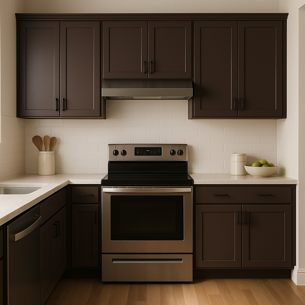
For kitchens and bathrooms, Raisin can be applied to cabinetry or furniture to create a sophisticated, custom feel. Pair it with brass or gold hardware for a touch of luxury, or opt for matte black finishes for a modern aesthetic.
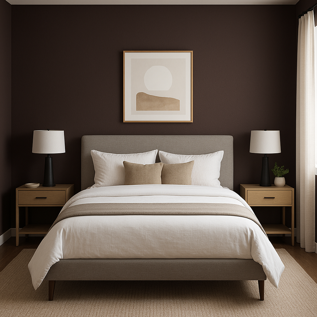
Raisin is ideal for creating intimate, cozy environments such as home offices, libraries, or reading nooks. Its deep tones evoke warmth and comfort, making it perfect for spaces where relaxation or focus is key.
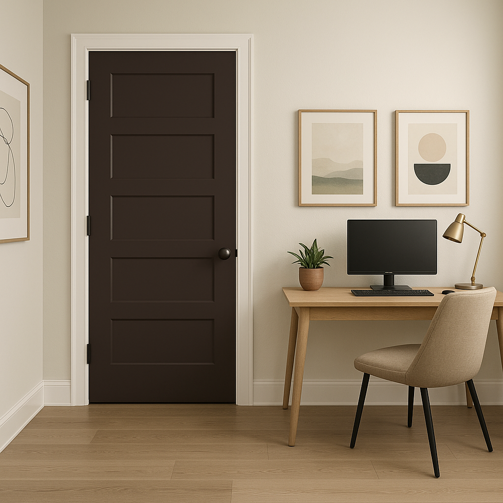
For a bold, unconventional look, consider using Raisin on ceilings or trim. It can make a space feel grounded and add a sense of architectural drama. Pair it with lighter shades on walls for contrast.
Raisin isn’t just for interiors—it can also serve as a stunning exterior color. Use it on front doors, shutters, or as an accent on siding to make a bold statement. Pair it with whites, grays, or even muted greens for a cohesive outdoor palette.
Sherwin-Williams Raisin combines the richness of brown with an unexpected hint of plum, creating a color that feels both timeless and unique. Its versatility allows it to be used in a wide range of settings, from modern urban lofts to cozy countryside homes. Whether you’re looking to make a bold statement or add depth to your design, Raisin is a sophisticated choice that never fails to impress.
Note: These images were all generated with AI, there may be inaccurate color results. Please only use a general reference to get a rough idea of what a color may look like, we will continue to generate new images to improve accuracy.
View Colors Only by Brand (No Imagery):
Sherwin-Williams
|
Benjamin-Moore
|
Behr
|
Valspar
Live on the Eastern Slope of Colorado and looking for a local painting professional, check out all our painting services and reach out for a free estimate.
Copyright © 2026 : Wild Fox Painting Inc. : 12435 Mead Way, Littleton, CO 80125


