Sherwin-Williams Palisade (SW 7635) is an exquisite, medium-toned neutral paint color that strikes a perfect balance between sophistication and versatility. It’s a soft taupe that exudes a natural warmth, making it an excellent choice for interiors seeking a welcoming and grounded ambiance. This shade is ideal for creating spaces that feel serene yet refined, whether in traditional, modern, or transitional designs.
Palisade has subtle undertones of beige and gray, leaning slightly warm without veering into the yellow spectrum. Its taupe base carries just enough gray to maintain a sense of calm neutrality, while the beige undertones lend a touch of earthiness. This delicate interplay of warm and cool undertones allows Palisade to harmonize beautifully with a wide range of palettes, making it a superb backdrop for both bold accents and muted decor.
Sherwin-Williams Palisade pairs effortlessly with a variety of coordinating colors, thanks to its adaptable nature. Here are some suggestions to inspire your design:
Complementary Neutrals:
Warm Accents:
Cool Highlights:
Palisade’s versatility makes it a dream choice for numerous applications throughout the home or office. Its balanced tones work well in spaces where you want to create a comfortable yet polished atmosphere.
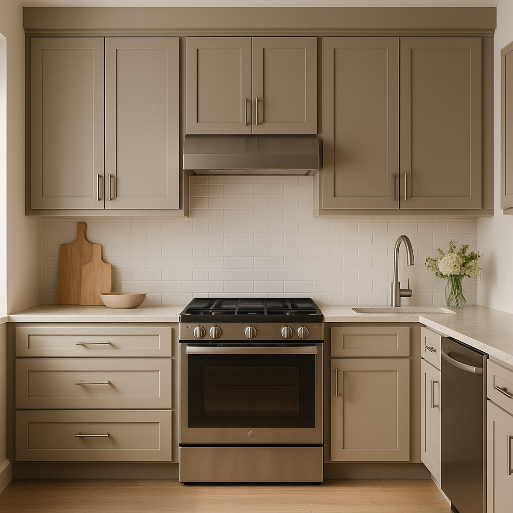
Living Rooms:
Palisade serves as a stunning neutral for living spaces, offering a warm backdrop for furniture and decor. Pair it with natural textures like wood, linen, and woven accents for a cozy, grounded feel.
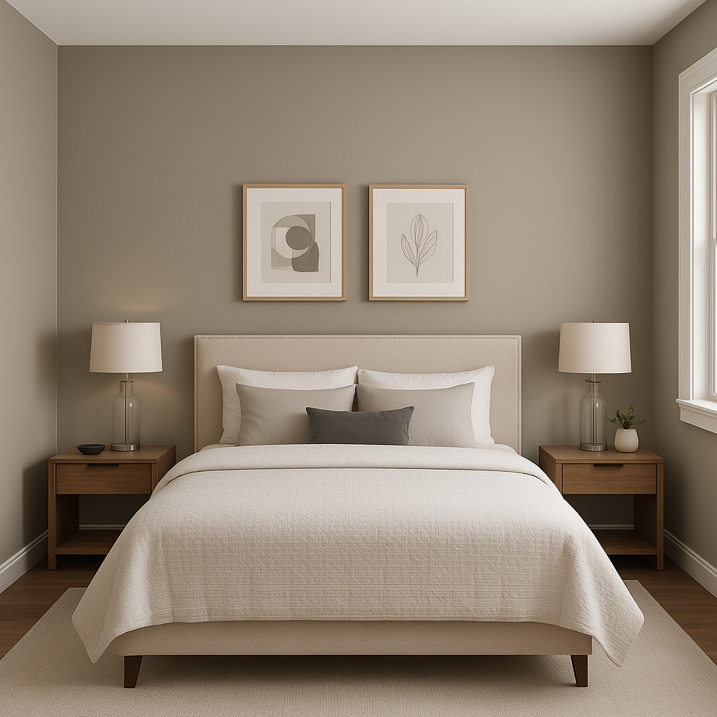
Bedrooms:
Its soft taupe tones promote relaxation, making it ideal for bedrooms. Pair it with light neutrals for a tranquil retreat or layer it with darker hues for a dramatic, intimate vibe.
Dining Areas:
In dining rooms, Palisade provides understated elegance. Accent the walls with metallic finishes, such as gold or bronze light fixtures, for a touch of sophistication.
Bathrooms:
Transform bathrooms into spa-like retreats by combining Palisade with crisp whites and cool blues. Add marble or quartz surfaces for a luxurious finish.
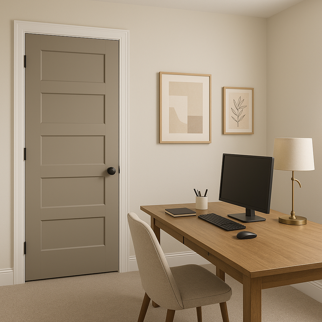
Offices:
For home offices, Palisade fosters a productive and calming atmosphere. Its neutral tones are conducive to focus and blend beautifully with modern or traditional office furniture.
As with any paint color, lighting plays a significant role in how Sherwin-Williams Palisade appears in your space. In rooms with ample natural light, the beige undertones become more pronounced, giving the room a cozy warmth. In spaces with cooler artificial light, the gray undertones may emerge, creating a softer, more subdued effect.
Sherwin-Williams Palisade (SW 7635) is a timeless choice for anyone looking to elevate their interior design with a neutral that feels effortlessly chic and adaptable. Its ability to complement a wide range of colors and styles ensures that it will remain relevant as trends evolve, making it a valuable investment for your home or workspace. Whether you're searching for a versatile wall color or a foundation for layered designs, Palisade is a reliable choice that radiates warmth and sophistication.
Note: These images were all generated with AI, there may be inaccurate color results. Please only use a general reference to get a rough idea of what a color may look like, we will continue to generate new images to improve accuracy.
View Colors Only by Brand (No Imagery):
Sherwin-Williams
|
Benjamin-Moore
|
Behr
|
Valspar
Live on the Eastern Slope of Colorado and looking for a local painting professional, check out all our painting services and reach out for a free estimate.
Copyright © 2026 : Wild Fox Painting Inc. : 12435 Mead Way, Littleton, CO 80125


