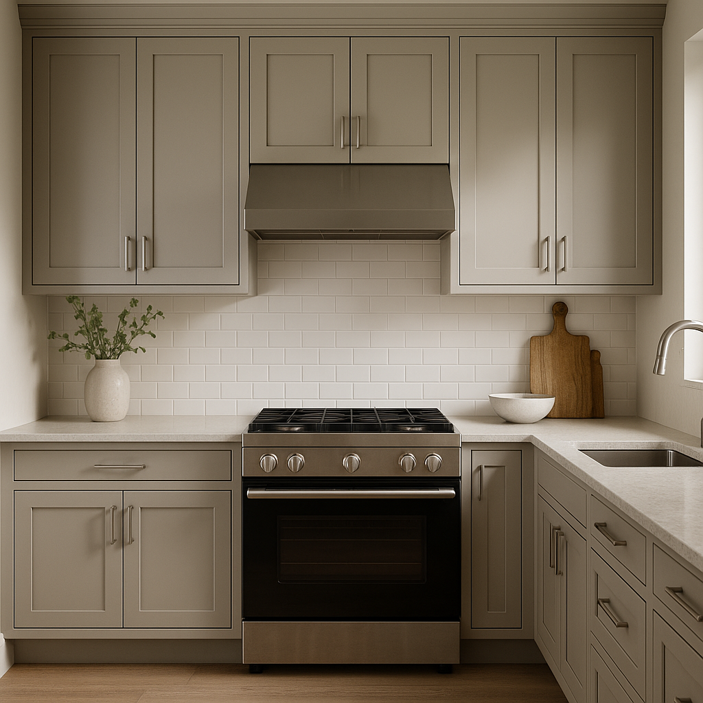
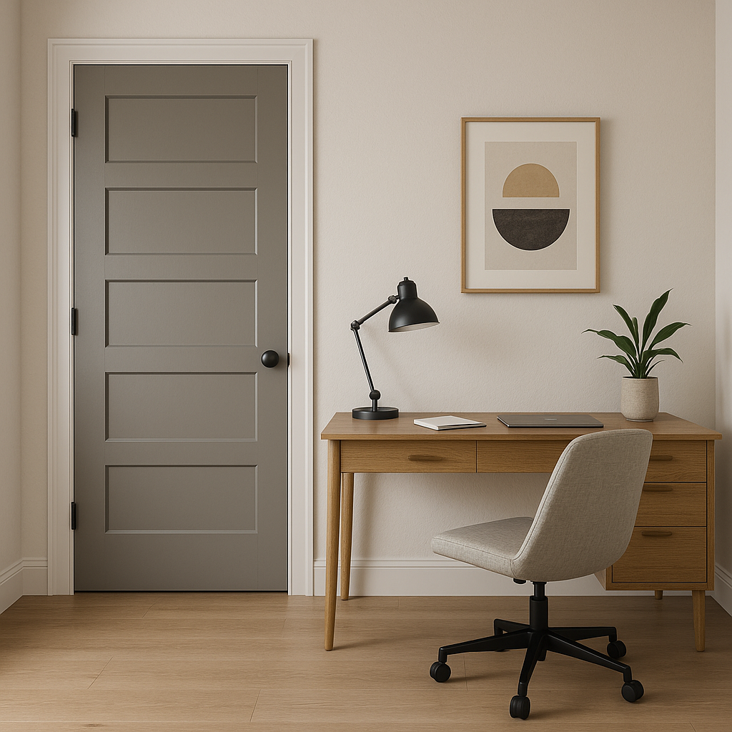
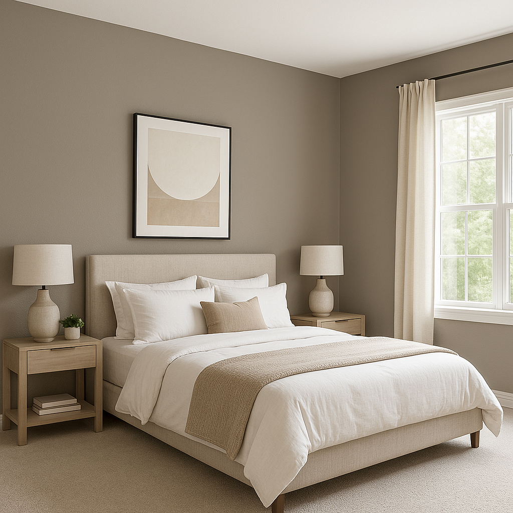
Sherwin-Williams Pavestone (SW 7642) is an elegant and versatile neutral that offers a perfect balance of earthy charm and refined sophistication. This medium-toned gray-beige, often referred to as a "greige", is a popular choice for both interior and exterior applications. It creates a calming and refined backdrop that complements a wide range of design styles, from modern minimalism to traditional elegance.
One of Pavestone's standout qualities is its neutral composition with subtle undertones. It features warm beige undertones softened by cool gray hints, making it a true greige. These undertones allow Pavestone to adapt beautifully to varying light conditions, creating a dynamic hue that shifts between warmer and cooler tones depending on the environment. In spaces with abundant natural light, Pavestone appears lighter and slightly warmer, while in dimly lit areas, its gray undertones become more pronounced, giving it a grounded and serene appearance.
Sherwin-Williams Pavestone pairs effortlessly with a wide array of colors, making it an excellent choice for both monochromatic and contrasting palettes. Here are some coordinating color suggestions:
Trim & Accent Colors:
Complementary Neutrals:
Bold Accent Colors:
Sherwin-Williams Pavestone is a versatile color that works beautifully across a variety of applications. Whether you're designing a cozy living space or a polished exterior, Pavestone delivers timeless appeal.
Sherwin-Williams Pavestone (SW 7642) is the epitome of versatility, offering an understated elegance that enhances the beauty of any space. Its warm greige undertones provide a balanced neutral palette, while its adaptability to different lighting conditions ensures it remains timeless and relevant. Whether you're redesigning a single room or refreshing your entire home, Pavestone is a dependable choice for achieving a sophisticated and harmonious aesthetic.
Note: These images were all generated with AI, there may be inaccurate color results. Please only use a general reference to get a rough idea of what a color may look like, we will continue to generate new images to improve accuracy.
View Colors Only by Brand (No Imagery):
Sherwin-Williams
|
Benjamin-Moore
|
Behr
|
Valspar
Live on the Eastern Slope of Colorado and looking for a local painting professional, check out all our painting services and reach out for a free estimate.
Copyright © 2026 : Wild Fox Painting Inc. : 12435 Mead Way, Littleton, CO 80125


