Sherwin-Williams Gateway Gray (SW 7644) is a refined and versatile mid-tone gray that effortlessly blends sophistication with warmth. Striking the perfect balance between bold and understated, Gateway Gray is ideal for creating a polished and grounded aesthetic in both traditional and modern spaces. Its ability to adapt to different lighting conditions and pair seamlessly with a wide range of colors makes it a favorite choice for interior designers looking to craft timeless, cohesive interiors.
Gateway Gray features complex undertones that make it truly unique. This shade leans toward a cool gray base with subtle hints of green and a whisper of blue. These undertones lend Gateway Gray a soothing and earthy quality, ensuring it doesn’t feel overly stark or sterile. Depending on the light source or time of day, the green undertones may become slightly more pronounced, creating a harmonious connection to nature and evoking a sense of calm.
One of Gateway Gray’s greatest strengths is its ability to pair beautifully with other hues. Whether you’re designing a monochromatic palette or introducing complementary colors, Gateway Gray provides a versatile foundation. Here are some coordinating colors to consider:
Gateway Gray’s adaptability makes it a go-to choice for a variety of spaces and styles. Its medium tone and subdued undertones create a serene backdrop while adding depth and richness to any room.
Gateway Gray is a superb choice for living areas where you want to strike a balance between coziness and sophistication. Pair it with plush furniture, textured throws, and metallic accents for a space that feels both inviting and elevated.
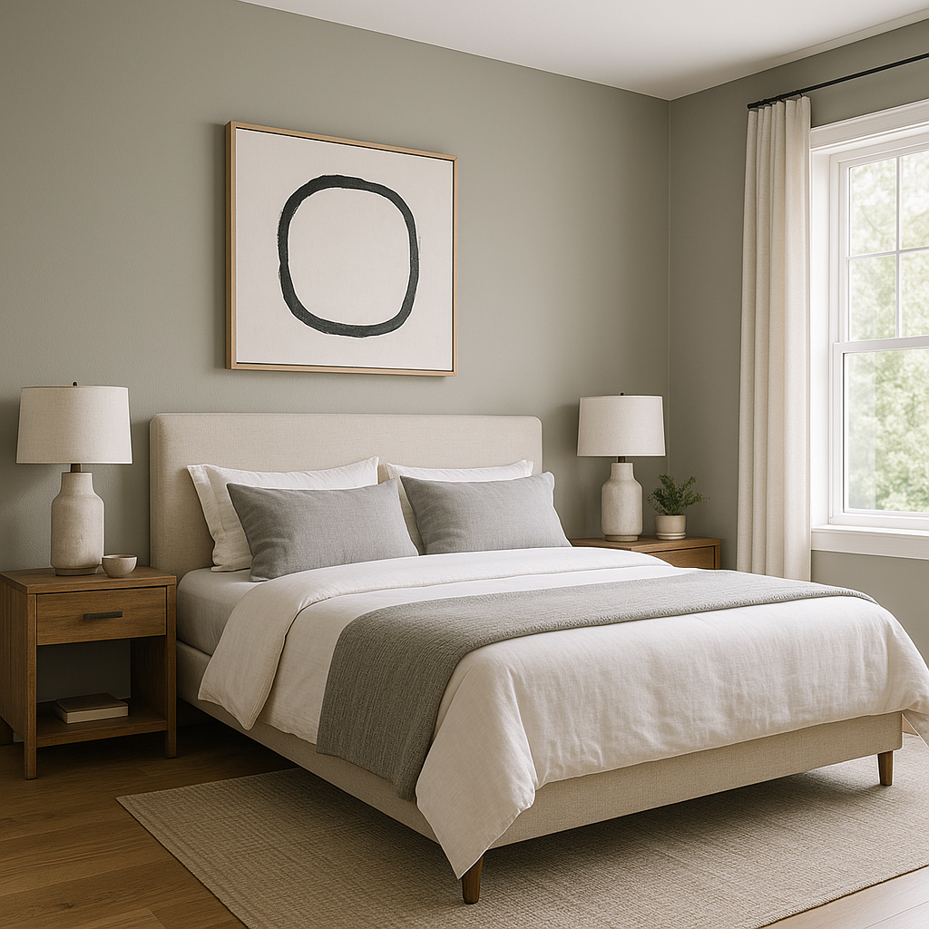
The calm and grounding nature of Gateway Gray makes it perfect for bedrooms. Complement it with soft linens in whites and creams, or add pops of color through accent pillows and artwork for a personalized retreat.
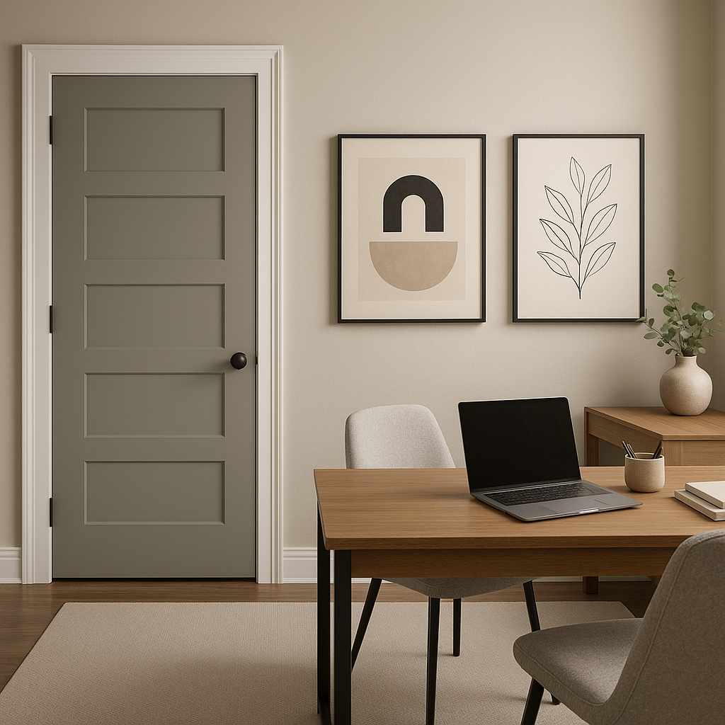
For a productive and focused environment, Gateway Gray offers the perfect neutral backdrop. Pair it with sleek black furniture, greenery, and warm wood tones to create a professional yet welcoming workspace.
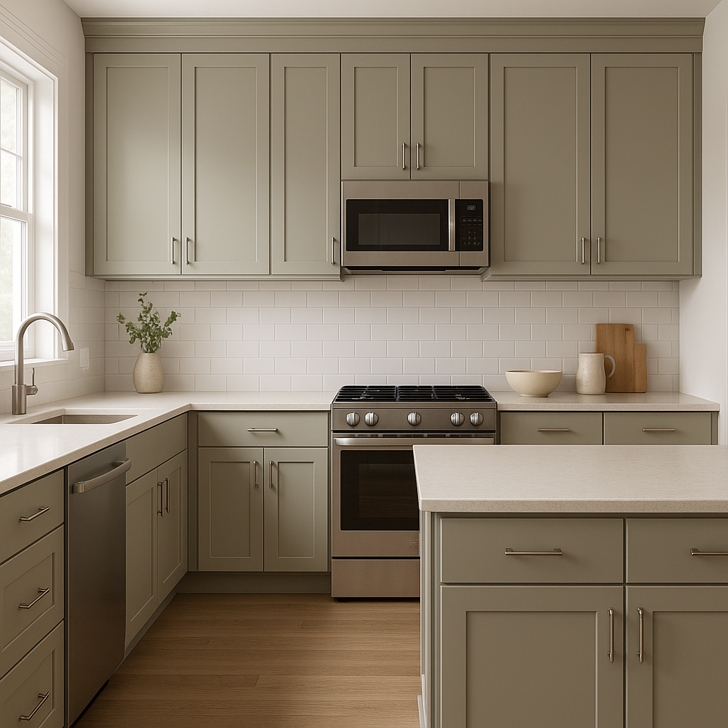
Gateway Gray works wonderfully in kitchens and dining spaces, especially when paired with white cabinetry or natural wood finishes. Add brass or matte black hardware for a modern twist.
On exteriors, Gateway Gray provides a sophisticated and timeless look. Pair it with white trim and a dark front door for a classic curb appeal or coordinate it with stone accents for a rustic yet refined aesthetic.
Lighting plays a key role in how Gateway Gray appears in your space. In rooms with plenty of natural light, the cool undertones may be more noticeable, giving the space a fresh and airy feel. In dimmer lighting, the green undertones can emerge, lending a cozy and grounded vibe. Always test Gateway Gray in your space before committing to ensure it complements your lighting conditions.
Sherwin-Williams Gateway Gray (SW 7644) is more than just a paint color—it’s a timeless neutral that brings personality and versatility to any space. With its sophisticated undertones, coordinating color options, and wide range of applications, it’s an excellent choice for homeowners and designers alike looking to craft spaces that are both stylish and serene.
Note: These images were all generated with AI, there may be inaccurate color results. Please only use a general reference to get a rough idea of what a color may look like, we will continue to generate new images to improve accuracy.
View Colors Only by Brand (No Imagery):
Sherwin-Williams
|
Benjamin-Moore
|
Behr
|
Valspar
Live on the Eastern Slope of Colorado and looking for a local painting professional, check out all our painting services and reach out for a free estimate.
Copyright © 2026 : Wild Fox Painting Inc. : 12435 Mead Way, Littleton, CO 80125


