Sherwin-Williams On the Rocks (SW 7671) is a timeless and versatile light gray paint color that exudes understated elegance. Perfect for creating a serene and balanced ambiance, this shade is an excellent choice for both modern and traditional interiors. Its subtle undertones and ability to complement a wide range of design elements make it a favorite among homeowners and interior designers alike.
On the Rocks is a light gray with a soft, neutral base, but it carries faint warm undertones that prevent it from feeling overly cool or sterile. Depending on your lighting and surrounding decor, you may notice hints of beige or taupe peeking through. These warm undertones make it ideal for spaces where you want to achieve a cozy yet sophisticated look.
Natural lighting can slightly shift its appearance, making it feel brighter and more neutral during the day, while artificial lighting may deepen its warmth in the evening. This chameleon-like quality ensures it harmonizes beautifully with a variety of settings.
Sherwin-Williams On the Rocks pairs seamlessly with other hues, allowing you to create a cohesive and polished color palette. Here are some suggestions for coordinating colors:
On the Rocks creates a calm and inviting atmosphere, making it perfect for living rooms. Pair it with plush fabrics, warm woods, and metallic accents for a cozy yet modern vibe.
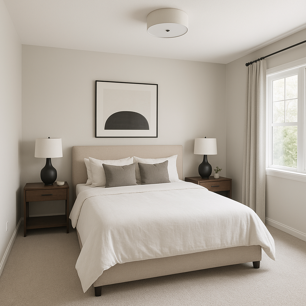
This light gray provides a soothing backdrop for restful spaces. Layer it with soft linens in whites, creams, and muted blues to foster tranquility.
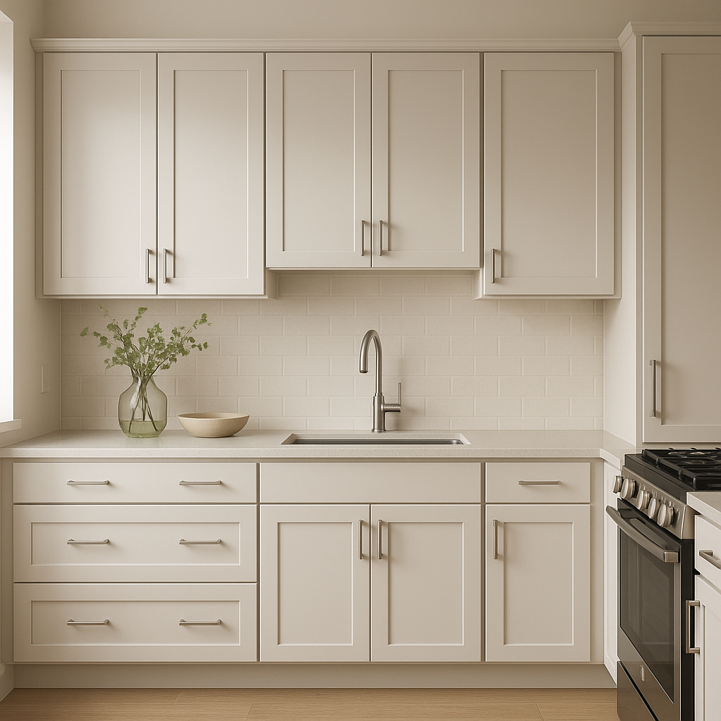
On the Rocks works beautifully in kitchens, whether as a wall color or on cabinetry. Pair it with white subway tiles, stainless steel appliances, and warm wood countertops for a balanced and timeless look.
Its understated warmth makes it a fantastic choice for bathrooms, especially when paired with white tile, chrome fixtures, and soft pastel accents.
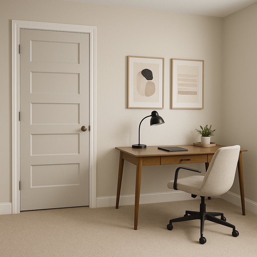
Create a productive yet serene workspace with On the Rocks. Combine it with crisp whites and pops of navy or green for an energizing and professional environment.
On the Rocks isn’t limited to interior use—it’s also a stunning option for exteriors. Use it as a main color for siding and pair it with white trim for a classic, sophisticated look.
Sherwin-Williams On the Rocks (SW 7671) is more than just a paint color—it's a design tool that transforms spaces with its adaptable nature and refined charm. Whether you're aiming for a neutral foundation, an elegant monochromatic scheme, or a complementary palette with bold accents, On the Rocks provides the perfect starting point. Its versatility makes it suitable for any room, style, or purpose, allowing you to create spaces that feel comfortable, stylish, and uniquely yours.
Note: These images were all generated with AI, there may be inaccurate color results. Please only use a general reference to get a rough idea of what a color may look like, we will continue to generate new images to improve accuracy.
View Colors Only by Brand (No Imagery):
Sherwin-Williams
|
Benjamin-Moore
|
Behr
|
Valspar
Live on the Eastern Slope of Colorado and looking for a local painting professional, check out all our painting services and reach out for a free estimate.
Copyright © 2026 : Wild Fox Painting Inc. : 12435 Mead Way, Littleton, CO 80125


