Sherwin-Williams Hinoki (SW 7686) is a sophisticated neutral that brings a sense of calm and understated elegance to any interior space. This unique shade is a warm greige—a harmonious blend of gray and beige—that effortlessly bridges modern style with timeless appeal. Ideal for creating a soothing atmosphere, Hinoki is versatile enough to complement a wide array of design aesthetics, from contemporary minimalism to classic, cozy interiors.
Hinoki has subtle undertones that make it such a versatile and adaptable color. With its warm base, it carries faint taupe and beige undertones that prevent it from feeling too cool or stark. This delicate warmth makes Hinoki an inviting choice for those seeking a neutral that avoids the sterility of cooler grays while still offering a modern, clean look. The soft taupe hints lend depth to the shade, ensuring it feels layered and dynamic rather than flat.
Choosing the right coordinating colors can elevate Hinoki and create a cohesive palette for your space. Pairing it with complementary hues will help highlight its warm undertones while creating visual interest.
These coordinating colors allow you to design spaces with depth and harmony, whether you’re aiming for a monochromatic palette or adding complementary pops of color.
Hinoki’s versatility makes it suitable for a variety of applications, from walls to cabinetry and even ceilings. Its warm neutrality ensures that it adapts well to various lighting conditions, making it a reliable choice for both residential and commercial spaces.
Hinoki is perfect for main living areas like living rooms, family rooms, and dens. Paired with natural wood furniture or soft textures like linen and wool, it can create a cozy yet modern atmosphere. Its warm undertones make it inviting and ideal for spaces where comfort is key.
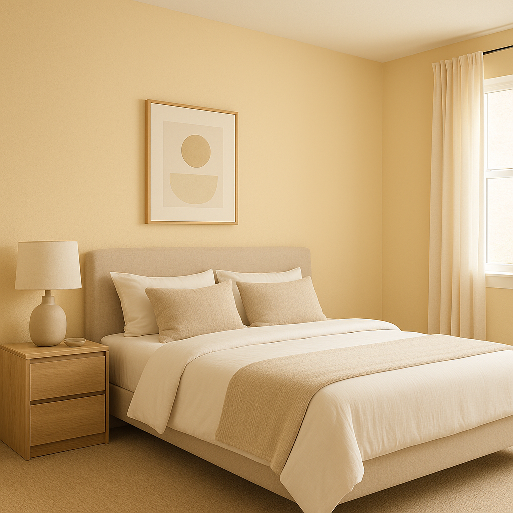
As a soothing neutral, Hinoki can help set the tone for a tranquil bedroom retreat. Combine it with soft whites and muted greens to create a serene sanctuary that promotes relaxation.
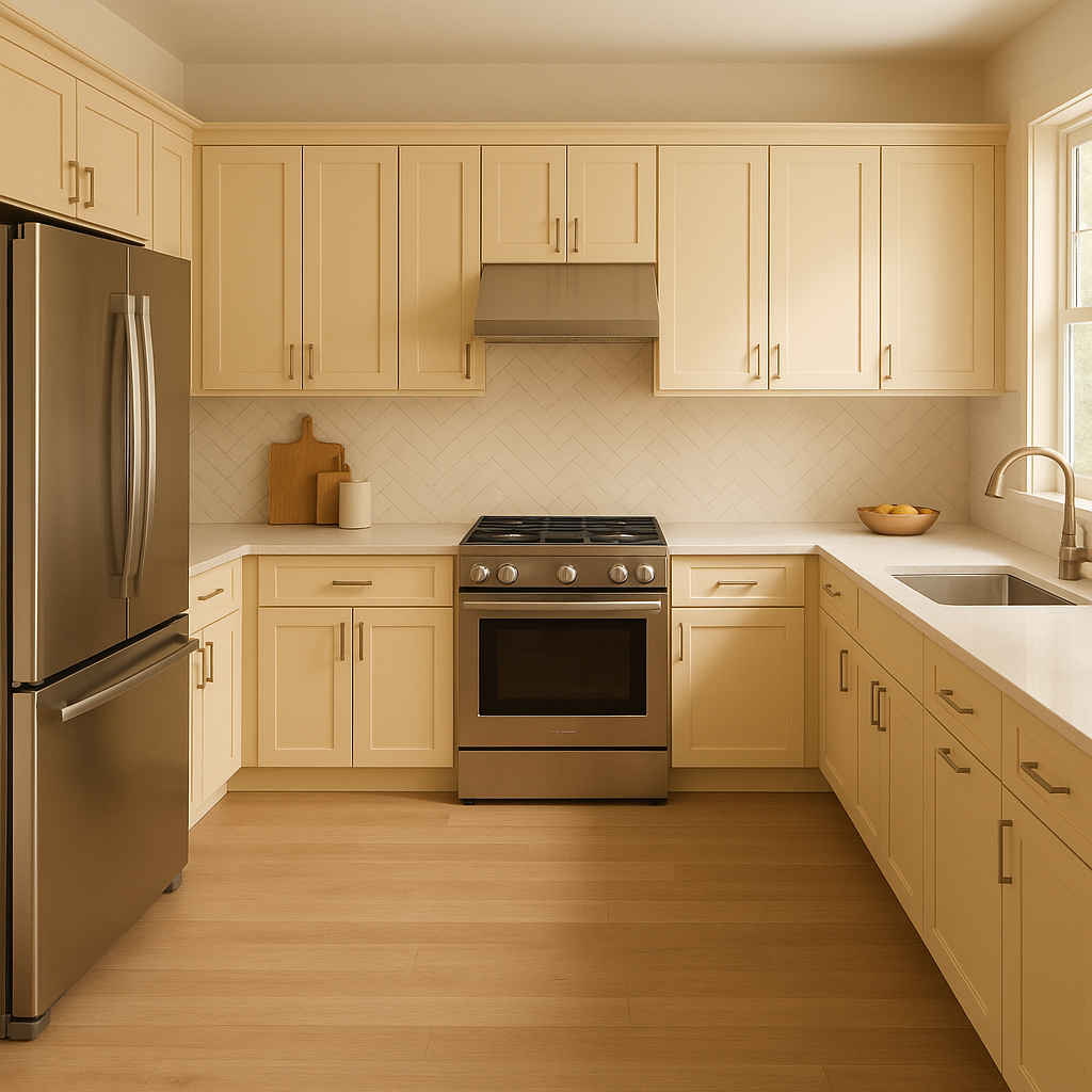
Hinoki works beautifully in kitchens and bathrooms, especially when paired with white subway tiles, brushed brass hardware, or marble countertops. Its warm undertones add just the right amount of charm and balance to these functional spaces.
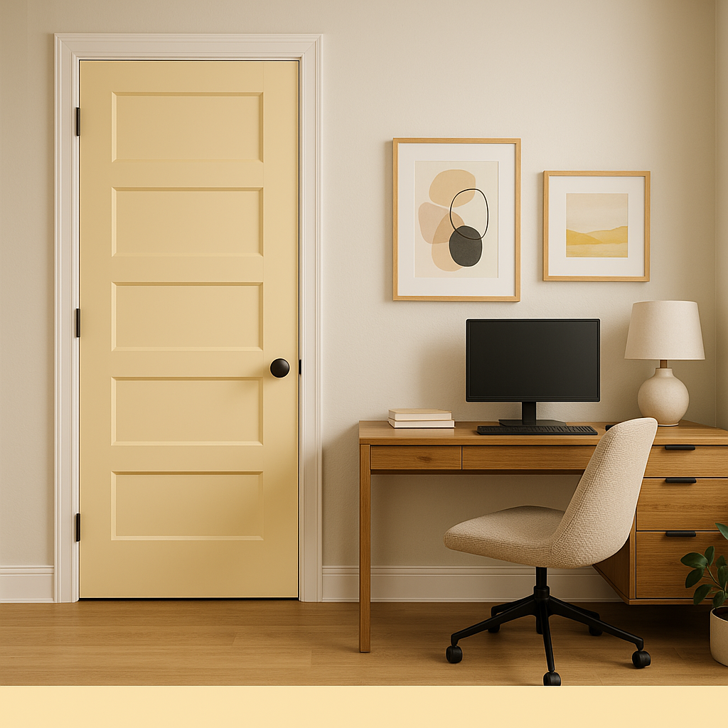
For home offices or workspaces, Hinoki provides a neutral backdrop that fosters concentration without feeling cold or clinical. Pair it with natural wood accents or matte black finishes for a professional yet welcoming environment.
While Hinoki is often celebrated for interior use, its warmth and adaptability also make it a great choice for exterior walls or trim. It complements natural surroundings and works well with stone, brick, or wood finishes.
The appearance of Sherwin-Williams Hinoki can shift depending on the lighting in your space. In rooms with abundant natural light, Hinoki leans more toward its taupe-gray side, offering a bright yet grounded feel. In spaces with softer, artificial lighting, its beige undertones become more pronounced, creating a warm and cozy atmosphere. Testing the color in different lighting conditions is key to fully appreciating its dynamic quality.
Sherwin-Williams Hinoki (SW 7686) is more than just a paint color—it’s a design tool that transforms interiors into serene, welcoming havens. Whether used as the main color or a complementary shade, Hinoki delivers timeless elegance with its versatile neutral tone. Its ability to adapt to various lighting conditions, pair with a wide range of coordinating colors, and suit diverse design styles makes it an invaluable choice for any interior designer or homeowner.
Note: These images were all generated with AI, there may be inaccurate color results. Please only use a general reference to get a rough idea of what a color may look like, we will continue to generate new images to improve accuracy.
View Colors Only by Brand (No Imagery):
Sherwin-Williams
|
Benjamin-Moore
|
Behr
|
Valspar
Live on the Eastern Slope of Colorado and looking for a local painting professional, check out all our painting services and reach out for a free estimate.
Copyright © 2026 : Wild Fox Painting Inc. : 12435 Mead Way, Littleton, CO 80125


