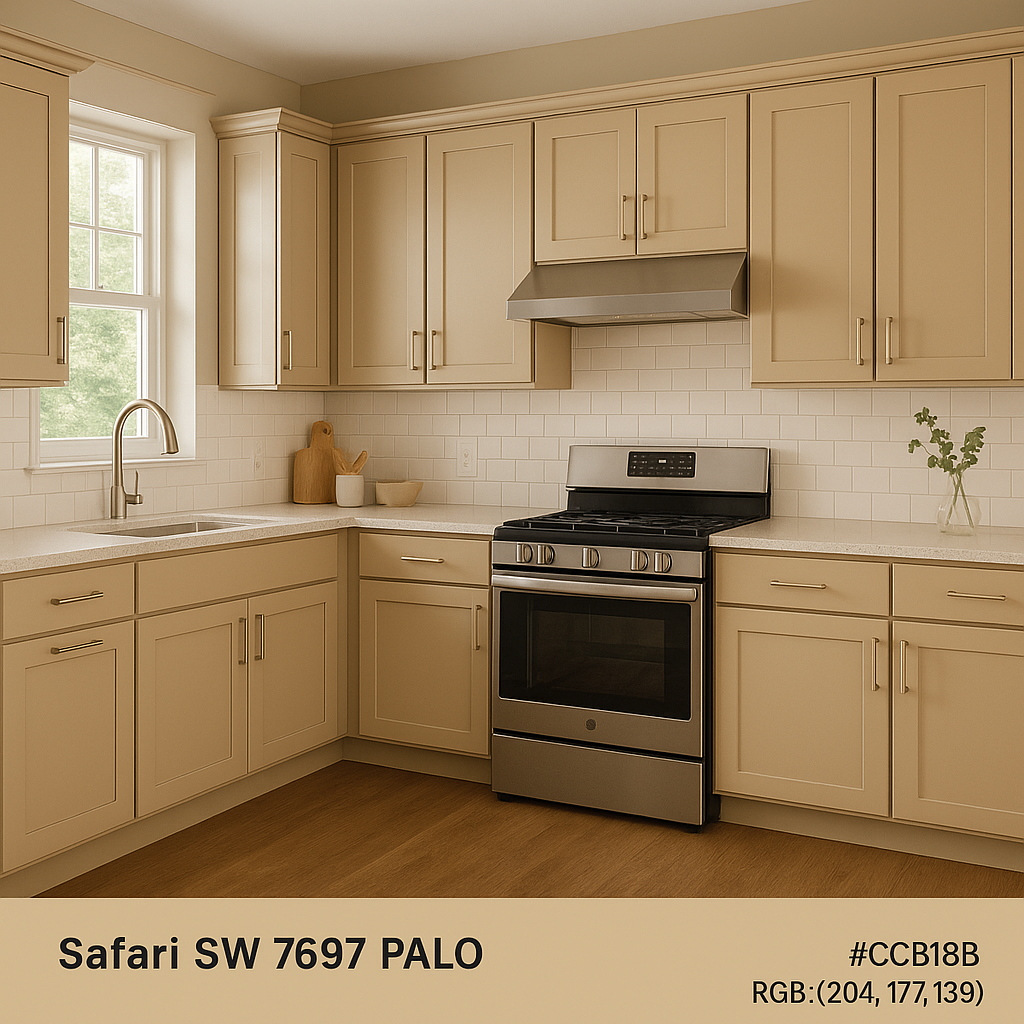
Sherwin-Williams Safari (SW 7697) is an inviting and versatile paint color that radiates warmth, sophistication, and subtle charm. Positioned within the family of warm neutrals, Safari is an excellent choice for creating cozy, timeless interiors. Its understated elegance makes it a favorite for designers looking to craft spaces that feel grounded and serene while exuding a refined aesthetic.
Safari is characterized by soft beige undertones with hints of taupe and golden warmth woven seamlessly into its composition. These undertones make it a highly adaptable shade, capable of complementing a variety of textures and finishes. The golden hints lend a touch of richness and depth without overpowering its neutral base, maintaining balance and subtle sophistication.
This color leans slightly warm, making it an excellent choice for spaces that need a comforting and welcoming ambiance. Its undertones work exceptionally well in rooms with both natural and artificial light, ensuring that the space feels inviting at any time of day.
Sherwin-Williams Safari harmonizes beautifully with a range of complementary shades, making it a versatile option for any color palette. Here are some coordinating colors to consider:
Sherwin-Williams Alabaster (SW 7008): A soft, creamy white that pairs seamlessly with Safari for a light and airy contrast. Use this duo to create a serene, clean aesthetic in bedrooms, kitchens, or bathrooms.
Sherwin-Williams Urbane Bronze (SW 7048): A deep, rich bronze that adds depth and drama when paired with Safari. This combination works wonderfully in living rooms or studies for a bold yet balanced look.
Sherwin-Williams Contented (SW 6191): A muted green-gray that brings a subtle hint of color while maintaining the neutral warmth of Safari. Perfect for creating a calming and nature-inspired palette.
Sherwin-Williams Dovetail (SW 7018): A medium gray with warm undertones that complements Safari’s beige-golden hues. Together, these colors form a sophisticated and timeless duo ideal for modern or transitional spaces.
Safari’s warm neutrality makes it a fantastic choice for a wide variety of applications and interior styles. Below are some ideas for incorporating this versatile shade into your home or project:
Sherwin-Williams Safari is perfect for grounding living spaces with its cozy yet refined nature. It pairs beautifully with wood accents, such as oak or walnut furniture, and works well with textured fabrics like linen or velvet. Layer Safari with metallic finishes like brushed gold or bronze for added elegance.
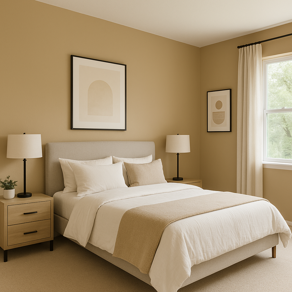
In bedrooms, Safari creates a tranquil and restful atmosphere. Pair it with soft whites, earthy greens, or muted blues for a soothing space that promotes relaxation. Add plush bedding and natural textures like woven rugs or rattan accents to enhance the overall aesthetic.
Safari can serve as a sophisticated backdrop in kitchens, especially when paired with crisp white cabinetry or natural wood finishes. Its golden undertones work well with brass or copper fixtures, giving the space a warm and welcoming feel.
Create a spa-like retreat with Safari as your wall color. Pair it with creamy whites or soft grays for a clean and serene look, or bring in natural stone elements and greenery for a luxurious, organic vibe.
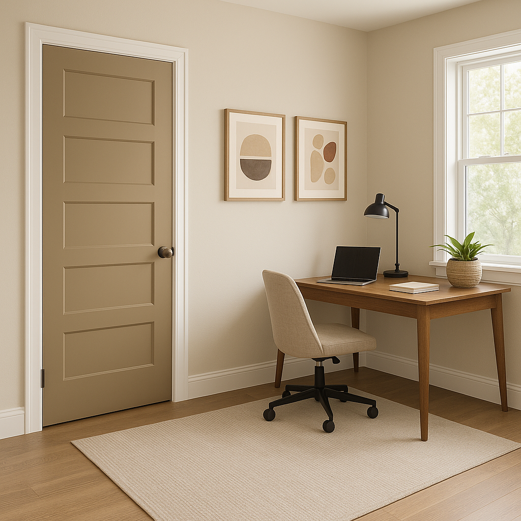
Set the tone for your home with Safari in hallways or entryways. Its warm neutrality ensures a welcoming first impression while providing an ideal canvas for showcasing artwork or decorative accents.
If you’re looking to add depth without overwhelming the room, Safari works wonderfully as an accent color. Pair it with lighter neutrals or complementary shades like Urbane Bronze for a striking yet balanced look.
Sherwin-Williams Safari (SW 7697) is more than just a paint color—it's an embodiment of understated elegance and warmth. Its versatility, paired with its ability to adapt to various lighting conditions and styles, makes it an excellent choice for both residential and commercial settings. Whether you’re designing a modern, traditional, or transitional space, Safari provides a foundation of timeless beauty and effortless sophistication.
If you’re searching for a warm neutral that blends seamlessly with a variety of coordinating colors while enhancing the overall atmosphere of your space, Sherwin-Williams Safari is a fantastic option to consider.
Note: These images were all generated with AI, there may be inaccurate color results. Please only use a general reference to get a rough idea of what a color may look like, we will continue to generate new images to improve accuracy.
View Colors Only by Brand (No Imagery):
Sherwin-Williams
|
Benjamin-Moore
|
Behr
|
Valspar
Live on the Eastern Slope of Colorado and looking for a local painting professional, check out all our painting services and reach out for a free estimate.
Copyright © 2026 : Wild Fox Painting Inc. : 12435 Mead Way, Littleton, CO 80125


