Sherwin-Williams Brandywine (SW 7710) is a rich, inviting red that exudes sophistication and warmth. Perfectly balanced between bold and elegant, this color is an excellent choice for those looking to make a statement while maintaining a sense of refinement in their space. With its deep, wine-like hue, Brandywine evokes feelings of comfort and luxury, making it a versatile option for a variety of interiors.
Brandywine is not just a plain red—it has warm brown undertones that soften its intensity and make it more approachable. These earthy undertones add depth to the color, giving it a slightly rustic charm while ensuring it doesn’t feel overly vibrant or stark. The subtle warmth in Brandywine makes it ideal for creating cozy environments that still have a touch of drama.
Brandywine pairs beautifully with a range of colors, allowing for dynamic and balanced palettes. Here are some coordinating colors that complement its rich tone:
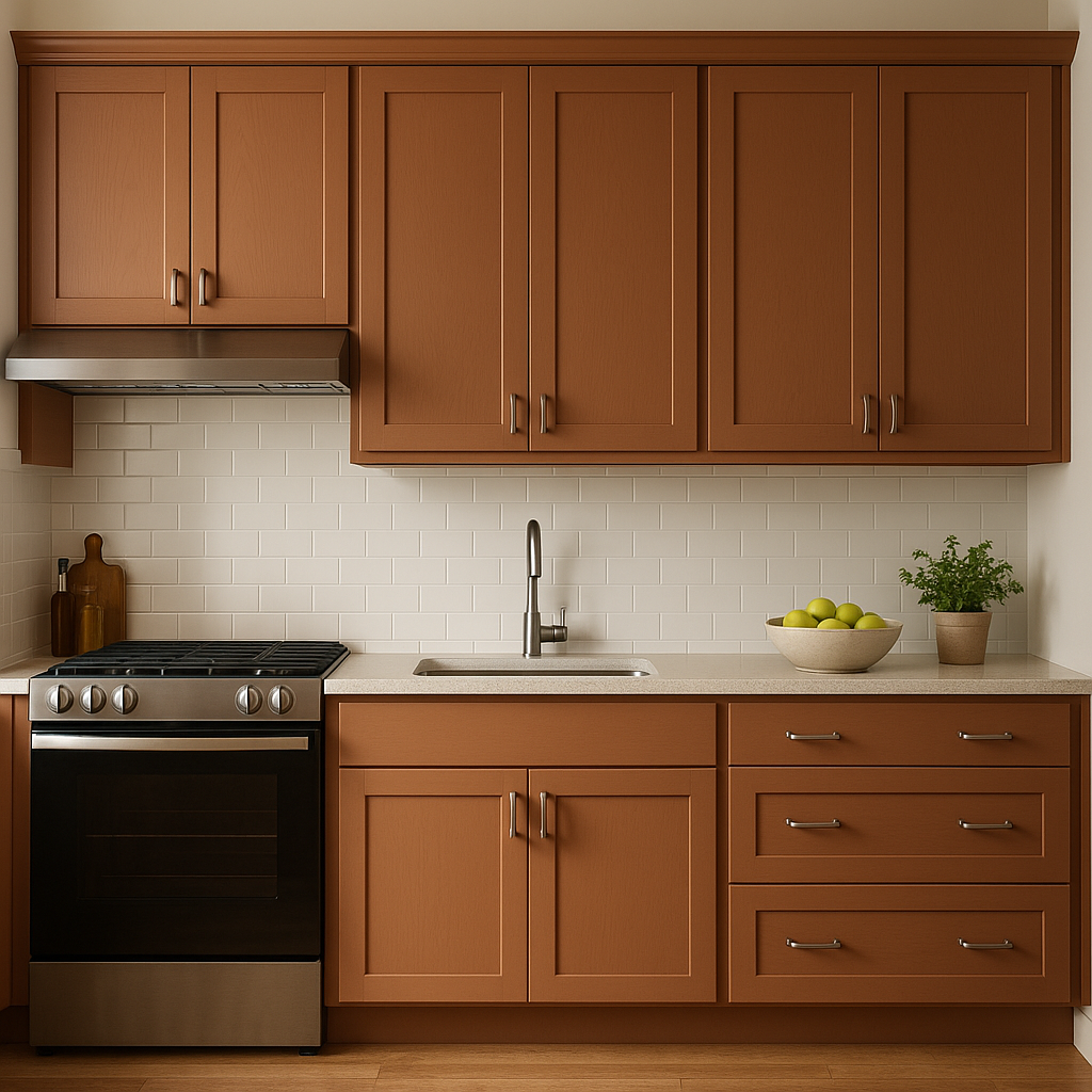
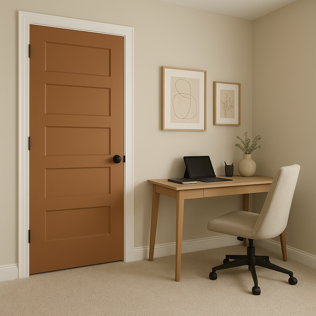
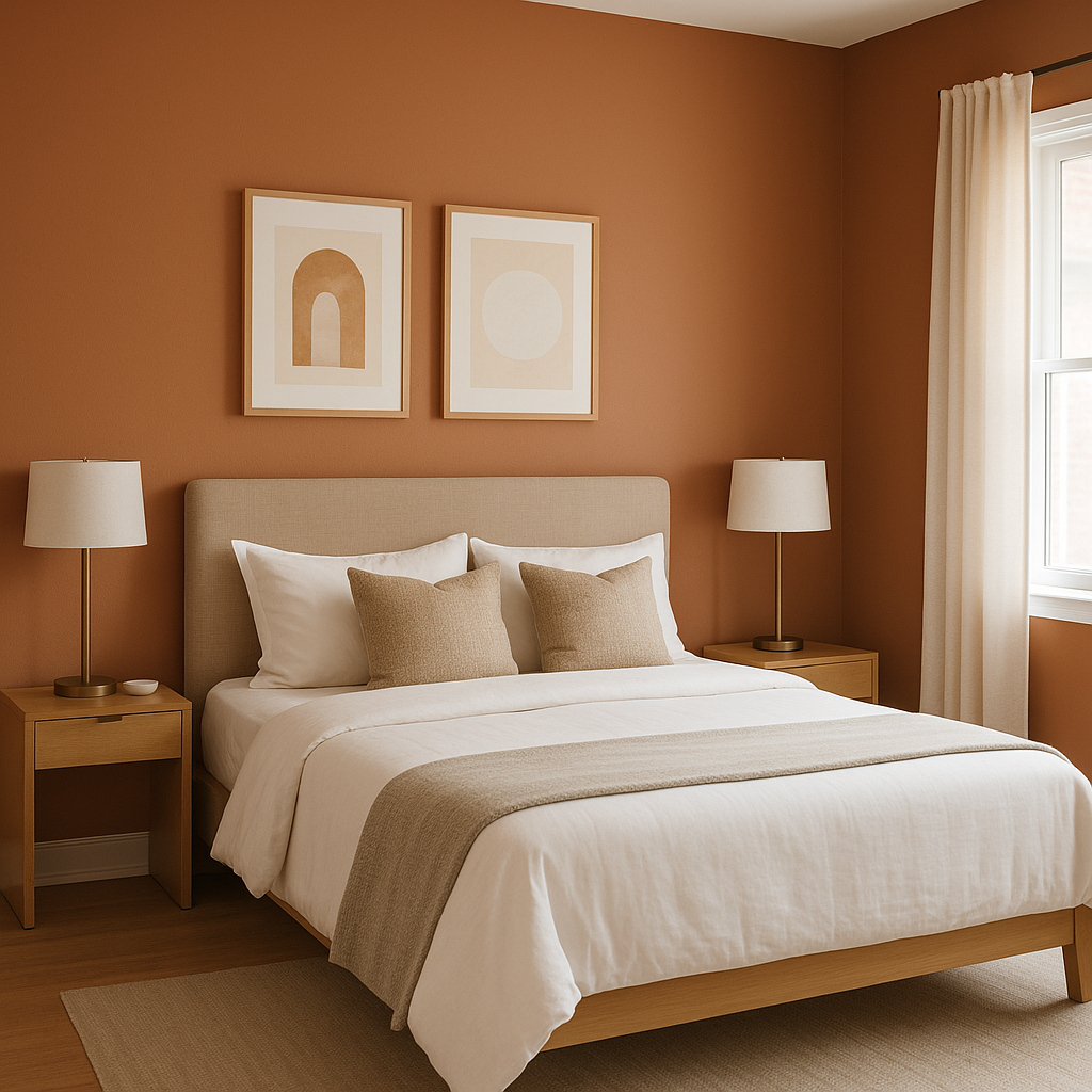
Brandywine’s bold yet refined character makes it suitable for a range of spaces and applications. Here are some excellent ways to incorporate this striking color:
Sherwin-Williams Brandywine (SW 7710) is more than just a paint color—it's a design statement that brings warmth, elegance, and drama to any interior. Whether used sparingly as an accent or boldly across larger areas, Brandywine is a versatile choice that elevates spaces with its timeless charm.
Note: These images were all generated with AI, there may be inaccurate color results. Please only use a general reference to get a rough idea of what a color may look like, we will continue to generate new images to improve accuracy.
View Colors Only by Brand (No Imagery):
Sherwin-Williams
|
Benjamin-Moore
|
Behr
|
Valspar
Live on the Eastern Slope of Colorado and looking for a local painting professional, check out all our painting services and reach out for a free estimate.
Copyright © 2026 : Wild Fox Painting Inc. : 12435 Mead Way, Littleton, CO 80125


