Sherwin-Williams Travertine (SW 7722) is an exquisite neutral paint color that offers the perfect balance of warmth and versatility. Named after the luxurious natural stone, Travertine embodies the timeless elegance and understated sophistication that many homeowners and designers seek. Its soft, creamy beige hue creates a tranquil backdrop, making it an ideal choice for a variety of interior styles, from classic to modern, rustic to contemporary.
Travertine boasts subtle yellow and golden undertones that infuse warmth into any space. These undertones ensure the paint color doesn’t feel flat or cool, making it a welcoming choice for rooms that need a touch of coziness. While Travertine is firmly rooted in the beige family, it avoids looking overly yellow or orange, maintaining its refined neutrality. This delicate balance allows it to complement a wide range of furnishings, decor styles, and lighting conditions.
The undertones of Travertine shine brightest in spaces with ample natural light. In such environments, the color appears slightly lighter and more luminous, while under artificial lighting, its warm beige notes remain grounded and serene. This adaptability ensures that Travertine works beautifully across different times of day and in various lighting scenarios.
Sherwin-Williams Travertine is incredibly flexible when it comes to pairing it with other hues. Whether you're looking to create a monochromatic palette or introduce contrasting colors, here's a list of coordinating shades that harmonize effortlessly with Travertine:
Complementary Neutrals: Pair Travertine with creamy whites like Sherwin-Williams Alabaster (SW 7008) or Pure White (SW 7005) to create a soft and seamless look. These shades enhance the warmth of Travertine without overpowering it.
Earthy Accents: For a grounded, nature-inspired palette, consider deeper browns like Sherwin-Williams Turkish Coffee (SW 6076) or rich greens such as Sherwin-Williams Clary Sage (SW 6178). These earthy tones complement Travertine’s golden undertones beautifully.
Muted Blues and Grays: To introduce a subtle contrast, opt for soft blues like Sherwin-Williams Rainwashed (SW 6211) or warm grays like Sherwin-Williams Repose Gray (SW 7015). These cooler hues provide a refreshing balance to Travertine’s inherent warmth.
Bold Contrasts: For a pop of drama, pair Travertine with deeper jewel tones like Sherwin-Williams Naval (SW 6244) or Urbane Bronze (SW 7048). This combination creates a sophisticated and striking focal point.
Travertine’s versatility makes it a popular choice for virtually any room in the home. Here are some ways this color can elevate your space:
Travertine is perfect for creating a cozy yet elegant living room. Its warm beige undertones provide a neutral backdrop that allows furniture, artwork, and accents to take center stage. Pair it with plush textures like velvet or linen, and add metallic accents such as brushed gold or bronze for a luxurious finish.
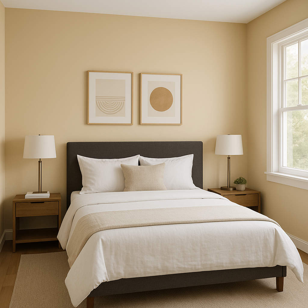
In the bedroom, Travertine fosters a serene and relaxing atmosphere. Coordinate it with soft white bedding, natural wood furniture, and muted pastel accents for a tranquil space that encourages rest and rejuvenation.
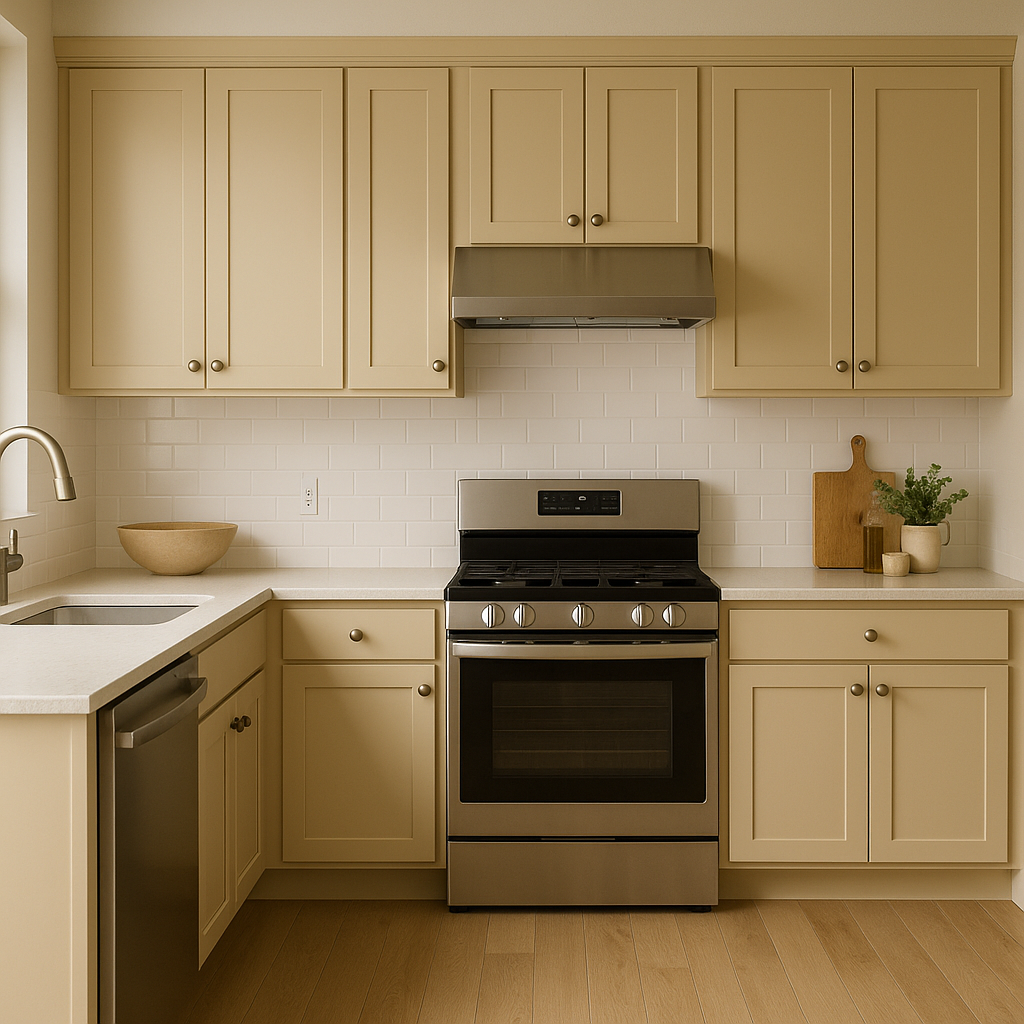
Travertine works beautifully in kitchens and dining areas, especially when paired with warm wood tones and creamy white cabinetry. Add natural stone countertops or backsplash elements to tie in its namesake inspiration and create a cohesive design.
For a spa-like bathroom, Travertine can act as the foundation for a calming retreat. Combine it with crisp whites, natural stone elements, and soft greenery for a fresh and soothing space.
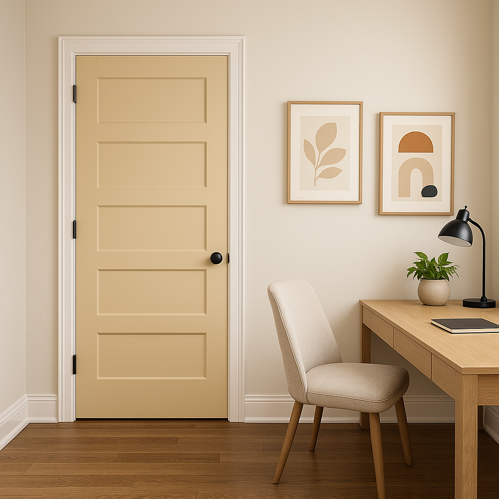
Travertine makes a welcoming choice for hallways and entryways, setting the tone for the rest of your home. Its neutral character allows it to pair seamlessly with bold accents like patterned rugs or statement lighting.
Sherwin-Williams Travertine (SW 7722) is more than just a neutral paint color—it’s a timeless classic that brings warmth, sophistication, and adaptability to any space. Its subtle golden undertones make it approachable and inviting, while its versatility allows for endless design possibilities. Whether you're designing a cozy retreat, a modern haven, or a luxurious statement space, Travertine is a reliable choice that delivers understated elegance every time.
Note: These images were all generated with AI, there may be inaccurate color results. Please only use a general reference to get a rough idea of what a color may look like, we will continue to generate new images to improve accuracy.
View Colors Only by Brand (No Imagery):
Sherwin-Williams
|
Benjamin-Moore
|
Behr
|
Valspar
Live on the Eastern Slope of Colorado and looking for a local painting professional, check out all our painting services and reach out for a free estimate.
Copyright © 2026 : Wild Fox Painting Inc. : 12435 Mead Way, Littleton, CO 80125


