Sherwin-Williams Green Sprout (SW 7728) is a rich, earthy green that effortlessly bridges the gap between modern sophistication and timeless natural beauty. This invigorating hue draws inspiration from lush vegetation and organic landscapes, creating an atmosphere that feels grounded yet alive. Its depth and versatility make Green Sprout a standout choice for interior and exterior spaces alike, offering a dynamic color palette for homeowners and designers.
Green Sprout possesses warm yellow undertones that add a subtle brightness and warmth to its base green color. These undertones prevent the shade from feeling overly dark or moody, giving it a sense of vitality and energy. The yellow undertones also make Green Sprout adaptable to a variety of lighting conditions. In spaces with ample natural light, it appears fresh and vibrant, while in dimmer settings, it takes on a slightly muted, cozy quality. This nuanced balance makes the color suitable for diverse applications.
To create harmonious and visually appealing spaces, pair Green Sprout with complementary or contrasting shades. Here are some ideas for coordinating colors:
Neutral Pairings:
Earthy Complements:
Bold Contrasts:
Green Sprout’s versatility allows it to shine in a variety of spaces and design styles. Whether you’re aiming for a rustic retreat, a modern sanctuary, or a global-inspired aesthetic, this color delivers a strong visual impact.
Green Sprout works beautifully as a wall color for living rooms, creating a cozy yet energetic space where family and friends can gather. Pair it with natural textures like linen, rattan, or reclaimed wood for an organic feel, or combine it with metallic accents for a more refined, contemporary vibe.
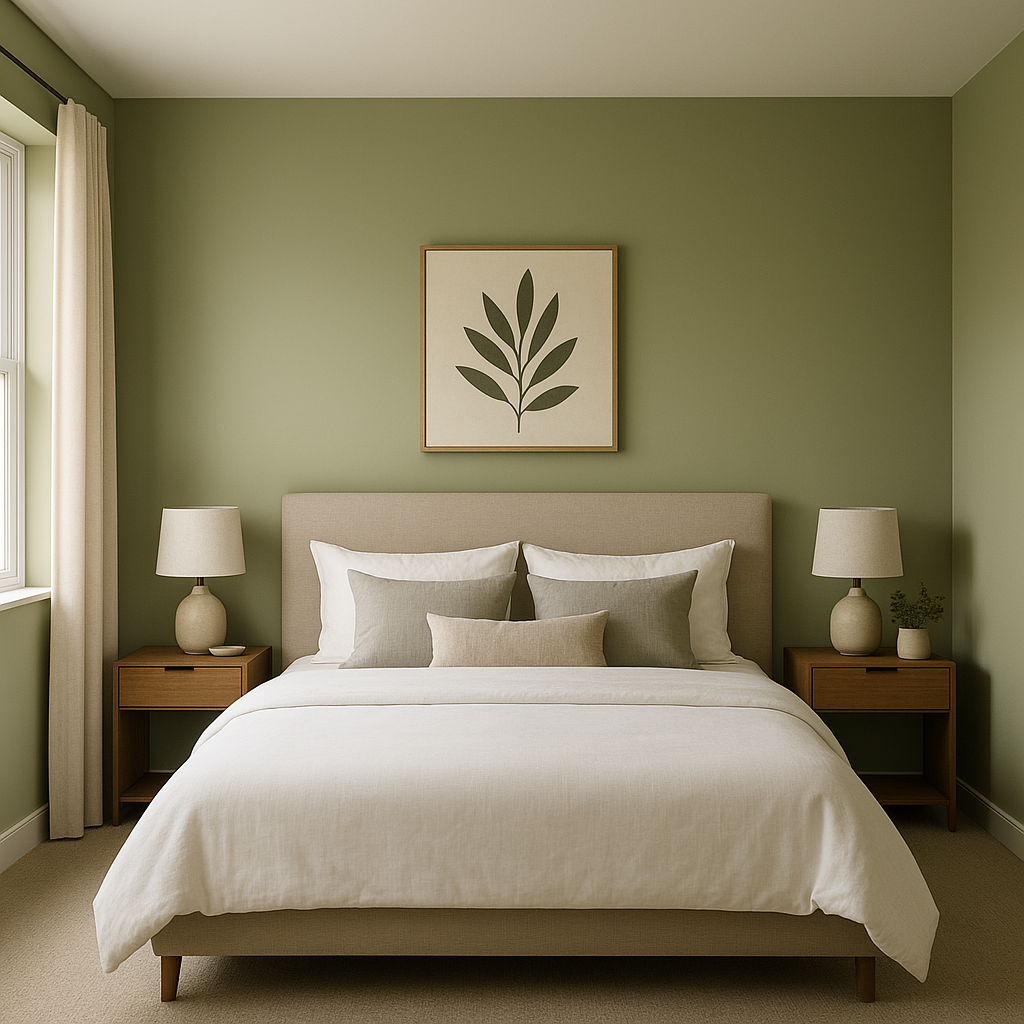
For a tranquil and restorative bedroom, use Green Sprout on accent walls or as the main color. Its soothing connection to nature promotes relaxation. Add soft neutrals like Alabaster or Accessible Beige for bedding and curtains to maintain balance and warmth.
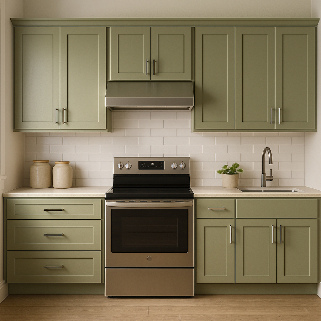
Green Sprout can invigorate kitchens and dining spaces, particularly when paired with white cabinetry or natural wood finishes. Incorporate decorative tiles or black accents to create a modern farmhouse aesthetic. This color also pairs well with brass hardware for a chic, timeless look.
Bring the outdoors in by using Green Sprout in bathrooms. It’s an excellent choice for creating a spa-like atmosphere, especially when combined with crisp whites, natural stone, or greenery elements like potted plants.
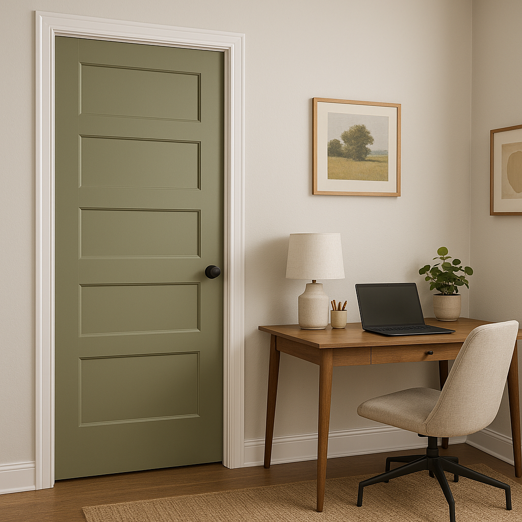
Green Sprout is a fantastic option for exterior siding or as a bold yet inviting front door color. Its organic richness blends seamlessly with surrounding landscapes, making it ideal for homes surrounded by trees or gardens. Pair it with a neutral trim color like Alabaster or Accessible Beige for a polished finish.
Sherwin-Williams Green Sprout is more than just a color—it’s a statement. Its ability to evoke feelings of vitality, warmth, and connection to nature makes it a favorite among designers and homeowners who want their spaces to feel both stylish and grounded. Whether used as a primary wall color or a striking accent, Green Sprout is an exceptional choice for creating inviting interiors and exteriors that stand the test of time.
Note: These images were all generated with AI, there may be inaccurate color results. Please only use a general reference to get a rough idea of what a color may look like, we will continue to generate new images to improve accuracy.
View Colors Only by Brand (No Imagery):
Sherwin-Williams
|
Benjamin-Moore
|
Behr
|
Valspar
Live on the Eastern Slope of Colorado and looking for a local painting professional, check out all our painting services and reach out for a free estimate.
Copyright © 2026 : Wild Fox Painting Inc. : 12435 Mead Way, Littleton, CO 80125


