Sherwin-Williams Laurel Woods (SW 7749) is a deeply sophisticated shade of green that evokes the serenity of lush forests and timeless elegance. Perfectly suited for creating cozy, grounded spaces, this rich hue brings a sense of calm and connection to nature into any interior. Whether you're looking to design a traditional, rustic, or modern space, Laurel Woods delivers versatility with its earthy appeal and distinctive character.
Laurel Woods is a dark green with neutral undertones that lean slightly warm. This subtle warmth prevents it from feeling overly cool or sterile, making it incredibly inviting. The color carries hints of muted olive and forest green, providing depth and richness without overwhelming the space. These undertones allow it to pair beautifully with natural materials like wood, stone, and leather, further enhancing its organic charm.
Sherwin-Williams Laurel Woods offers endless possibilities for coordinating palettes, whether you're designing a monochromatic look or seeking complementary contrasts. Some excellent coordinating colors include:
Neutral Pairings:
Accent Colors:
Monochromatic Options:
The versatility of Sherwin-Williams Laurel Woods makes it an ideal choice for a variety of interior applications. Here are some ways to use this color effectively in your designs:
Laurel Woods is perfect for creating a cozy, inviting atmosphere in living rooms or family spaces. Pair it with warm-toned furniture, soft throws, and natural wood finishes for a rustic yet refined look.
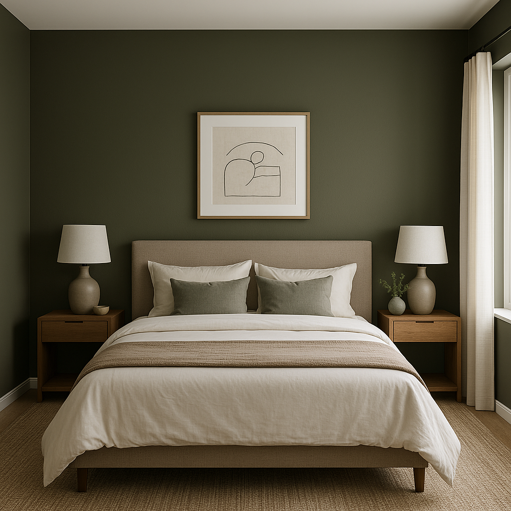
This rich green is an excellent choice for bedrooms, as its calming qualities promote relaxation. Use it as an accent wall behind the bed or throughout the space for a cocoon-like retreat. Pair with creamy whites and muted golds for a luxurious, serene vibe.
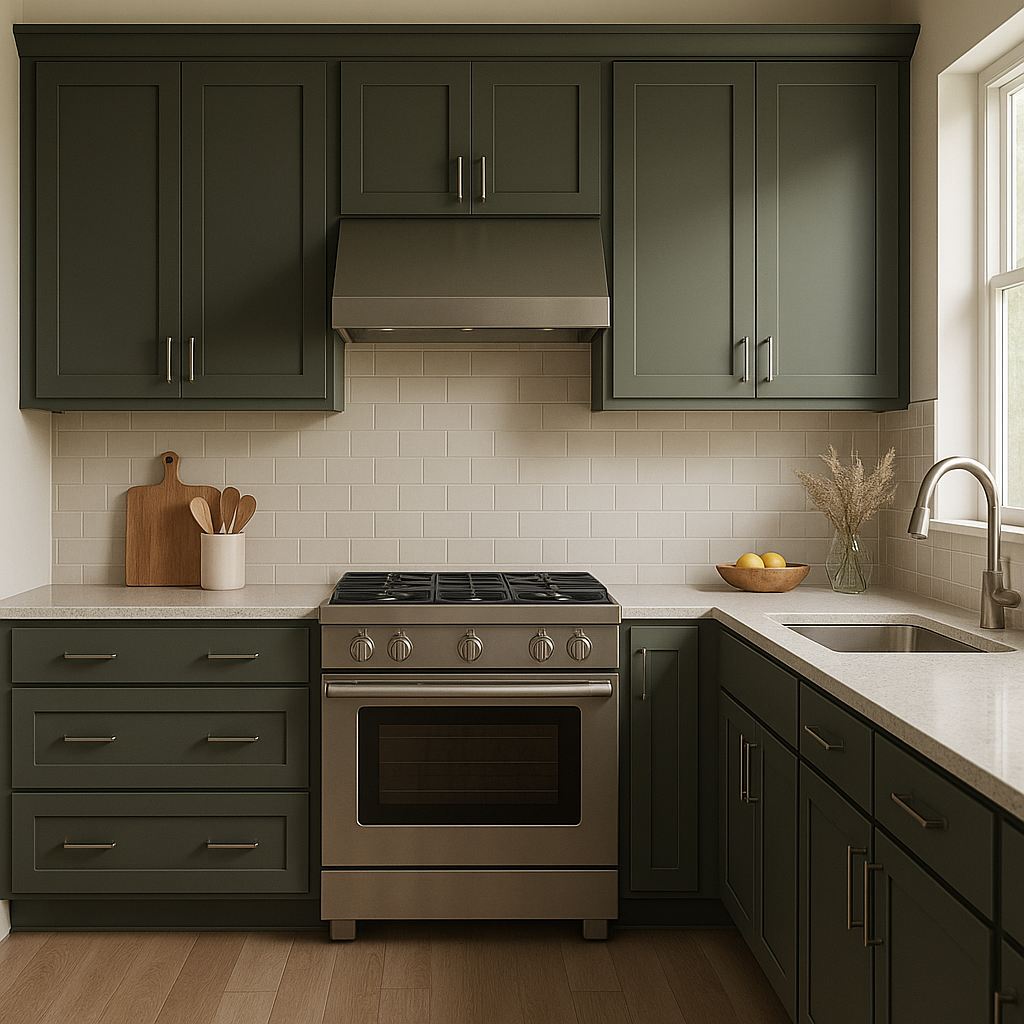
Laurel Woods can add depth and character to kitchens, especially when used on cabinets. Combine it with brass hardware and a light countertop such as quartz or marble to create a stunning balance between boldness and brightness.
For formal dining rooms, Laurel Woods exudes elegance. Pair it with traditional furniture, metallic accents, and ambient lighting to elevate the space.
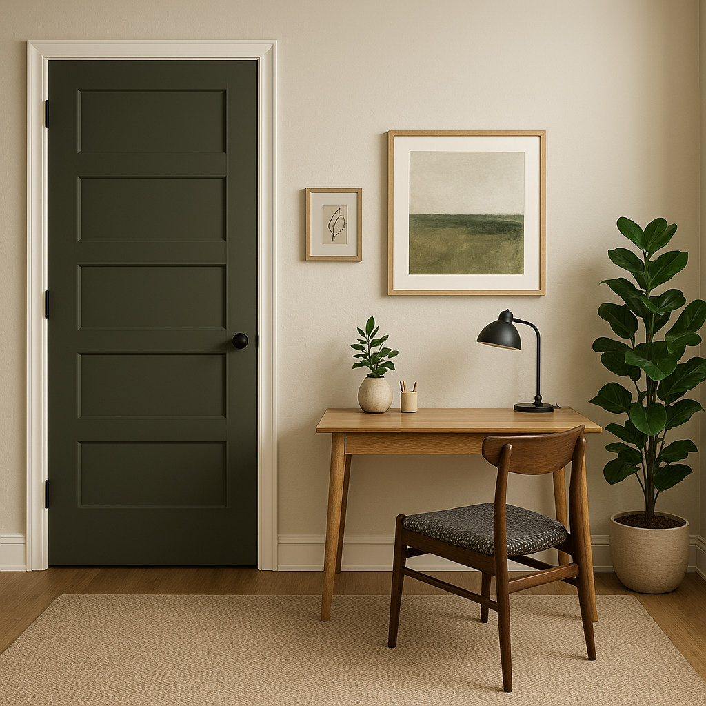
Create a focused and grounding workspace by painting your home office with Laurel Woods. Its earthy undertones encourage productivity while maintaining a sense of calm.
Laurel Woods isn’t just for interiors; it works beautifully as an exterior color for siding, shutters, or front doors. Its rich green tone blends harmoniously with outdoor landscapes, making it an excellent choice for homes surrounded by trees or gardens.
Laurel Woods behaves differently depending on the lighting conditions. In spaces with ample natural light, its green tone becomes more vibrant, while in dim or artificial lighting, it appears deeper and more subdued. Consider layering lighting sources, such as overhead fixtures and table lamps, to bring out the best qualities of this versatile hue.
Sherwin-Williams Laurel Woods (SW 7749) is more than just a paint color—it's an invitation to bring the beauty of nature indoors. With its rich, grounded green, subtle undertones, and endless versatility, this timeless shade is a designer's dream for crafting serene yet striking spaces. Whether you're refreshing a single room or redesigning your entire home, Laurel Woods is sure to leave a lasting impression.
Note: These images were all generated with AI, there may be inaccurate color results. Please only use a general reference to get a rough idea of what a color may look like, we will continue to generate new images to improve accuracy.
View Colors Only by Brand (No Imagery):
Sherwin-Williams
|
Benjamin-Moore
|
Behr
|
Valspar
Live on the Eastern Slope of Colorado and looking for a local painting professional, check out all our painting services and reach out for a free estimate.
Copyright © 2026 : Wild Fox Painting Inc. : 12435 Mead Way, Littleton, CO 80125


