Sherwin-Williams Dakota Wheat (9023) is a timeless neutral paint color that exudes warmth and subtle sophistication. Its soft golden-beige hue creates an inviting atmosphere, making it perfect for both residential and commercial interiors. This versatile shade balances earthy richness with understated elegance, making it a favorite among homeowners and interior designers alike.
Dakota Wheat carries warm undertones of muted gold and beige, lending it a cozy yet refined character. The golden undertones add a touch of brightness and vitality, making spaces feel welcoming without overwhelming the design. These undertones also complement a variety of palettes, ensuring that Dakota Wheat remains adaptable to both traditional and contemporary styles.
While it leans warm overall, the color is nuanced enough to avoid appearing overly yellow. Its subtle beige foundation tempers the warmth, making it an ideal choice for creating harmony in interior spaces.
Dakota Wheat pairs beautifully with a wide range of coordinating colors, allowing for endless design possibilities. Here are some suggestions to inspire your next project:
Dakota Wheat’s balance of warmth and neutrality makes it a highly versatile choice for various applications throughout the home. Here are some ideas to make the most of this inviting shade:
Dakota Wheat is an excellent choice for living rooms and family rooms, where its golden-beige tones create a welcoming environment. Pair it with warm wood furniture and textured fabrics, such as linen or jute, for a relaxed yet elegant aesthetic. Add pops of color through throw pillows or artwork to personalize the space.
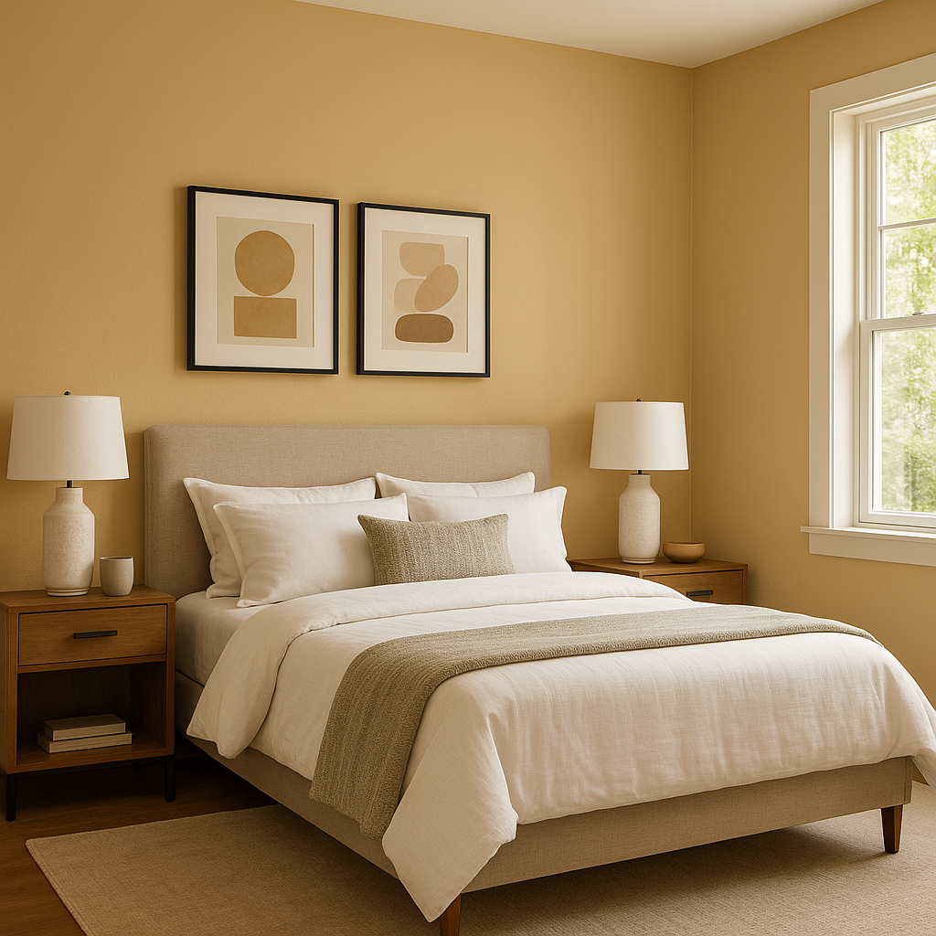
Create a soothing retreat by using Dakota Wheat in bedrooms. Its warm undertones foster a sense of comfort and relaxation. Combine it with soft whites like Alabaster for trim and bedding to keep the space light and airy. Incorporate subtle metallics like brushed gold or bronze in lighting and decor for added sophistication.
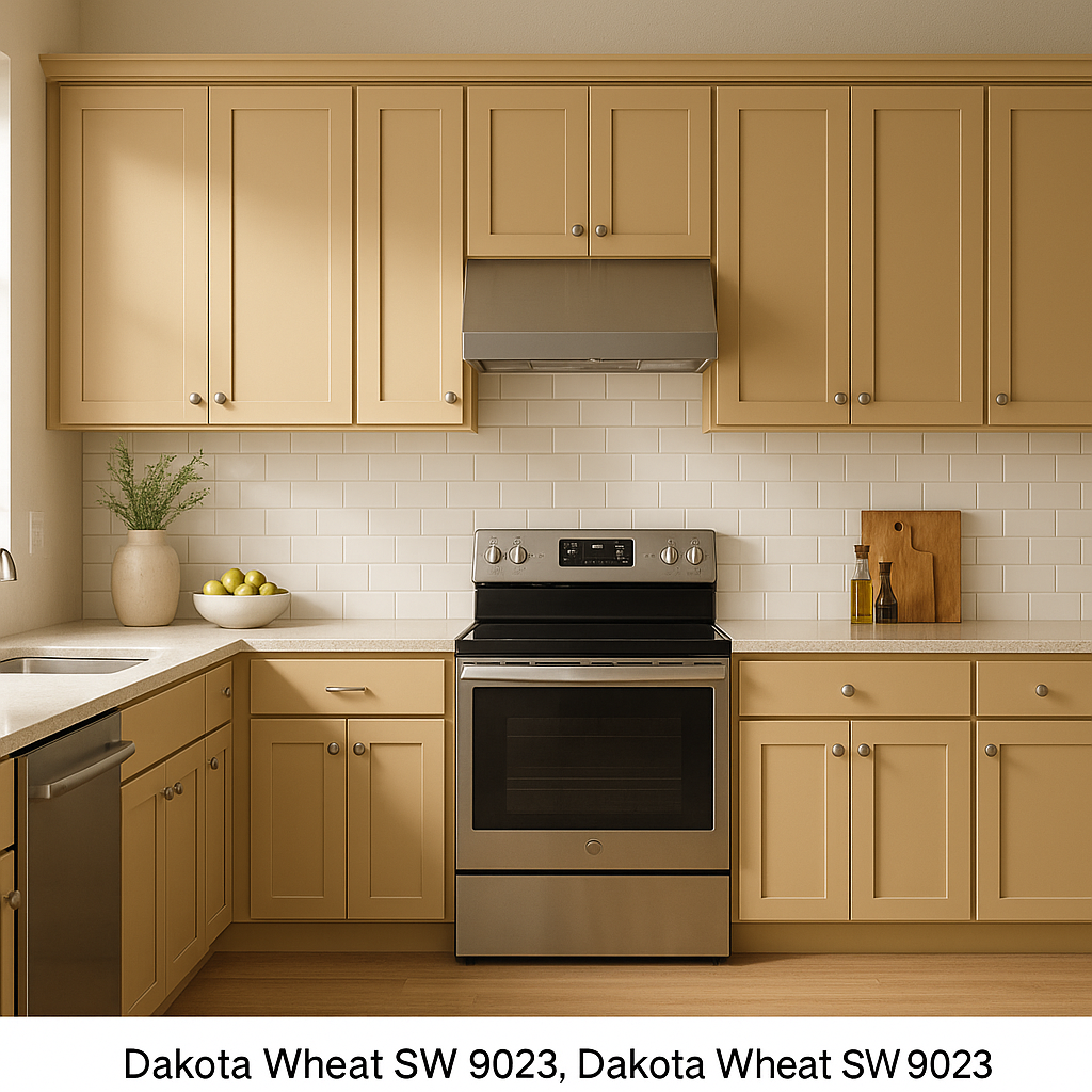
Dakota Wheat shines in kitchens and dining rooms, where its warmth encourages conviviality. Pair it with crisp white cabinetry for a clean and classic look, or opt for darker woods to emphasize a rustic, farmhouse-inspired vibe. Adding coordinating shades like Rosemary or Urbane Bronze to dining chairs or accent walls can enhance the visual interest.
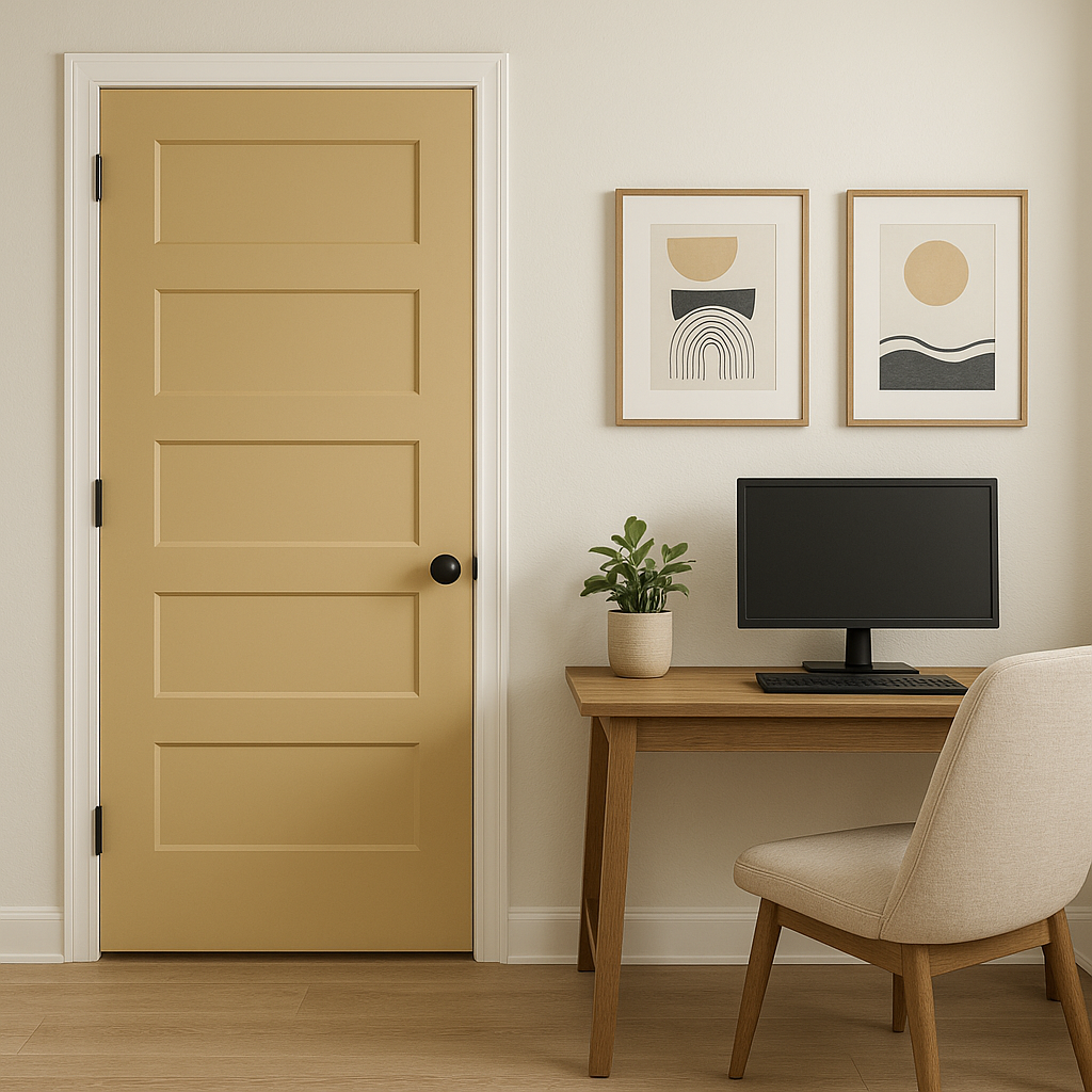
For hallways and entryways, Dakota Wheat provides a welcoming first impression. Its neutral yet warm hue works beautifully with natural light, making transitional spaces feel more inviting. Use coordinating colors like Accessible Beige or Toasty for trim to create a seamless flow throughout your home.
Dakota Wheat is equally suited for commercial environments such as offices, boutique shops, or cafes. Its approachable warmth fosters a sense of comfort while remaining professional and polished. Pair it with Urbane Bronze for a modern, sophisticated look or with Rosemary for a natural, organic vibe.
Sherwin-Williams Dakota Wheat (9023) is more than just a paint color—it’s a foundation for creating spaces that feel warm, balanced, and timeless. Its ability to complement a wide range of coordinating colors and design styles makes it a go-to choice for interior designers who want to achieve a harmonious, inviting aesthetic.
Whether you’re refreshing a single room or designing an entire home, Dakota Wheat offers the versatility and warmth needed to elevate your space while ensuring it remains approachable and livable. Its soft golden-beige tones create a perfect backdrop for layering textures, colors, and decor, helping you craft a space that feels uniquely yours.
Note: These images were all generated with AI, there may be inaccurate color results. Please only use a general reference to get a rough idea of what a color may look like, we will continue to generate new images to improve accuracy.
View Colors Only by Brand (No Imagery):
Sherwin-Williams
|
Benjamin-Moore
|
Behr
|
Valspar
Live on the Eastern Slope of Colorado and looking for a local painting professional, check out all our painting services and reach out for a free estimate.
Copyright © 2026 : Wild Fox Painting Inc. : 12435 Mead Way, Littleton, CO 80125


