Sherwin-Williams Pale Moss (9027) is a beautifully soft, muted green that evokes feelings of tranquility and harmony. With its subtle earthy undertones, this shade is perfectly suited for creating serene environments that feel grounded yet sophisticated. Whether you're designing a nature-inspired retreat or adding a touch of organic elegance to your home, Pale Moss offers unmatched versatility and charm.
Pale Moss has warm green undertones with a gentle hint of gray, giving it a balanced and neutral quality. These undertones make it an adaptable color that complements a wide range of palettes without overpowering them. The gray influence softens the green, making it a more subdued and versatile choice compared to brighter or more saturated greens. Its undertones help it blend seamlessly into both contemporary and traditional design aesthetics, making it a favorite among interior designers for its timeless appeal.
Pairing Pale Moss (9027) with coordinating colors can amplify its natural beauty and create a cohesive look throughout your space. Consider these complementary shades for a polished design:
These coordinating colors provide endless possibilities for creating a balanced and stylish space tailored to your design preferences.
Pale Moss is a versatile color choice that works well in a variety of settings and design styles. Here are some ideas to inspire its use in your home:
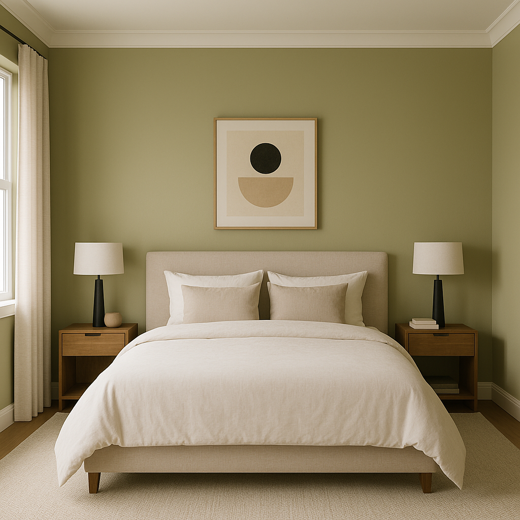
Transform your living room or bedroom into a tranquil sanctuary by using Pale Moss as the primary wall color. Its soothing green tones work beautifully in spaces designed for relaxation. Pair it with soft linens in neutral colors, and incorporate natural textures like wood or woven accents to enhance its organic feel.
Pale Moss is an excellent choice for bathrooms, as its fresh and natural vibe evokes a spa-like atmosphere. Pair it with crisp white tiles and chrome fixtures for a clean, modern aesthetic, or use warm wood accents to create a more rustic retreat.
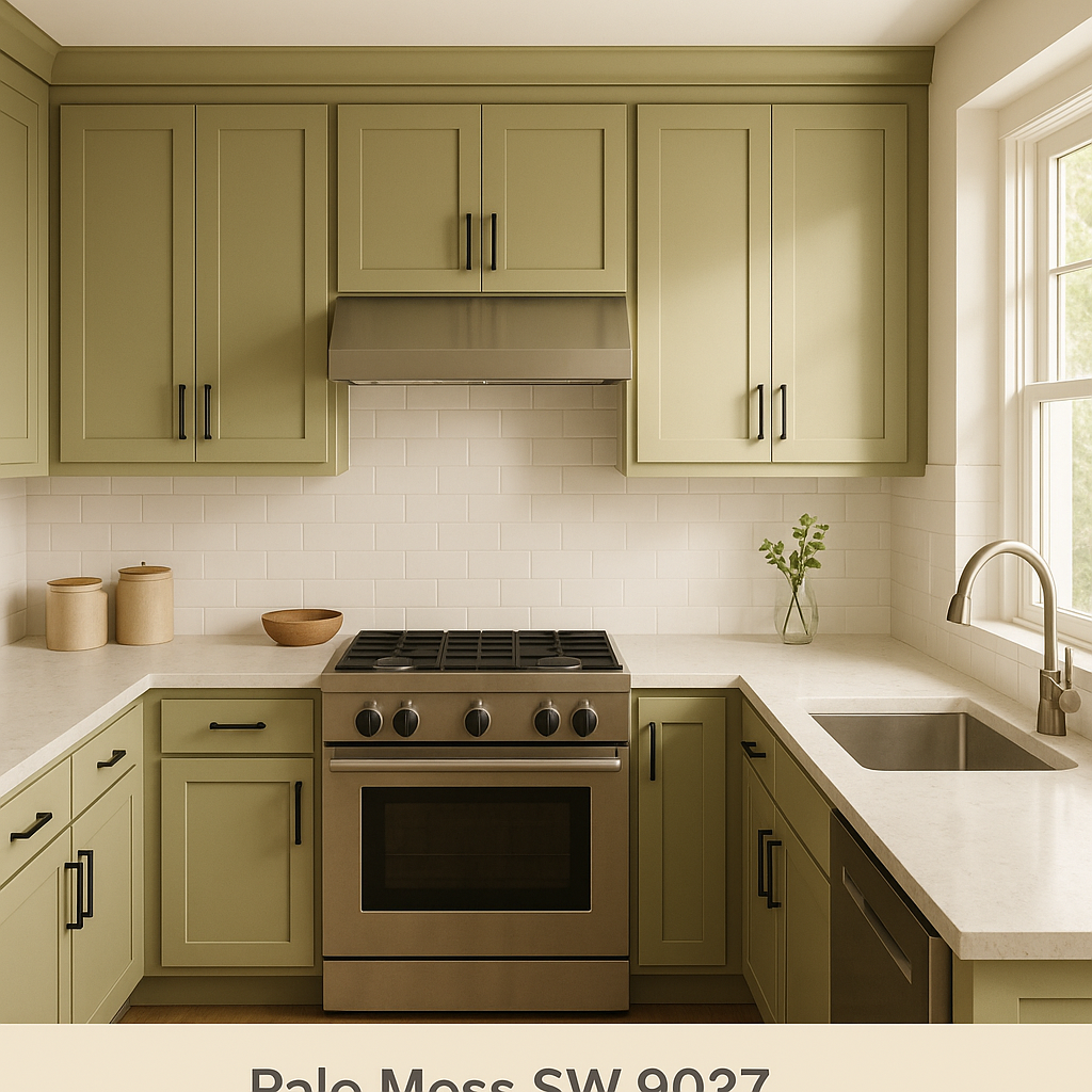
Add a touch of warmth and character to your kitchen by using Pale Moss on cabinets or as a backsplash color. Its muted green shade pairs wonderfully with butcher block countertops, brass hardware, or subway tiles for a timeless design.
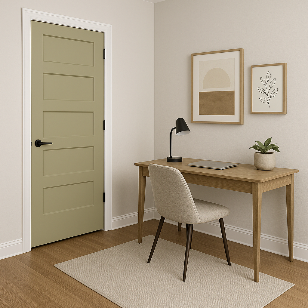
Create a calming yet inspiring workspace with Pale Moss. Its understated elegance helps foster focus and clarity, making it an ideal backdrop for productivity. Pair it with warm wood tones and pops of greenery for a cohesive, energizing design.
If you're not ready to commit to Pale Moss as the primary color for a room, consider using it as an accent wall. Its soft green hue adds depth and interest without overwhelming the space. Pair it with lighter neutrals or contrasting darker shades for a striking visual impact.
Sherwin-Williams Pale Moss is a perfect choice for those seeking a color that’s both soothing and versatile. Its muted green tone with gray undertones makes it adaptable to a range of design styles, from rustic farmhouse to modern minimalist. Whether used as a primary wall color or as an accent, Pale Moss brings an understated elegance to any space. Its ability to coordinate effortlessly with both warm and cool tones makes it a go-to choice for homeowners and designers alike.
Let Sherwin-Williams Pale Moss breathe life into your interiors and create a home that feels connected to the beauty of nature.
Note: These images were all generated with AI, there may be inaccurate color results. Please only use a general reference to get a rough idea of what a color may look like, we will continue to generate new images to improve accuracy.
View Colors Only by Brand (No Imagery):
Sherwin-Williams
|
Benjamin-Moore
|
Behr
|
Valspar
Live on the Eastern Slope of Colorado and looking for a local painting professional, check out all our painting services and reach out for a free estimate.
Copyright © 2026 : Wild Fox Painting Inc. : 12435 Mead Way, Littleton, CO 80125


