Sherwin-Williams Parisian Patina (SW 9041) is a soft, muted green that evokes a sense of refined sophistication and effortless charm. Perfectly blending vintage allure with modern appeal, this versatile hue carries a touch of European elegance inspired by the timeless beauty of Parisian interiors. Whether you're designing a cozy living space or a serene retreat, Parisian Patina offers a gentle yet distinctive character that can complement a variety of aesthetics.
Parisian Patina is a subdued green with warm undertones that lean slightly into the gray spectrum. These undertones ensure that the color remains grounded, avoiding excessive brightness or vibrancy, making it ideal for creating calm and inviting spaces. The subtle gray notes lend an air of neutrality, enabling Parisian Patina to harmonize beautifully with other colors while maintaining its own unique identity.
This hue is particularly suited for spaces that aim to feel tranquil and understated, yet sophisticated. The soft green base is reminiscent of weathered patina, echoing the charm of antique finishes and aged metalwork often found in Parisian decor.
To maximize the potential of Parisian Patina, pair it with complementary shades that enhance its subdued elegance. Some excellent coordinating colors include:
Parisian Patina’s soothing green tones are ideal for living rooms and sitting areas where comfort and relaxation are paramount. Pair it with plush furnishings, vintage decor, and soft textiles to create a cozy yet refined space.
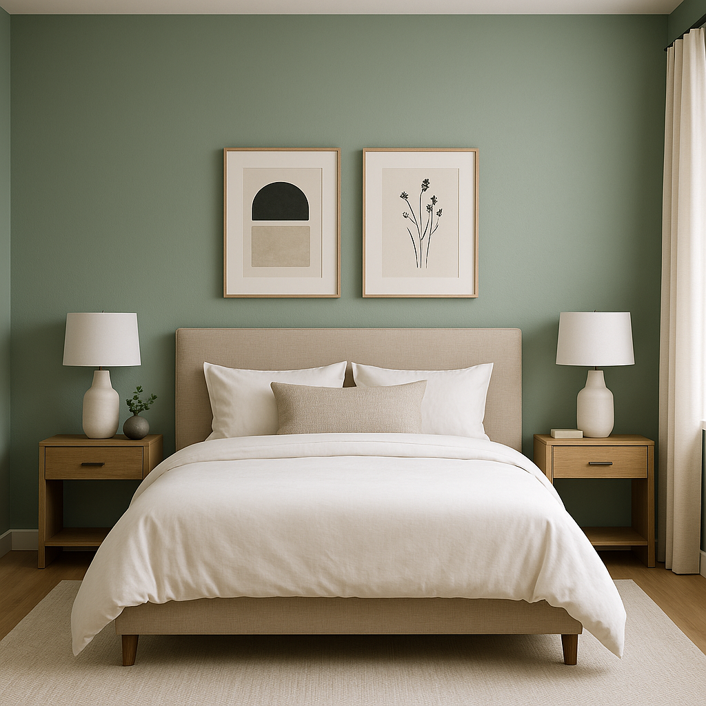
Transform your bedroom into a peaceful retreat with Parisian Patina. Its muted green hue promotes tranquility, making it a perfect choice for walls or accent details. Combine it with warm whites and natural wood finishes for a serene, spa-like atmosphere.
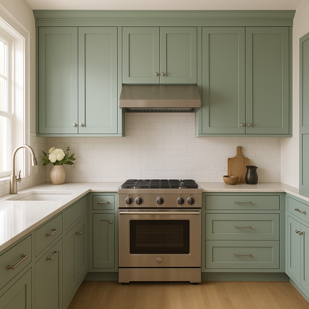
For a fresh yet timeless kitchen or dining room, Parisian Patina works beautifully as a cabinet color or wall shade. Pair it with brass or gold hardware to enhance its antique-inspired charm, or opt for black accents for a modern twist.
Parisian Patina can create a luxurious and calming bathroom environment. Use it on walls alongside crisp white tiles and metallic fixtures to achieve a clean, sophisticated look.
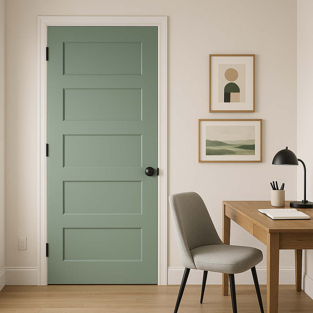
If you prefer a more subtle use of Parisian Patina, consider it for accent walls, built-in shelving, or painted furniture pieces. This approach allows the color’s elegance to shine without overwhelming the space.
Sherwin-Williams Parisian Patina (SW 9041) stands out for its ability to balance charm, sophistication, and versatility. Its soft green tones and understated warmth make it a perfect choice for both traditional and contemporary interiors. Whether used as a primary wall color or a thoughtful accent, Parisian Patina adds a layer of timeless elegance that transforms any space into a sanctuary of style and comfort.
For homeowners and designers seeking a hue that effortlessly bridges the gap between classic and modern, Parisian Patina is a palette-perfect choice that delivers on all fronts.
Note: These images were all generated with AI, there may be inaccurate color results. Please only use a general reference to get a rough idea of what a color may look like, we will continue to generate new images to improve accuracy.
View Colors Only by Brand (No Imagery):
Sherwin-Williams
|
Benjamin-Moore
|
Behr
|
Valspar
Live on the Eastern Slope of Colorado and looking for a local painting professional, check out all our painting services and reach out for a free estimate.
Copyright © 2026 : Wild Fox Painting Inc. : 12435 Mead Way, Littleton, CO 80125


