Sherwin-Williams Verdigreen (SW 9042) is a captivating color that effortlessly bridges the gap between vintage charm and modern sophistication. This soft green hue, reminiscent of verdant landscapes and weathered patinas, radiates tranquility while offering a subtle nod to nature’s timeless beauty. Perfect for creating serene spaces that feel both refreshing and grounded, Verdigreen is a versatile choice for homeowners and designers alike.
Verdigreen is a nuanced green with subtle blue undertones, giving it a cool, calming presence. These undertones imbue the color with a sense of depth and sophistication, making it suitable for both contemporary and traditional settings. The slight bluish tint prevents it from feeling overly earthy, balancing the color so it remains soft and inviting rather than overpowering. This delicate interplay between green and blue ensures Verdigreen feels equally at home in coastal-inspired spaces and lush, garden-like interiors.
Additionally, Verdigreen carries a whisper of gray that tempers its vibrancy and adds a refined, muted quality. This smoky undertone ensures the color remains versatile, adapting beautifully to various lighting conditions and complementing a wide range of palettes.
Sherwin-Williams Verdigreen pairs effortlessly with a variety of colors, whether you're aiming for a monochromatic look or a bold contrast. Here are some coordinating options to inspire your design:
Verdigreen’s versatile and calming nature makes it a go-to choice for a variety of applications. Here are some ideas to inspire your next project:
Transform your living room into a peaceful retreat by using Verdigreen on the walls. Pair it with soft cream furniture and natural wood accents for a cozy, inviting atmosphere. Add pops of navy or coral to introduce depth and personality.
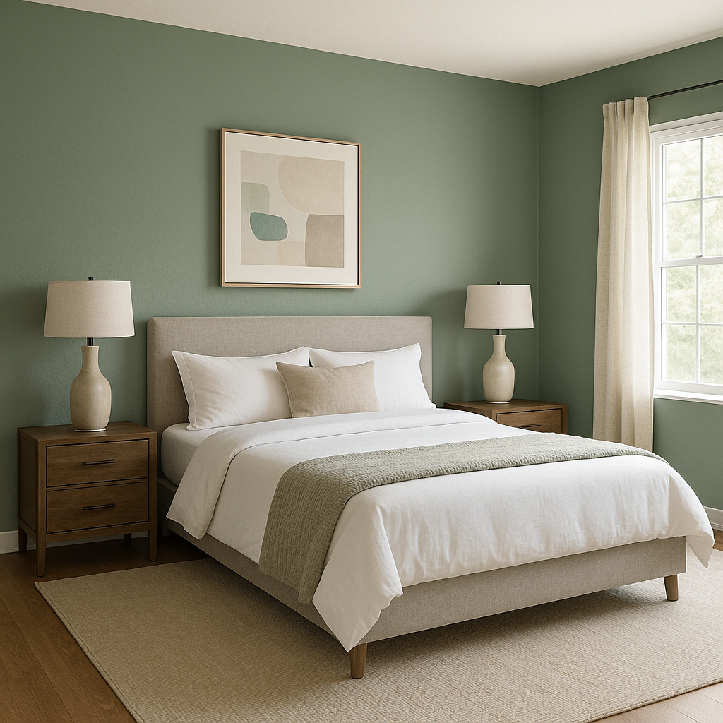
Verdigreen is an excellent choice for bedrooms, as its soothing tones create a restful environment. Use crisp white bedding and touches of gold or brass for an elegant, layered look. For added texture, incorporate woven baskets or linen curtains.
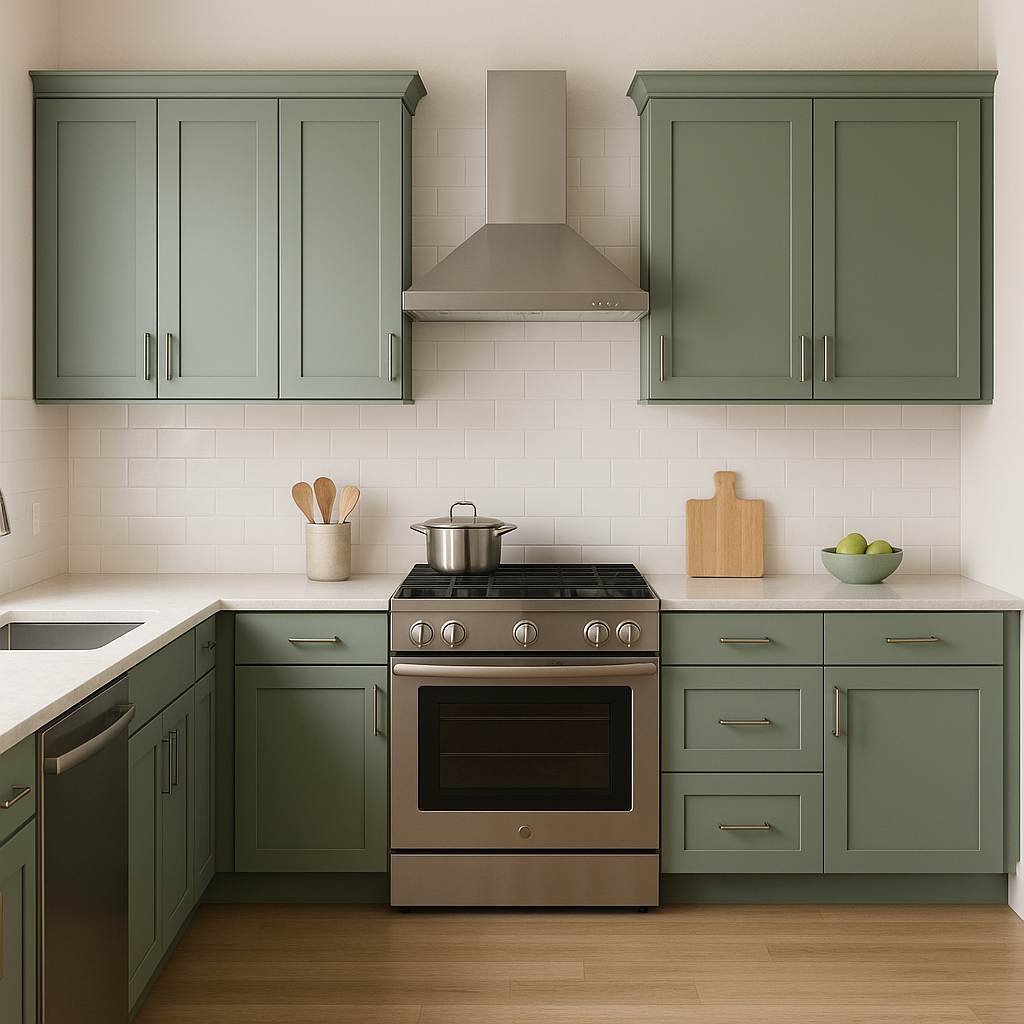
Bring a breath of fresh air to your kitchen by using Verdigreen on cabinetry or walls. Pair it with marble countertops, brushed nickel hardware, and white subway tile for a clean, timeless aesthetic. For a farmhouse vibe, add rustic wood shelves or a butcher block island.
Verdigreen works beautifully in bathrooms, evoking the tranquility of a spa. Combine it with white tiles, chrome fixtures, and soft gray accents for a clean and serene design. For a more dramatic look, pair it with rich navy or dark charcoal tones.
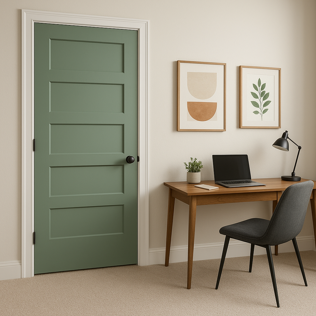
If you prefer a subtle approach, use Verdigreen as an accent wall color to highlight specific areas like a reading nook, fireplace, or entryway. Coordinating it with neutral tones ensures the color stands out without overwhelming the space.
Verdigreen is also stunning on painted furniture pieces like dressers, side tables, or bookshelves. Use it to breathe new life into vintage or antique pieces while maintaining their timeless appeal. Complement with brass or matte black hardware for added elegance.
Sherwin-Williams Verdigreen (SW 9042) is a color that speaks to timelessness and versatility. Its soft, muted green with subtle undertones of blue and gray makes it an adaptable choice for both interiors and exteriors. Whether you’re designing a cozy living space or refreshing a bathroom, Verdigreen brings balance, serenity, and a touch of sophistication to any environment.
From its ability to pair effortlessly with neutrals and rich accents to its calming presence in bedrooms or bathrooms, Verdigreen proves to be a color that harmonizes beautifully with your design vision. Let this refined hue inspire your creativity and transform your space into a haven of timeless beauty.
Note: These images were all generated with AI, there may be inaccurate color results. Please only use a general reference to get a rough idea of what a color may look like, we will continue to generate new images to improve accuracy.
View Colors Only by Brand (No Imagery):
Sherwin-Williams
|
Benjamin-Moore
|
Behr
|
Valspar
Live on the Eastern Slope of Colorado and looking for a local painting professional, check out all our painting services and reach out for a free estimate.
Copyright © 2026 : Wild Fox Painting Inc. : 12435 Mead Way, Littleton, CO 80125


