Sherwin-Williams Bora Bora Shore (SW 9045) is an enchanting color that perfectly captures the tranquil allure of tropical waters. This soft, medium-tone blue evokes feelings of serenity and relaxation, making it an excellent choice for spaces where a calming atmosphere is desired. Whether you're designing a coastal-inspired retreat or simply looking to infuse your home with a touch of breezy elegance, Bora Bora Shore offers a refreshing and versatile option.
Bora Bora Shore features subtle green undertones that add depth and complexity to its blue base. These undertones give the color a slightly aquatic feel, making it reminiscent of the crystalline lagoons found in paradise destinations. The green nuances prevent the shade from feeling overly cool, lending it a balanced warmth that complements a wide range of interiors.
To create a harmonious palette, Bora Bora Shore pairs beautifully with both neutrals and complementary shades.
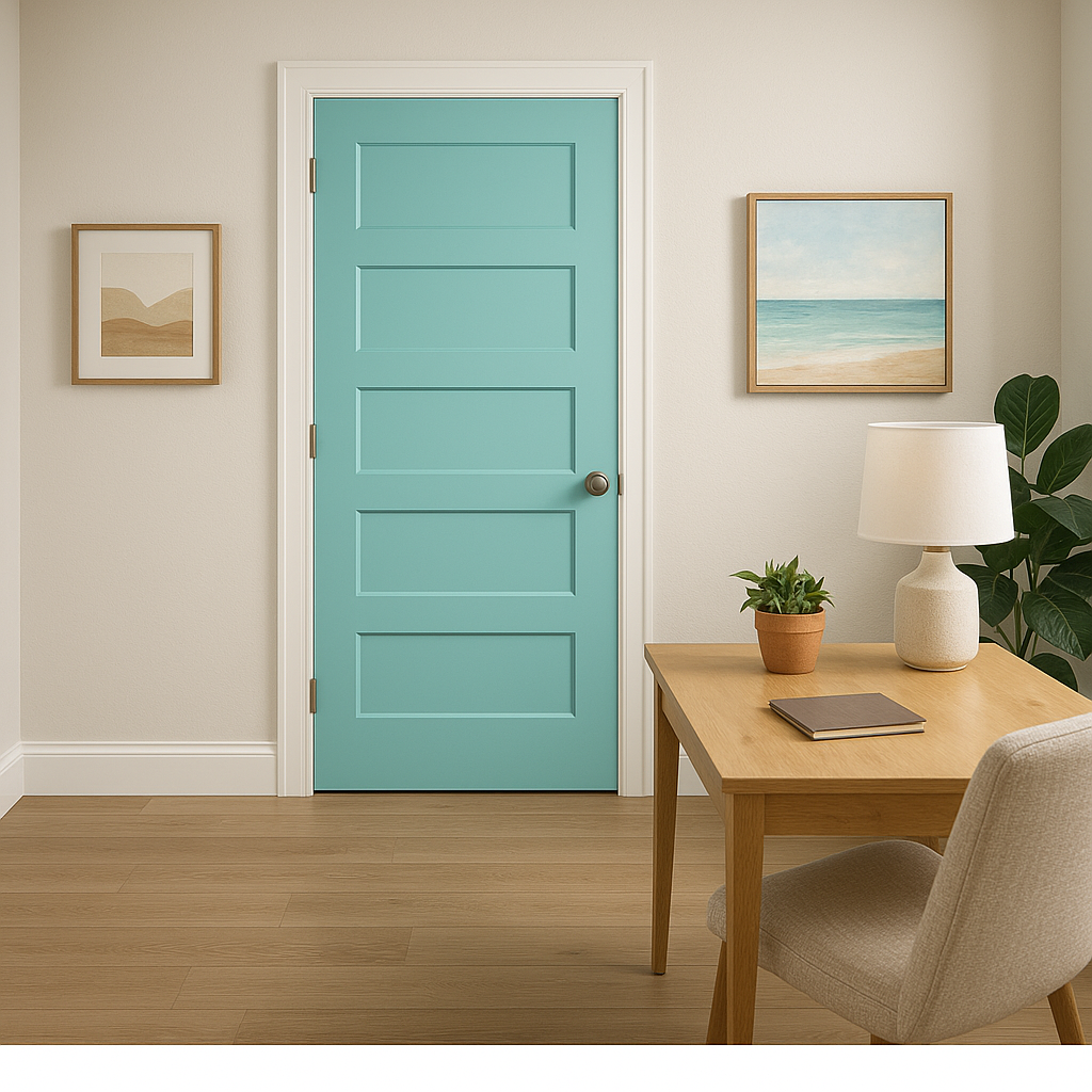
Bora Bora Shore is a versatile color that works well in various settings and design styles. Its soothing qualities make it particularly suitable for spaces where relaxation and comfort are prioritized.
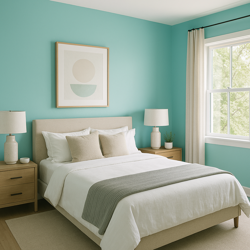
Transform your bedroom into a dreamy sanctuary by using Bora Bora Shore on the walls. Pair it with crisp white bedding, natural wood accents, and soft textiles to create a space that feels both rejuvenating and inviting.
Bring a spa-like ambiance to your bathroom with Bora Bora Shore. This color shines against white subway tiles, marble countertops, or brushed nickel fixtures, creating a clean yet tranquil aesthetic. Add touches of greenery with houseplants to enhance the natural feel.
In living rooms, Bora Bora Shore can act as either a feature wall or a full-room color. Pair it with light neutral tones for a coastal vibe or with deeper blues for a layered, monochromatic look. Incorporate woven textures, driftwood furniture, or coastal-inspired decor for a cohesive design.
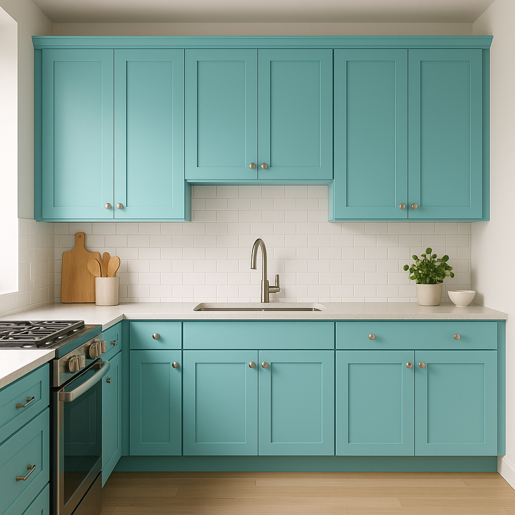
For kitchens and dining areas, Bora Bora Shore works beautifully on cabinetry or as an accent wall. Combine it with white quartz countertops, brass hardware, and natural wood finishes for a chic yet approachable aesthetic.
Extend the breezy charm outdoors by using Bora Bora Shore on patio furniture, planters, or exterior walls. Its coastal essence makes it a natural fit for porches, poolside areas, or garden spaces.
Bora Bora Shore can appear slightly different depending on the lighting conditions in your space. In rooms with ample natural light, the color will lean more toward its vibrant blue tones, while in dimmer spaces, the green undertones may become more pronounced. Consider testing the color in different areas of your home to ensure it achieves the desired effect.
Sherwin-Williams Bora Bora Shore (SW 9045) is a captivating choice for anyone seeking to infuse their home with serenity, beauty, and a subtle nod to nature. Its delicate balance of blue and green undertones, along with its versatility, makes it a timeless option for both modern and traditional interiors.
Note: These images were all generated with AI, there may be inaccurate color results. Please only use a general reference to get a rough idea of what a color may look like, we will continue to generate new images to improve accuracy.
View Colors Only by Brand (No Imagery):
Sherwin-Williams
|
Benjamin-Moore
|
Behr
|
Valspar
Live on the Eastern Slope of Colorado and looking for a local painting professional, check out all our painting services and reach out for a free estimate.
Copyright © 2026 : Wild Fox Painting Inc. : 12435 Mead Way, Littleton, CO 80125


