
Sherwin-Williams Perfect Periwinkle (SW 9065) is a delicate, enchanting shade that perfectly balances the soothing qualities of blue with the playful vibrancy of purple. This color is truly versatile, bringing a sense of calm yet spirited energy to any space. Whether you're designing a cozy bedroom retreat or a sophisticated living room, Perfect Periwinkle offers timeless charm that complements a variety of interior styles.
Perfect Periwinkle carries subtle undertones of lavender and gray, making it both soft and refined. The gentle infusion of purple lends a cheerful, uplifting character, while the gray undertones temper the brightness, keeping the color grounded and versatile. This unique combination creates a hue that feels fresh without being overpowering, making it ideal for spaces where you want both tranquility and a hint of personality.
Perfect Periwinkle pairs beautifully with an array of complementary and contrasting colors. Here are some suggestions for creating a cohesive and harmonious look:
Neutrals: Pair it with warm neutrals like Sherwin-Williams Alabaster (SW 7008) or Anew Gray (SW 7030) for a soft, balanced aesthetic. These subtle tones allow Perfect Periwinkle to shine as the focal point while maintaining a serene atmosphere.
Deep Accents: Add depth and sophistication with rich, grounding colors like Naval (SW 6244) or Urbane Bronze (SW 7048). These darker shades create a dramatic contrast that enhances the vibrancy of Perfect Periwinkle.
Pastel Complements: For a playful and airy palette, consider coordinating Perfect Periwinkle with other soft shades such as Mint Condition (SW 6743) or Lemon Chiffon (SW 6686). This combination works beautifully in cheerful spaces like nurseries or creative studios.
Earthy Greens: Pair with nature-inspired greens such as Evergreen Fog (SW 9130) or Sea Salt (SW 6204) for a calming, organic feel. These hues can bring an element of serenity to any room.
Perfect Periwinkle is a versatile choice that fits seamlessly into various applications across your home or office. Its gentle demeanor makes it ideal for spaces where relaxation and creativity are paramount. Here are some suggested uses:
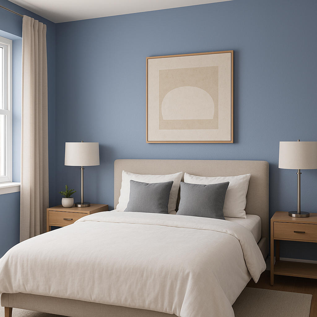
Perfect Periwinkle is a natural fit for bedrooms, offering a peaceful and dreamy ambiance that promotes rest and relaxation. Combine it with soft white linens and plush textures for a timeless look that feels like a serene escape.
Use Perfect Periwinkle in living rooms to create a welcoming yet sophisticated environment. Pair it with modern furniture and metallic accents for a contemporary feel, or opt for rustic wood tones to achieve a farmhouse-inspired charm.
The playful yet calming nature of this hue makes it perfect for nurseries or children's rooms. Its gentle lavender undertones evoke a sense of whimsy without overwhelming the senses, making it a delightful backdrop for young imaginations.
Transform your bathroom into a spa-like retreat with Perfect Periwinkle. Pair it with crisp whites, natural stone, or light gray tiles for an elegant and refreshing space.
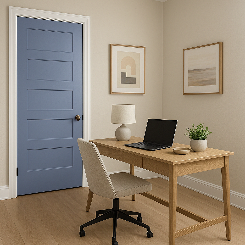
Perfect Periwinkle’s soothing yet inspiring qualities make it an excellent choice for home offices, art studios, or reading nooks. It fosters creativity while maintaining a sense of calm focus.
Like any paint color, Perfect Periwinkle can shift in appearance depending on the lighting conditions in your space. In natural light, its cool blue tones may become more pronounced, while artificial lighting can emphasize the warmer lavender undertones. Be sure to test the color in your space at different times of day to ensure it aligns with your vision.
Sherwin-Williams Perfect Periwinkle (SW 9065) is a truly versatile and beautiful choice for any interior design project. With its soothing undertones, wide range of coordinating colors, and adaptability across different spaces, this color is perfect for creating environments that are both stylish and inviting.
Note: These images were all generated with AI, there may be inaccurate color results. Please only use a general reference to get a rough idea of what a color may look like, we will continue to generate new images to improve accuracy.
View Colors Only by Brand (No Imagery):
Sherwin-Williams
|
Benjamin-Moore
|
Behr
|
Valspar
Live on the Eastern Slope of Colorado and looking for a local painting professional, check out all our painting services and reach out for a free estimate.
Copyright © 2026 : Wild Fox Painting Inc. : 12435 Mead Way, Littleton, CO 80125


