Sherwin-Williams Veri Berri (SW 9069) is a rich, jewel-toned paint color that exudes sophistication and drama, making it a striking choice for interiors. This deep berry hue is perfect for homeowners and designers who want to infuse a space with energy, personality, and a touch of modern elegance. Its luxurious appearance can transform a room into a statement-making masterpiece, while its versatility allows it to pair beautifully with a range of complementary shades.
Veri Berri is a bold and saturated color with distinct red and purple undertones. These undertones give it a warm yet vibrant character, making it feel both inviting and energizing. The red base adds warmth, while the purple notes introduce a subtle coolness, striking a perfect balance. Depending on the lighting, the color can appear slightly more red or lean towards a deeper plum, allowing it to adapt beautifully to various environments.
The versatility of Veri Berri makes it easy to coordinate with a wide range of shades. Here are some suggestions to help you create a cohesive and stunning color palette:
Neutrals: Pair Veri Berri with soft neutrals like Sherwin-Williams Alabaster (SW 7008) or Pure White (SW 7005) to create balance and allow the bold berry hue to shine. These light tones provide contrast and keep the space feeling fresh and open.
Grays: For a modern vibe, consider pairing Veri Berri with cool grays like Repose Gray (SW 7015) or Dovetail (SW 7018). These shades complement the purple undertones while grounding the overall look.
Golds and Yellows: Warm metallics like Sherwin-Williams Goldfinch (SW 6690) add a touch of glamour and luxury, creating a high-impact palette. Incorporating golden accents can elevate the richness of Veri Berri.
Greens: Deep greens like Evergreen Fog (SW 9130) or muted sage tones can harmonize beautifully with Veri Berri, introducing an organic feel to the space. This pairing evokes a sense of nature-inspired sophistication.
Blues: For a bold and eclectic look, pair Veri Berri with navy blues such as Naval (SW 6244). The contrast between the berry hue and deep blue creates a dramatic yet refined aesthetic.
Veri Berri is an excellent choice for spaces where you want to create visual interest and depth. Here are some ways to use this distinctive color effectively:
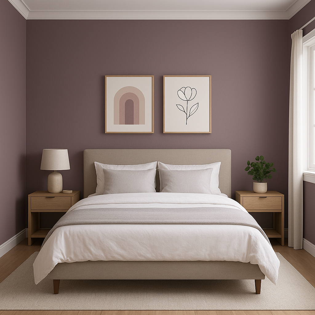
Accent Walls: Add drama to a living room, bedroom, or dining area by using Veri Berri on an accent wall. Its bold tone draws the eye and creates a focal point that anchors the space.
Powder Rooms: Smaller spaces, like powder rooms, are ideal for experimenting with rich, saturated colors. Veri Berri can make these areas feel chic and luxurious while leaving a lasting impression.
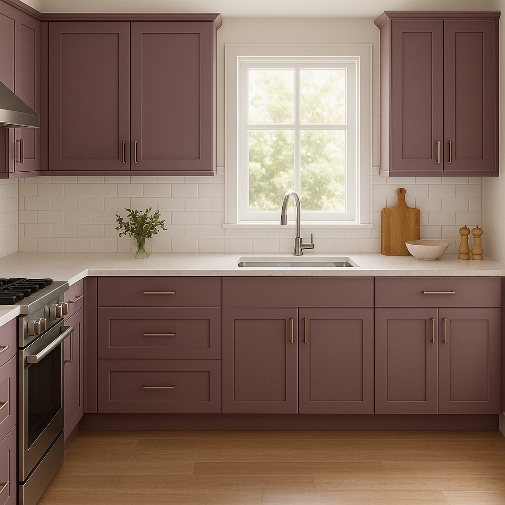
Furniture and Cabinetry: Consider using Veri Berri to paint furniture pieces or cabinetry in kitchens or bathrooms. Paired with brass or gold hardware, it creates an upscale, custom look.
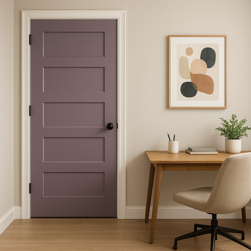
Artistic Spaces: Veri Berri can inspire creativity in spaces like home offices, craft rooms, or studios. Its vibrant yet moody character fosters a stimulating atmosphere.
Bohemian or Eclectic Designs: Incorporate Veri Berri into bohemian or eclectic interiors where bold colors and layered textures are celebrated. It works especially well with patterned fabrics, woven materials, and artisanal decor.
Dining Rooms: Berry tones like Veri Berri are known to evoke feelings of warmth and intimacy, making them a great choice for dining spaces where you entertain guests.
As with any bold paint color, lighting plays a crucial role in how Veri Berri appears in your space. In natural light, the red undertones of the shade become more pronounced, giving it a warm, inviting glow. In artificial lighting, especially cooler LED lights, its purple undertones might become more noticeable, lending a moody sophistication. Always test the color in your space with different lighting conditions to ensure it achieves the desired effect.
Sherwin-Williams Veri Berri (SW 9069) is a true gem for those who want to make a statement with their interior design. Its rich, luscious tones and adaptability allow it to transform any space into one that is both captivating and timeless. Whether used as a bold feature or a subtle accent, Veri Berri brings unparalleled charm and depth to your home.
Note: These images were all generated with AI, there may be inaccurate color results. Please only use a general reference to get a rough idea of what a color may look like, we will continue to generate new images to improve accuracy.
View Colors Only by Brand (No Imagery):
Sherwin-Williams
|
Benjamin-Moore
|
Behr
|
Valspar
Live on the Eastern Slope of Colorado and looking for a local painting professional, check out all our painting services and reach out for a free estimate.
Copyright © 2026 : Wild Fox Painting Inc. : 12435 Mead Way, Littleton, CO 80125


