Sherwin-Williams Rosaline Pearl (SW 9077) is a delicate and refined shade that exudes charm and sophistication. This warm, muted pink is a perfect choice for spaces that require a subtle touch of color without overwhelming the senses. Rosaline Pearl provides a gentle balance between femininity and versatility, making it suitable for a wide variety of design styles, from modern minimalism to classic elegance.
Rosaline Pearl is characterized by its warm, peachy-pink undertones, which lend it a soft and inviting feel. The subtle hints of beige in its base create an understated depth, ensuring that the color doesn’t feel overly vibrant or flashy. These undertones make Rosaline Pearl an approachable and versatile choice that complements both neutral palettes and more colorful schemes. Its warmth ensures that it won’t feel stark in natural or artificial light, making it ideal for spaces that require a cozy and welcoming atmosphere.
Rosaline Pearl pairs beautifully with a range of complementary and coordinating hues. Here are some color pairings that can enhance its appeal:
Neutral Companions:
Bolder Accents:
Earthy Complements:
These coordinating colors allow you to style Rosaline Pearl in a way that suits different moods and themes, from tranquil and airy to bold and dynamic.
Rosaline Pearl’s soft, warm pink tone makes it an excellent choice for spaces where you want to evoke comfort, elegance, or a subtle touch of romance. Here are some ideas for incorporating Rosaline Pearl into your home or workspace:
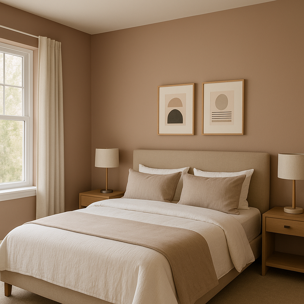
Bedrooms:
Create a serene retreat by using Rosaline Pearl as a wall color. Pair it with crisp white linens and gold or brass accents for a luxurious and calming atmosphere.
Living Rooms:
Rosaline Pearl can set the stage for a cozy yet sophisticated living area. Combine it with textured neutrals, such as taupe or beige furniture, and add pops of navy or green for balance.
Nurseries or Kids’ Rooms:
Its soft pink tone makes it ideal for children’s spaces, providing a playful yet refined backdrop that can grow with them.
Bathrooms:
Use Rosaline Pearl to add warmth and elegance to a bathroom. Pair it with marble countertops, brushed nickel fixtures, and creamy white trim for a spa-like feel.
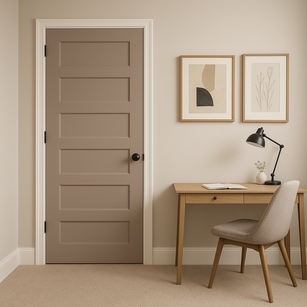
Accent Walls:
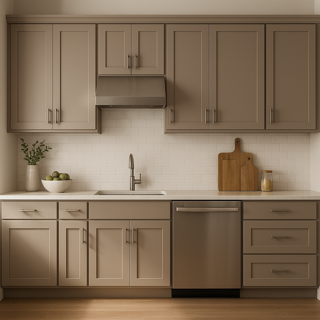
If you want to introduce color without committing to an entire room, Rosaline Pearl works beautifully as an accent wall. It can add depth and personality to spaces like dining rooms, entryways, or home offices.
Furniture and Décor Updates:
Rosaline Pearl isn’t just for walls—it can be used on accent furniture pieces, such as a painted dresser or side table, to add character without overwhelming the room.
Rosaline Pearl is a color that thrives in spaces with both natural and artificial light. In areas with ample sunlight, the peachy undertones become more prominent, giving the room a cheerful glow. Under softer artificial lighting, it leans more toward its beige-pink base, creating a cozy and intimate ambiance. Its adaptability ensures that it will look stunning in various lighting conditions.
Sherwin-Williams Rosaline Pearl (SW 9077) is more than just a paint color—it’s an invitation to create spaces that feel timeless, inviting, and elegant. Whether you're designing a calming bedroom, a chic living space, or an inspired home office, Rosaline Pearl provides the perfect balance of warmth and subtlety. With its versatile undertones and compatibility with a wide range of coordinating colors, this hue opens up endless possibilities for creative expression.
Note: These images were all generated with AI, there may be inaccurate color results. Please only use a general reference to get a rough idea of what a color may look like, we will continue to generate new images to improve accuracy.
View Colors Only by Brand (No Imagery):
Sherwin-Williams
|
Benjamin-Moore
|
Behr
|
Valspar
Live on the Eastern Slope of Colorado and looking for a local painting professional, check out all our painting services and reach out for a free estimate.
Copyright © 2026 : Wild Fox Painting Inc. : 12435 Mead Way, Littleton, CO 80125


