Sherwin-Williams Redend Point (SW 9081) is a captivating neutral with a warm, earthy undertone that evokes a sense of comfort and serenity. This versatile hue is rooted in nature, combining elements of soft terracotta and subtle blush tones to create a modern yet timeless aesthetic. Whether you're designing a cozy living space or refreshing your kitchen cabinets, Redend Point delivers an inviting and grounded feel that works beautifully across a variety of styles.
Redend Point features understated red and brown undertones, giving it a soft, organic quality that feels both sophisticated and approachable. The faint blush notes add a hint of warmth, making it an ideal choice for creating spaces that feel nurturing and restorative. These undertones allow Redend Point to adapt beautifully to different lighting conditions, appearing slightly richer in warm light and more subdued in cooler environments.
The color’s subtle complexity makes it a perfect neutral for spaces where you want a hint of personality without overwhelming the overall design. It balances beautifully between earthy and refined, offering a grounded base for a variety of palettes.
Sherwin-Williams Redend Point pairs effortlessly with a range of complementary colors, making it an excellent choice for creating harmonious interiors. Consider these coordinating options:
Neutral Pairings:
Accent Colors:
Vibrant Contrasts:
When paired with natural materials like warm wood tones, brushed brass, or woven textures, Redend Point shines as the perfect backdrop for a curated, organic design.
Redend Point’s understated elegance and versatility make it ideal for a variety of applications in both residential and commercial spaces. Here’s how to use it effectively:
Create a cozy, inviting atmosphere by using Redend Point on walls in living rooms or family spaces. Its warmth pairs beautifully with textured rugs, neutral furniture, and soft lighting for a serene environment.
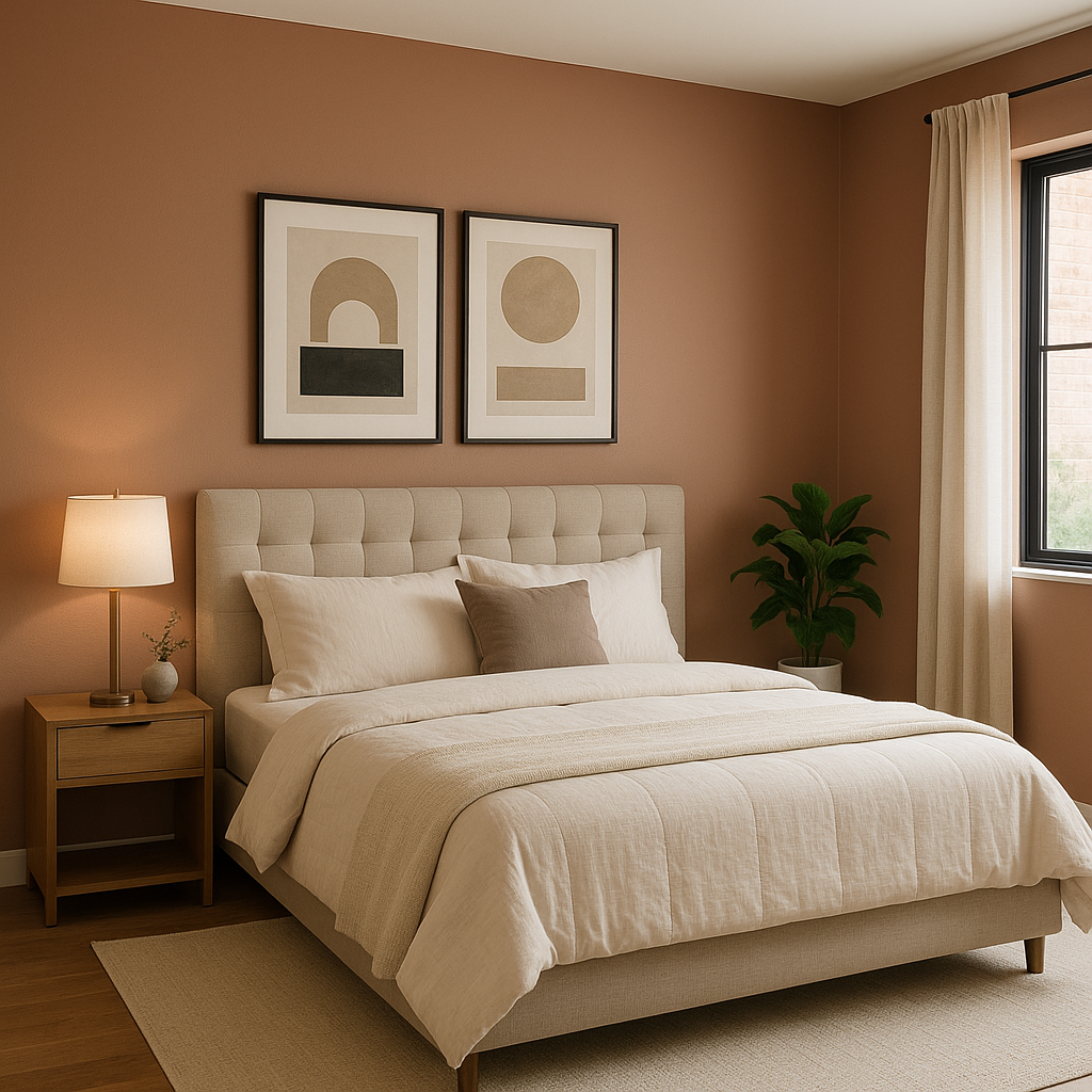
For a restful retreat, consider Redend Point for bedroom walls or accent areas. Pair it with soft linens in cream, taupe, or muted green to craft a calming sanctuary.
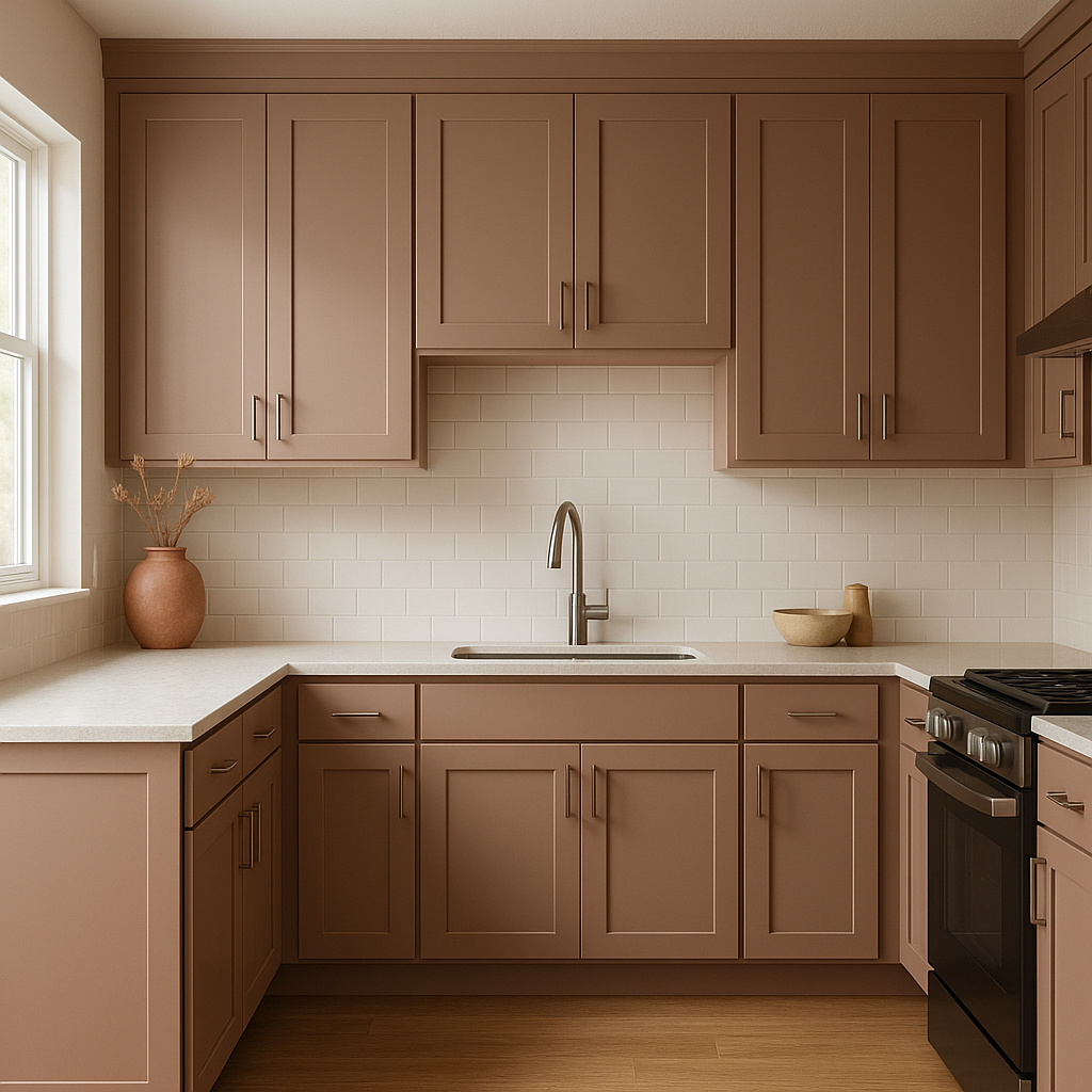
Redend Point works wonderfully on cabinetry, bringing a subtle pop of personality without overwhelming the space. It pairs beautifully with marble or quartz countertops and matte black or brass finishes for a modern yet earthy vibe. In bathrooms, it lends a spa-like quality when combined with natural stone and greenery.
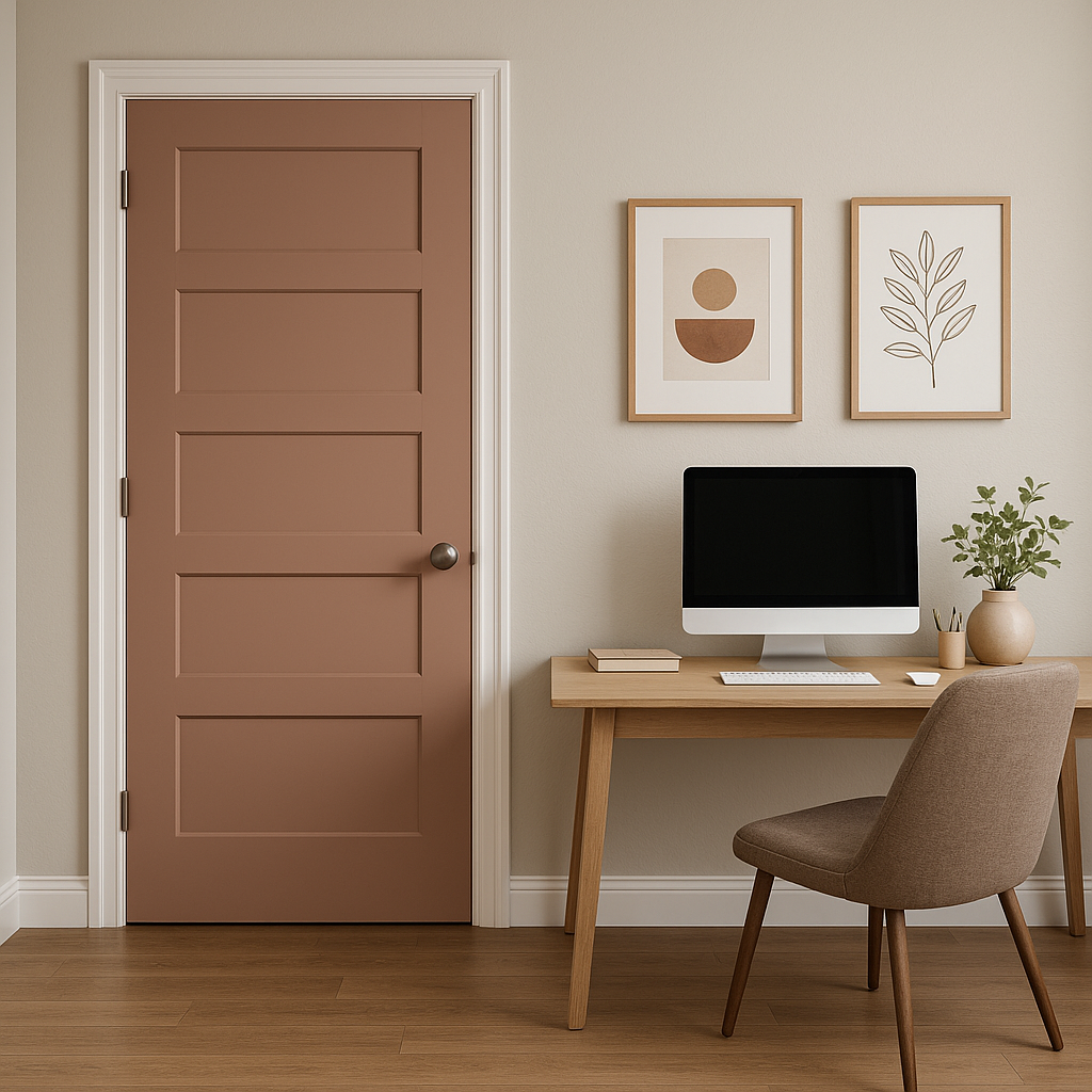
Use Redend Point as an accent wall in dining rooms, offices, or entryways to add depth and visual interest. Pair it with neutral tones and metallic accents for a sophisticated look.
Redend Point isn’t just for interiors—it makes a stunning statement on front doors, shutters, or exterior trim. Its earthy undertones allow it to blend seamlessly with brick, stone, or wood siding while providing a touch of unexpected charm.
Sherwin-Williams Redend Point (SW 9081) is more than just a color; it’s a mood. Its soothing warmth and versatile nature make it a go-to choice for designers looking to create spaces that feel grounded, welcoming, and effortlessly chic. Whether used as a primary wall color or a supporting player in your palette, Redend Point has the ability to transform a space into an oasis of comfort and style.
Embrace the beauty of this earthy terracotta-inspired hue and discover how Redend Point can bring depth, warmth, and personality to your next design project.
Note: These images were all generated with AI, there may be inaccurate color results. Please only use a general reference to get a rough idea of what a color may look like, we will continue to generate new images to improve accuracy.
View Colors Only by Brand (No Imagery):
Sherwin-Williams
|
Benjamin-Moore
|
Behr
|
Valspar
Live on the Eastern Slope of Colorado and looking for a local painting professional, check out all our painting services and reach out for a free estimate.
Copyright © 2026 : Wild Fox Painting Inc. : 12435 Mead Way, Littleton, CO 80125


