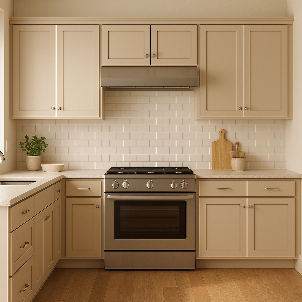
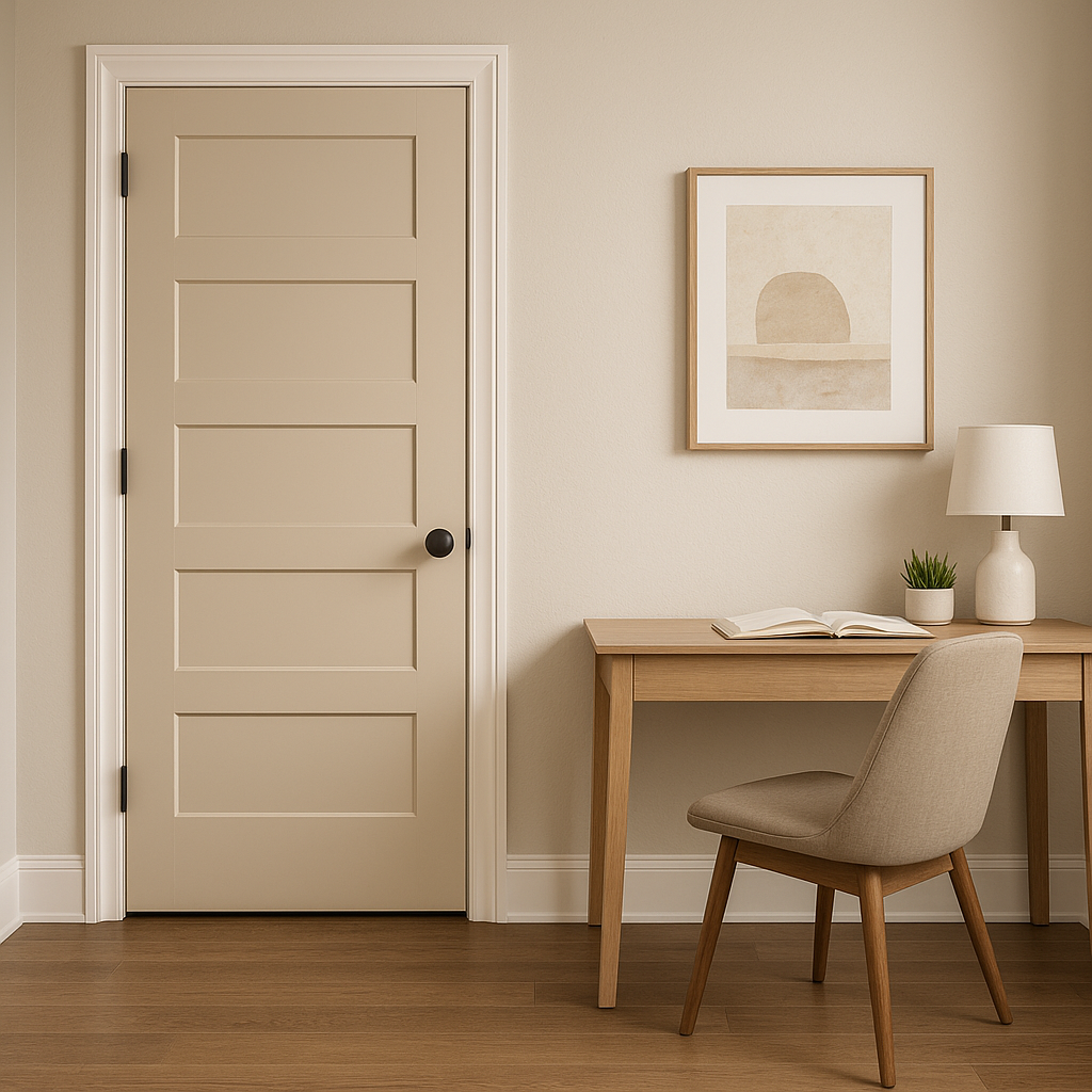
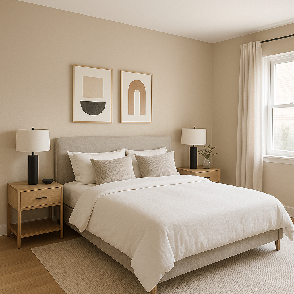
Sherwin-Williams Touch of Sand (SW 9085) is a refined, warm neutral that effortlessly balances sophistication and versatility. Its delicate blend of beige and taupe evokes a sense of calm and comfort, making it an excellent choice for creating serene and inviting spaces. Whether you're designing a cozy living room, a tranquil bedroom, or a welcoming entryway, Touch of Sand's understated elegance makes it a versatile option for nearly any interior.
Touch of Sand features subtle pink and peach undertones, giving it a gentle warmth without feeling overly saturated. These undertones help soften the beige base, making it ideal for spaces that need a touch of coziness while maintaining a light and airy aesthetic. The peachy-pink notes lend a slightly sunlit glow, making this color particularly appealing in rooms with ample natural light. In lower-light settings, it retains its warm charm, creating an enveloping and soothing atmosphere.
Pairing colors with Sherwin-Williams Touch of Sand is effortless, thanks to its neutral yet warm profile. Here are some excellent coordinating options:
These coordinating colors provide endless possibilities for creating layered and cohesive designs, ranging from minimalist and modern aesthetics to warm and traditional palettes.
Touch of Sand's adaptability makes it suitable for a variety of applications, whether you're designing a single room or an entire home. Below are some ideas for incorporating this timeless shade into your space:
Sherwin-Williams Touch of Sand (SW 9085) is more than just a paint color—it's a design tool that enables you to craft spaces that feel timeless, elegant, and inviting. Its subtle undertones and versatile nature make it a go-to choice for both residential and commercial interiors. Whether you're refreshing a single room or embarking on a full-scale renovation, Touch of Sand provides the perfect neutral foundation to build upon.
Elevate your interior design with this warm, welcoming shade and discover how Sherwin-Williams Touch of Sand can transform your space into a haven of comfort and style.
Note: These images were all generated with AI, there may be inaccurate color results. Please only use a general reference to get a rough idea of what a color may look like, we will continue to generate new images to improve accuracy.
View Colors Only by Brand (No Imagery):
Sherwin-Williams
|
Benjamin-Moore
|
Behr
|
Valspar
Live on the Eastern Slope of Colorado and looking for a local painting professional, check out all our painting services and reach out for a free estimate.
Copyright © 2026 : Wild Fox Painting Inc. : 12435 Mead Way, Littleton, CO 80125


