Sherwin-Williams Delft (9134) is a refined and tranquil color that captures the essence of understated elegance. This distinctive blue-green shade is reminiscent of serene coastal waters or antique ceramic glazes, offering a timeless aesthetic that seamlessly blends traditional charm with contemporary sophistication. Delft is an excellent choice for anyone seeking a paint color that balances cool tones with a subtle warmth, creating a harmonious space that feels both relaxing and inviting.
Delft has complex undertones that add depth and versatility to its character. While the dominant color leans towards a medium blue-green, it carries soft gray undertones that temper its vibrancy. These gray undertones ensure Delft remains grounded and understated, making it suitable for both modern and classic design schemes. The green undertones add a touch of earthiness, while the blue gives it a calming, nautical flair. Together, these undertones create a color that feels organic yet polished, ideal for bringing balance to your interiors.
Pairing Sherwin-Williams Delft with complementary hues can help you create a cohesive and visually stunning palette. Whether you’re working within a monochromatic scheme or looking for contrasting accents, here are some suggestions:
Neutral Partners: To emphasize Delft’s versatility, pair it with soft neutrals like Sherwin-Williams Pure White (7005) or Alabaster (7008). These warm whites create a crisp and clean backdrop that allows Delft to stand out without overwhelming the space.
Warm Accents: Add depth and contrast by incorporating warmer tones like Sherwin-Williams Urbane Bronze (7048) or Poised Taupe (7635). These rich shades complement Delft’s coolness while introducing warmth and sophistication.
Fresh Greens: Highlight Delft’s green undertones with lively greens such as Sherwin-Williams Rosemary (6187) or Clary Sage (6178). These shades evoke a sense of nature and pair beautifully with Delft in biophilic design schemes.
Complementary Blues: For added cohesion, integrate other blues such as Sherwin-Williams Naval (6244) or Distance (6243). These deeper blues enhance the soothing qualities of Delft while maintaining a layered and tonal look.
Metallics & Textures: Delft pairs wonderfully with metallic accents like brushed gold, brass, or matte black. Consider incorporating these finishes through hardware, lighting, or decor for a sophisticated, polished aesthetic.
Sherwin-Williams Delft is a versatile color that works well in a variety of spaces and design styles. Its balanced tones make it an ideal choice for creating environments that feel calm, collected, and visually appealing. Here are some ideas for incorporating Delft into your home:
Delft’s soothing nature makes it a perfect option for living rooms, especially when paired with light-colored furniture and natural textures. Use it on walls to create a calming backdrop, or apply it to built-ins and cabinetry for a pop of muted color.
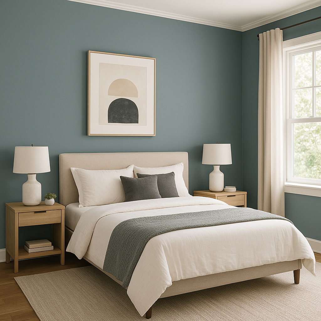
Bring tranquility into the bedroom by using Delft for walls or accent areas like headboards or dressers. Its serene quality encourages relaxation, making it an ideal choice for spaces dedicated to rest and rejuvenation.
Delft’s coastal vibe works beautifully in bathrooms. Pair it with white or marble surfaces to evoke a spa-like retreat, or incorporate it into cabinetry for a fresh, modern look.
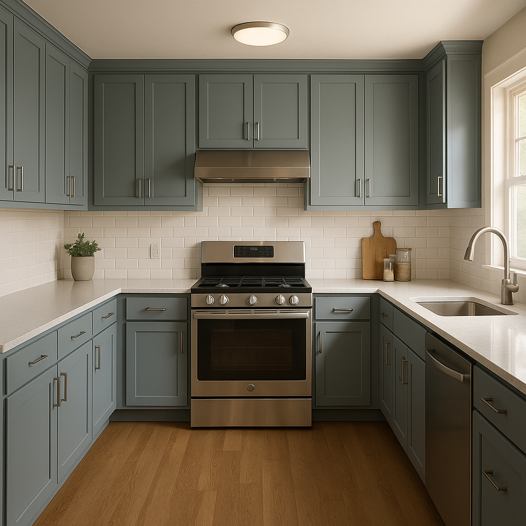
For a unique twist, use Delft on kitchen cabinets or an accent wall. Its balanced blue-green tones pair well with warm wood finishes, white countertops, and metallic hardware, creating a kitchen that feels both inviting and stylish.
Delft can transform dining rooms into elegant spaces filled with character. Use it on walls or as a backdrop for curated decor pieces, such as framed artwork or mirrors.
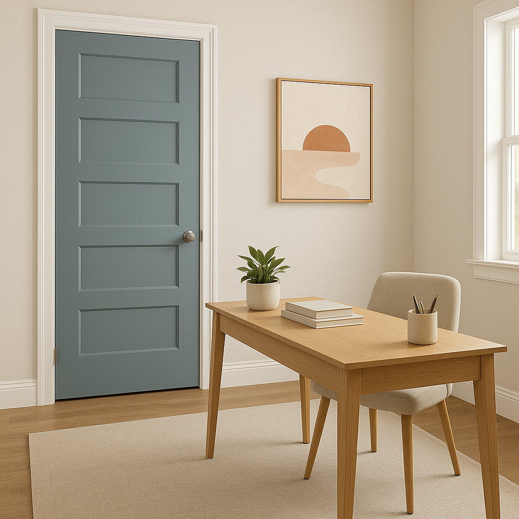
Create a productive yet calming environment in your home office by painting the walls with Delft. Its muted tones encourage focus and creativity, helping you stay centered throughout the day.
Delft is not limited to interior spaces; it’s also a fantastic choice for exteriors. Use it on shutters, doors, or siding to add charm and personality to your home’s curb appeal. It pairs beautifully with white trim and natural stone accents.
Sherwin-Williams Delft (9134) is more than just a paint color—it’s a design statement. Its rich yet subtle tones allow it to complement a wide range of styles, from coastal-inspired interiors to modern minimalist spaces. Whether you’re looking to create a serene retreat or add a touch of sophistication to your home, Delft’s versatility makes it a standout choice for enhancing your living environment.
Note: These images were all generated with AI, there may be inaccurate color results. Please only use a general reference to get a rough idea of what a color may look like, we will continue to generate new images to improve accuracy.
View Colors Only by Brand (No Imagery):
Sherwin-Williams
|
Benjamin-Moore
|
Behr
|
Valspar
Live on the Eastern Slope of Colorado and looking for a local painting professional, check out all our painting services and reach out for a free estimate.
Copyright © 2026 : Wild Fox Painting Inc. : 12435 Mead Way, Littleton, CO 80125


