Sherwin-Williams Whirlpool (SW 9135) is a sophisticated medium gray with subtle blue undertones that exudes a sense of calm and refinement. Its balanced hue makes it a versatile choice for various design styles, from modern and contemporary to classic and transitional. Whether you're updating a single accent wall or transforming an entire room, Whirlpool offers a serene, polished aesthetic that pairs beautifully with a wide range of colors and materials.
At its core, Whirlpool is a neutral gray with cool undertones, leaning slightly toward blue. This coolness gives the color a sense of tranquility, making it ideal for spaces intended to feel peaceful and relaxing. The blue undertones are understated—not overly pronounced—allowing Whirlpool to maintain its versatility while bringing a touch of subtle sophistication.
In spaces with abundant natural light, the color can appear lighter and more silvery, enhancing its airy qualities. In dimmer lighting, the blue undertone becomes more prominent, adding depth and character without overwhelming the space. This dynamic adaptability makes Whirlpool a favorite among homeowners and designers alike.
Sherwin-Williams Whirlpool pairs beautifully with a variety of complementary shades, enabling you to create cohesive and striking color palettes. Here are some excellent coordinating options:
Sherwin-Williams Whirlpool shines in a variety of applications, making it a go-to choice for many interior design projects. Here are some ideas to incorporate this stunning gray into your home:
Whirlpool provides a neutral yet distinctive backdrop that allows furniture and decor to shine. Pair it with plush textiles, natural wood finishes, and metallic accents for a contemporary look.
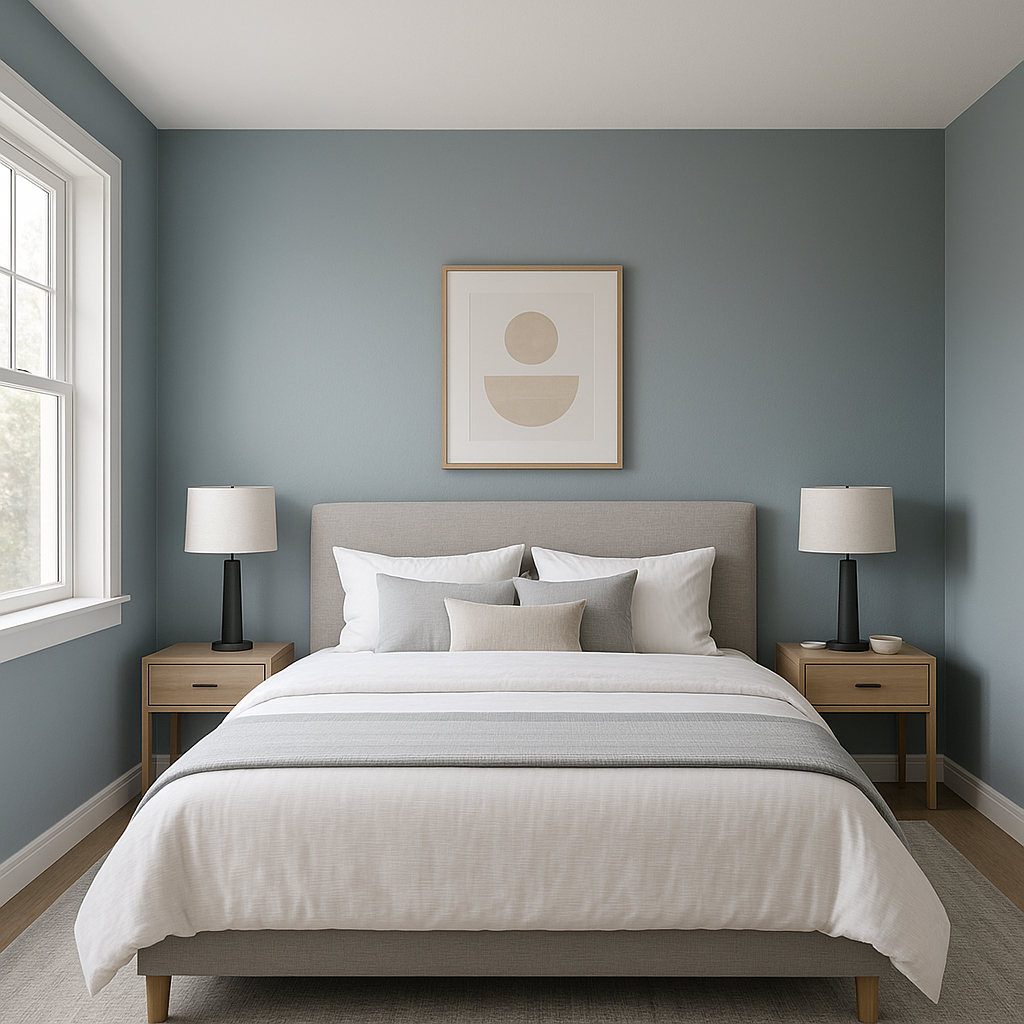
The calming blue undertones make Whirlpool an excellent choice for bedrooms. Use it on walls to promote relaxation and pair it with soft whites, muted blues, or warm beige tones for a tranquil retreat.
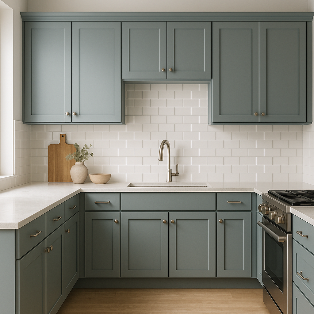
For a sophisticated kitchen design, try Whirlpool on cabinetry or walls. It pairs beautifully with marble countertops, brushed nickel fixtures, and crisp white backsplashes.
Create a spa-like atmosphere with Whirlpool in your bathroom. Combine it with soft whites and natural textures such as wicker, bamboo, or stone for a soothing and luxurious vibe.
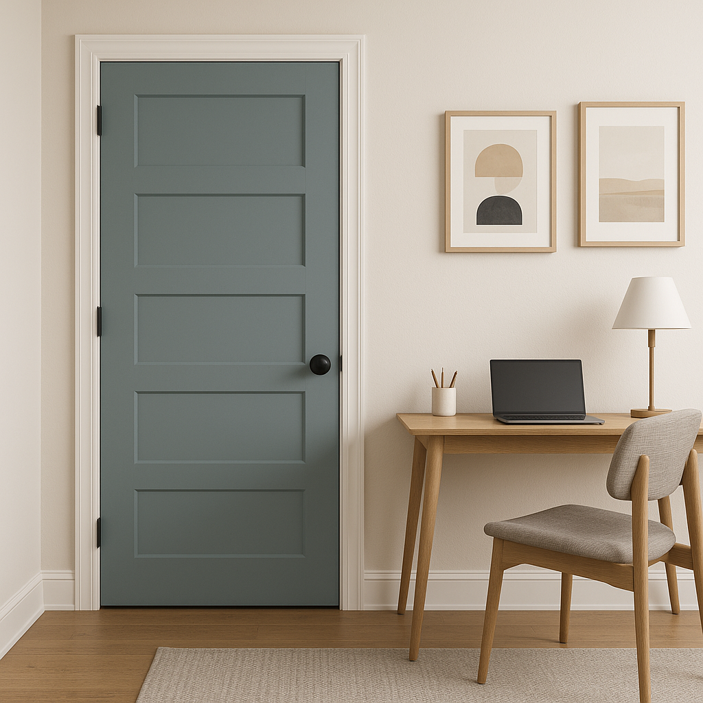
Whirlpool’s cool gray tone fosters focus and productivity, making it ideal for a home office. Pair it with darker neutrals like charcoal or navy for a professional yet inviting space.
Whirlpool is equally striking as an exterior paint color. Its cool undertones work beautifully with white trim, dark shutters, or stone accents, giving your home a modern and elegant curb appeal.
Sherwin-Williams Whirlpool (SW 9135) is more than just a paint color—it's an invitation to transform your space into a sophisticated and serene environment. Its cool gray base and subtle blue undertones make it versatile enough to work in virtually any room or design style. Pair it with warm accents for balance or cool shades for a cohesive, modern aesthetic. Whether used as a main wall color or an accent, Whirlpool’s understated beauty will elevate your home’s interior or exterior with timeless charm.
Note: These images were all generated with AI, there may be inaccurate color results. Please only use a general reference to get a rough idea of what a color may look like, we will continue to generate new images to improve accuracy.
View Colors Only by Brand (No Imagery):
Sherwin-Williams
|
Benjamin-Moore
|
Behr
|
Valspar
Live on the Eastern Slope of Colorado and looking for a local painting professional, check out all our painting services and reach out for a free estimate.
Copyright © 2026 : Wild Fox Painting Inc. : 12435 Mead Way, Littleton, CO 80125


