Sherwin-Williams Daphne (SW 9151) is a sophisticated, mid-tone blue that exudes a sense of calm and timeless beauty. Perfectly suited for modern, traditional, and transitional spaces alike, this color strikes a harmonious balance between boldness and subtlety, making it a versatile choice for any design scheme.
Daphne is a rich and refined blue with a subtle gray undertone that softens its intensity. This undertone prevents it from veering into overly vibrant or saturated territory, giving it a slightly muted appearance that feels grounded and serene. The gray undertones also make Daphne adaptable to changing lighting conditions, allowing it to retain its elegance in both natural and artificial light.
This hue evokes feelings of tranquility and sophistication, reminiscent of a clear evening sky or the deep waters of a serene lake. Its understated nature makes it equally suitable for creating peaceful retreats or stylish, statement-making spaces.
Sherwin-Williams Daphne pairs beautifully with a variety of shades, helping you craft cohesive and dynamic interior palettes. Here are a few suggestions:
Daphne’s versatile nature makes it suitable for a variety of applications across your home or commercial space.
Transform your living room into a serene retreat by using Daphne on the walls. Pair it with light-colored furniture and metallic accents like gold or brass to achieve a chic and polished look.
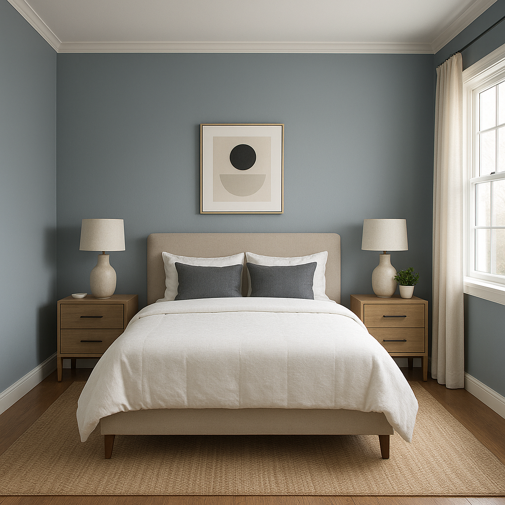
Daphne’s calming qualities make it an ideal choice for bedrooms. Use it as the main wall color for a restful atmosphere and pair it with soft linens in complementary shades like white, gray, or muted green.
Create a spa-like ambiance in your bathroom by incorporating Daphne. Use it on cabinetry or walls and complement it with marble finishes and chrome fixtures for a luxurious touch.
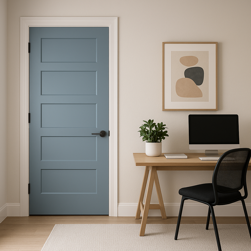
If you’re not ready to commit to Daphne in an entire room, consider using it as an accent color. It works beautifully on a single wall, behind bookshelves, or in niches, adding depth and personality without overwhelming the space.
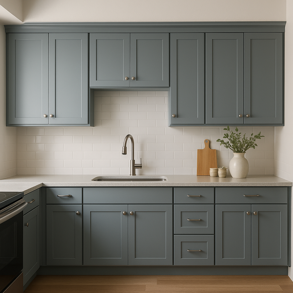
Daphne can also shine in smaller applications, such as painted furniture or cabinetry. Use it in kitchens or home offices to bring a splash of personality while maintaining a sophisticated vibe.
Like all paint colors, Daphne’s appearance will shift based on lighting conditions. In spaces with ample natural light, its blue tones will feel airy and uplifting. In dimmer spaces, the gray undertones take center stage, lending a cozy and intimate feel. It’s always wise to test the color in your room before committing to ensure it complements your unique lighting.
Sherwin-Williams Daphne (SW 9151) embodies a sense of timelessness, making it an excellent choice for those seeking a color that blends beauty, versatility, and elegance. Whether you're designing a calming retreat or a bold focal point, Daphne’s adaptable nature ensures that it will elevate your space with effortless charm.
Note: These images were all generated with AI, there may be inaccurate color results. Please only use a general reference to get a rough idea of what a color may look like, we will continue to generate new images to improve accuracy.
View Colors Only by Brand (No Imagery):
Sherwin-Williams
|
Benjamin-Moore
|
Behr
|
Valspar
Live on the Eastern Slope of Colorado and looking for a local painting professional, check out all our painting services and reach out for a free estimate.
Copyright © 2026 : Wild Fox Painting Inc. : 12435 Mead Way, Littleton, CO 80125


