Sherwin-Williams Dustblu (SW 9161) is a captivating shade of blue-gray that brings a sense of calm sophistication to any space. This versatile color is perfect for creating serene environments while adding a touch of refined elegance to your interiors. Dustblu balances beautifully between warm and cool tones, making it an adaptable choice for a wide range of design styles, from modern minimalism to timeless traditional aesthetics.
Dustblu is characterized by its subtle gray undertones, which add depth and versatility to the hue. With its muted nature, it avoids feeling overly vibrant or saturated, making it an excellent choice for those seeking a soft and understated blue. The gray undertones lend Dustblu a sophisticated edge, ensuring it works harmoniously in both contemporary and classic spaces. Additionally, the faint cool undertones give the color a peaceful and refreshing vibe, making it ideal for areas where relaxation is key.
Pairing Dustblu with complementary or contrasting colors can bring your design vision to life. Here are some ideal coordinating colors to consider:
By mixing and matching these coordinating colors, you can create a space that feels balanced and visually appealing.
Sherwin-Williams Dustblu is a versatile color that can be used in a variety of applications throughout your home or office. Here are some inspiring ways to incorporate this hue into your interiors:
Dustblu is an excellent choice for living rooms, where it can create a tranquil, welcoming atmosphere. Pair it with light neutral furniture and accents in soft textures, such as linen or velvet, to enhance its calming effect. Add metallic finishes like brushed silver or matte gold for a touch of sophistication.
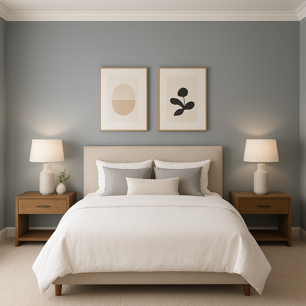
Dustblu’s soothing qualities make it an ideal color for bedrooms. Use it on walls to set a peaceful tone, complemented by crisp white bedding and soft gray throws. Incorporate natural wood furniture or accents for warmth and balance.
This hue works wonderfully in bathrooms, where its cool undertones can create a spa-like ambiance. Pair it with white subway tiles, marble countertops, and chrome fixtures for a fresh, clean look that exudes elegance.
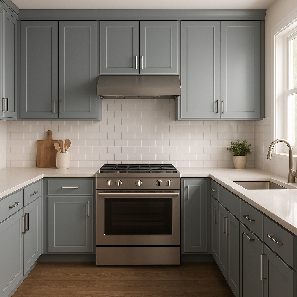
Dustblu can bring a modern yet inviting feel to kitchens. Consider using it for cabinetry or as an accent wall color, paired with white countertops and backsplashes. Finish the look with brushed nickel hardware and natural wood bar stools for added warmth.
The calming nature of Dustblu makes it a fantastic choice for home office spaces. Use it on walls to promote focus and relaxation, and pair it with dark wood furniture and neutral decor for a professional yet comfortable setting.
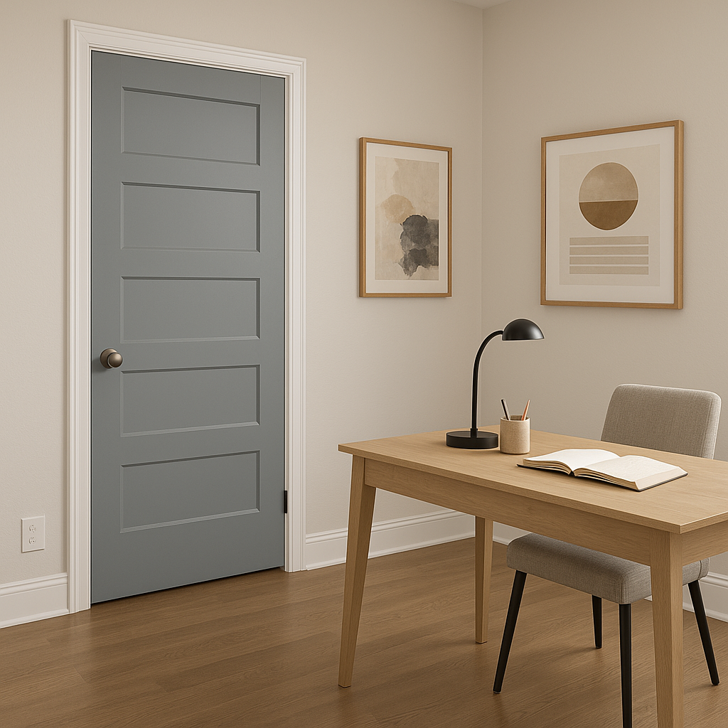
For those who love to experiment with color, Dustblu can be used as an accent wall to add depth and interest to a room. Pair it with lighter shades like Pure White or Eider White to keep the space feeling bright and airy.
Dustblu’s appearance can shift slightly depending on the lighting in your space. In natural light, its blue tones are more prominent, creating a fresh and airy feel. Under warm artificial light, the gray undertones may become more noticeable, lending a cozier and more grounded vibe. Be sure to test Dustblu in your specific space before committing to ensure it achieves the desired look.
Sherwin-Williams Dustblu strikes the perfect balance between elegance and tranquility, making it a go-to choice for homeowners and designers alike. Its adaptable nature allows it to complement a wide variety of design styles, while its subtle undertones ensure it feels timeless rather than trendy. Whether you're looking to create a calming retreat or a polished, professional space, Dustblu delivers a refined aesthetic that will stand the test of time.
Note: These images were all generated with AI, there may be inaccurate color results. Please only use a general reference to get a rough idea of what a color may look like, we will continue to generate new images to improve accuracy.
View Colors Only by Brand (No Imagery):
Sherwin-Williams
|
Benjamin-Moore
|
Behr
|
Valspar
Live on the Eastern Slope of Colorado and looking for a local painting professional, check out all our painting services and reach out for a free estimate.
Copyright © 2026 : Wild Fox Painting Inc. : 12435 Mead Way, Littleton, CO 80125


