Sherwin-Williams Chatura Gray (SW 9169) is a refined and versatile paint color that effortlessly blends cool sophistication with warm undertones. Perfect for creating a serene and balanced ambiance, this shade is part of the Sherwin-Williams Emerald Designer Edition collection, celebrated for its rich and nuanced hues. Whether you're designing a contemporary space or a classic interior, Chatura Gray offers endless possibilities for creating a polished and harmonious look.
Chatura Gray is a mid-tone neutral with subtle undertones that make it a standout choice for designers and homeowners alike. It carries a soft balance of warm beige and cool gray, giving it an inviting yet modern appearance. Depending on the lighting, Chatura Gray may lean slightly cooler or warmer, making it highly adaptable to a variety of spaces. In well-lit areas, the gray tones come forward to create a crisp and clean aesthetic, while in dimmer settings, the beige undertones add a touch of coziness and depth.
This flexibility makes Chatura Gray an ideal choice for spaces where you need a neutral color that complements both warm and cool design elements. Its undertones ensure it never feels stark or overly cold, making it a perfect backdrop for everything from sleek metallics to warm wood finishes.
Pairing Chatura Gray with complementary hues can truly elevate your interior design. Here are some excellent coordinating colors to consider:
Sherwin-Williams Pure White (SW 7005): A clean, crisp white that works beautifully on trim, ceilings, and cabinetry, Pure White enhances the subtle sophistication of Chatura Gray.
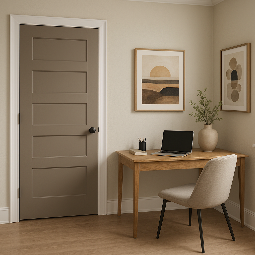
Sherwin-Williams Urbane Bronze (SW 7048): This deep, earthy bronze adds richness and drama to spaces, making it an excellent accent color for furniture, doors, or feature walls.
Sherwin-Williams Dovetail (SW 7018): A medium gray with warm undertones, Dovetail complements Chatura Gray while adding depth and contrast.
Sherwin-Williams Accessible Beige (SW 7036): For a softer, more traditional palette, Accessible Beige pairs seamlessly with Chatura Gray, accentuating its warm undertones.
Sherwin-Williams Sea Salt (SW 6204): A calming green-gray, Sea Salt brings a subtle pop of color while maintaining a cohesive and tranquil aesthetic.
These coordinating colors allow you to customize your space to suit your personal style, whether you’re aiming for a modern, monochromatic look or a layered palette with contrasting tones.
Chatura Gray is incredibly versatile and works beautifully across a wide range of interior design applications. Here are some ideas for incorporating this sophisticated neutral into your home or workspace:
Chatura Gray is a perfect choice for living rooms, where its calming qualities create a welcoming and relaxing atmosphere. Pair it with textured throws, wooden coffee tables, and metallic light fixtures to create a space that feels cozy yet refined.
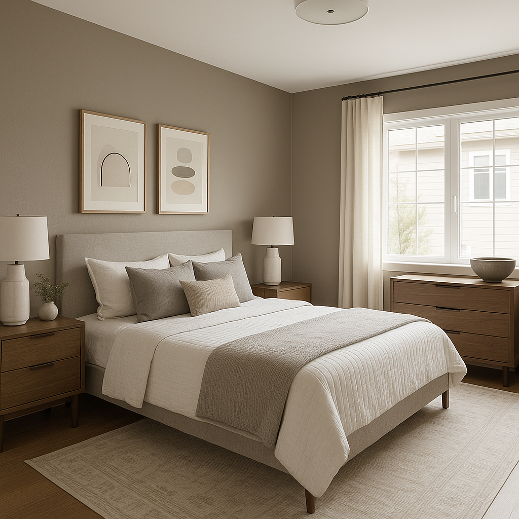
In bedrooms, Chatura Gray lends itself to serene retreats that promote rest and relaxation. Use it on walls to establish a neutral backdrop, then layer in natural linens, soft blues, and creamy whites for a tranquil, spa-like vibe.
For home offices, Chatura Gray strikes the ideal balance between professional and inviting. Its neutral tones encourage focus while maintaining warmth. Pair it with modern furniture and pops of Urbane Bronze for a sleek, productive space.
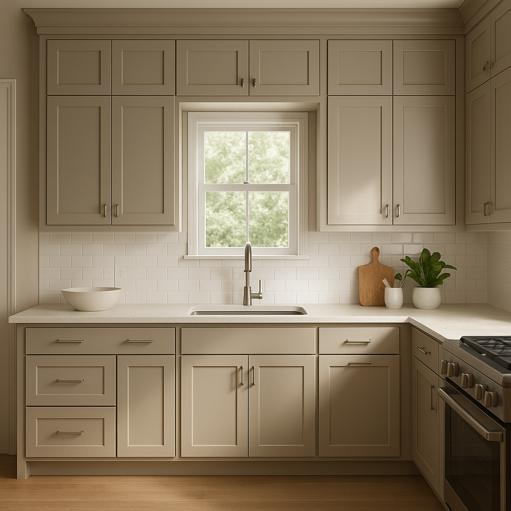
Chatura Gray’s adaptable undertones make it an excellent choice for kitchens and bathrooms. It pairs beautifully with white or gray cabinetry, marble countertops, and stainless steel appliances for a clean and sophisticated look. For bathrooms, consider adding Sea Salt accents to complement the neutral base with a hint of color.
Transform entryways and hallways into elegant transitional spaces by using Chatura Gray. Its timeless appeal makes it an excellent choice for setting the tone of your home, particularly when paired with crisp white trim and bold accents like black-framed mirrors or pendant lighting.
While Chatura Gray can easily be used throughout an entire room, it also makes a stunning accent wall color. Pair it with lighter neutrals like Pure White or Accessible Beige on surrounding walls for a subtle yet impactful design feature.
As with any paint color, lighting plays a crucial role in how Chatura Gray appears in your space. In rooms with ample natural light, Chatura Gray’s cooler undertones are more pronounced, giving the room a fresh and airy feel. In spaces with warmer, artificial lighting, its beige undertones come to life, creating a cozy and grounded ambiance. To ensure Chatura Gray works well in your specific space, test it with samples and observe how it interacts with your lighting throughout the day.
Sherwin-Williams Chatura Gray is a truly timeless neutral that adapts to a variety of styles and spaces. Its subtle blend of gray and beige undertones ensures it complements both warm and cool palettes, making it an ideal choice for homeowners and designers seeking versatility. Whether you’re refreshing a single room or embarking on a full-scale redesign, Chatura Gray is a sophisticated and reliable hue that will elevate your interiors with ease.
Note: These images were all generated with AI, there may be inaccurate color results. Please only use a general reference to get a rough idea of what a color may look like, we will continue to generate new images to improve accuracy.
View Colors Only by Brand (No Imagery):
Sherwin-Williams
|
Benjamin-Moore
|
Behr
|
Valspar
Live on the Eastern Slope of Colorado and looking for a local painting professional, check out all our painting services and reach out for a free estimate.
Copyright © 2026 : Wild Fox Painting Inc. : 12435 Mead Way, Littleton, CO 80125


