A painted interior door is one of the easiest ways to add character to a room without touching the walls. Swap a builder-grade white slab for a deep charcoal, a soft sage, or a navy blue and the whole hallway reads more finished. But bold doors only work when they sit right next to your trim and walls — and that's exactly where a lot of DIY color picks go sideways.
Here's how we think about it, and how to test a color before you commit.
Start with the trim, not the door
Most homes in Castle Rock and Highlands Ranch run white or off-white trim — baseboards, door casings, window sills. That trim is the frame around your bold door, so it decides how the door reads.
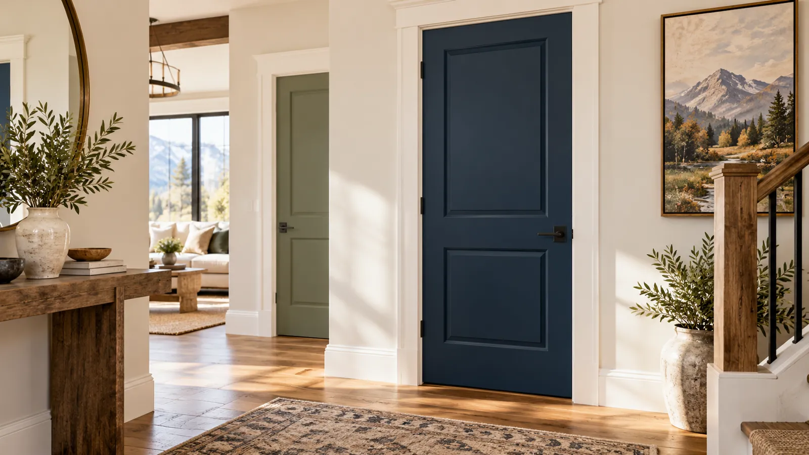
A true bright white casing makes a black or navy door look crisp and intentional. A warmer, creamier trim softens things and pairs better with sage or a muted olive. Mismatch the undertones — cool trim against a warm-leaning door, or vice versa — and the door looks slightly off even when you can't name why.
So before you fall for a door color, know your trim. If your trim is getting repainted too, that's a chance to coordinate both at once. Trim, baseboards, and doors are typically finished in semi-gloss, which reflects a little more light and makes a saturated door color feel deliberate rather than flat.
The three that keep working: black, sage, navy
These are the bold door colors we see requested most, and there's a reason they hold up:
- Black (usually a soft or warm black, not a flat true black): reads as trim more than as an accent. Against white casing it looks architectural. Great on a study door, a pantry, or a run of hallway doors.
- Sage / muted green: the quietest of the three. It leans organic and calm, and pairs well with warm woods and creamy trim. Good in bedrooms and bathrooms where you want low contrast.
- Navy: the most versatile deep color. It feels classic against white, but check it in your actual light — north-facing rooms can pull navy toward gray-black, while warm afternoon light brings out the blue.
One rule that saves regret: a color that looks bold on a paint chip almost always reads darker and heavier once it covers a full door in a small room. The chip lies. The door in context tells the truth.
See it in the room before you buy a gallon
This is the part worth slowing down for. A 2x2 swatch taped to a door tells you almost nothing about how the finished color plays against your trim and wall.
Use our color tools to close that gap:
- Browse door and cabinet colors on /inspiration — roughly 11,800 colors across Sherwin-Williams, Benjamin Moore, Behr, and Valspar. Filter by color family and light/dark, then open the visualizations. Seeing a color rendered on an actual door, next to trim, is the whole point — a chip in your hand won't show you that.
- Run your top picks through /color-finder. Set the room, whether you want warm or cool, and light or dark, and it recommends real catalog colors you can then test against your trim tone.
- Build the full combo in /palette — set your wall color, your trim, and your door as coordinating/accent, all snapped to real colors so the relationship is honest.
You can save favorites as you go, no login needed, then compare them side by side before deciding.
Test the door against the wall AND the trim
A door touches two things: the wall it sits in and the trim that frames it. Judge the color against both at once. A navy door might look perfect against white casing and slightly muddy against a greige wall — better to learn that on screen than after the second coat.
And think about light through the day. South and west rooms get strong, warm Front Range light that deepens dark colors; a black door that looks refined at noon can go heavy by evening. Look at your renders in a couple of lighting moods before you settle.
How we finish a bold door
When it's time to paint, we spray interior doors in our climate-controlled Littleton booth — both faces and all four edges — rather than brushing them in place. Bold colors especially reward a sprayed finish: no brush marks to catch the eye, even coverage, clean edges. We use Sherwin-Williams Emerald Urethane Trim Enamel, two coats, for a hard, smooth surface that holds up to hands and cleaning.
If your doors are currently stained wood, going bold means blocking the old tannins first. We sand hard, fill flaws, and prime with BIN Shellac so the stain can't bleed through and ghost the new color over time. Skipping that step is the top reason painted-over stained doors yellow — so we don't skip it.
A bold interior door is a small change with a big payoff. Get the color right against your trim, see it in context first, and it'll look intentional for years.
When you've narrowed it down and want a written, itemized quote, book a free estimate — we'll walk your doors and confirm the color, sheen, and finish in person.