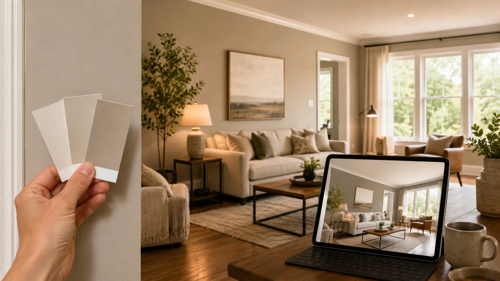
You hold a paint chip up to the wall in the store, it looks perfect, you buy two gallons, and three days later the room reads gray-green instead of the warm greige you wanted. It happens to careful people all the time. The problem isn't your eye. The problem is the chip.
A chip is a one-inch square of color printed on cardstock and viewed under fluorescent store lighting. Your room is hundreds of square feet of painted surface, lit by north-facing windows in the morning and warm lamps at night, bouncing light off your floors, your furniture, and the trim. Those are two completely different things. Expecting one to predict the other is where most color regret starts.
Why a chip can't tell you the truth
Color doesn't exist in a vacuum — it reacts to everything around it. A few specific reasons a chip leads you astray:
- Scale changes everything. A color that looks soft on a small chip gets louder and more saturated once it covers a whole wall. Light pastels can turn surprisingly intense at full size.
- Light shifts the hue. Cool north light pulls colors toward blue and gray. West light at sunset warms everything up. The same gray can look blue in one room and lavender in another.
- Surroundings push and pull. Your wood floors, countertops, and existing trim all reflect onto a freshly painted wall. A chip held in mid-air ignores all of that context.
- Sheen matters. A color in flat reads differently than the same color in a satin or semi-gloss finish, because sheen changes how light bounces off it. (We stop at semi-gloss — no glare-heavy finishes that exaggerate every flaw.)
So the chip isn't lying on purpose. It's just answering a question you didn't ask. You want to know how the color lives in your room, and a chip only knows how it looks on cardstock.
A rendered room shows you the truth
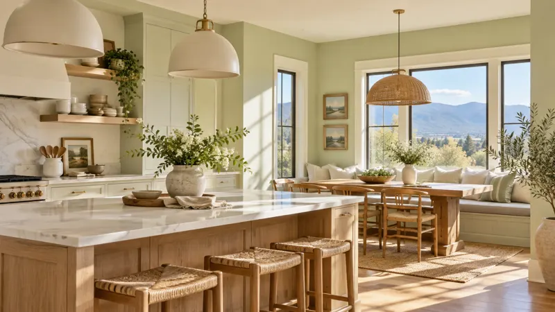
This is the whole reason we built our color tools the way we did. Instead of squinting at a chip, you can see a color rendered into a real room — walls, cabinets, doors, and feature walls — before a drop of paint goes on anything.
Start by browsing curated looks on our Explore Colors page. You'll see colors in context, on actual surfaces, instead of floating as abstract swatches. That context does the heavy lifting your eye needs: it shows you scale, neighboring tones, and how a color reads across a full surface rather than a square inch.
From there you can narrow things down with the Color Finder, which helps you move from a vague idea — "something warm but not yellow" — toward specific colors worth testing. And when you've got a few contenders, the Palette Builder lets you put them side by side so you can judge how a wall color, a trim, and a cabinet tone actually work together. That's the comparison a chip can never give you, because color is always a relationship, not a single value.
How to use the tools well
A few habits that lead to better decisions:
- Look at the whole room, not the wall in isolation. Notice how the color sits next to flooring and trim in the rendering. That's the relationship you'll live with.
- Consider the light your room actually gets. If your kitchen is north-facing and dim, lean warmer to keep it from going cold. Sun-drenched rooms can handle cooler, deeper tones.
- Test color combinations, not just single colors. Pair your wall candidate with your planned cabinet or door color. A color that's lovely alone can clash with the one next to it.
- Narrow to two or three, then stop. More options past that point usually just stalls the decision. The tools are meant to get you to a confident shortlist, not an endless one.
Where the rendering ends and we begin
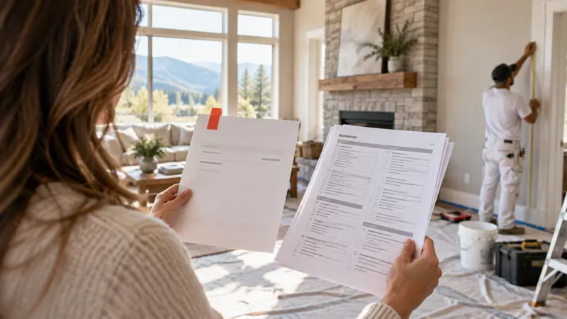
The tools get you most of the way — they kill the guesswork that turns a weekend project into a redo. The last step is a real conversation about your specific space. At your free estimate, we walk through the room, talk about how your light behaves at different times of day, and confirm the finish and sheen that fit each surface. Cabinets, doors, walls, and feature walls each behave differently, and we'd rather get that right before the brushes come out.
That matters most on the projects you can't easily undo. Repainting cabinets, for example, is a fraction of the cost of replacing them — replacement runs anywhere from $15,000 to $40,000 or more — but the color choice still needs to be right the first time. Seeing it rendered before you commit takes the gamble out of it.
Play with the colors, build a palette you trust, and when you're ready to see how it plays out on your actual walls, book a free estimate and we'll take it from there.